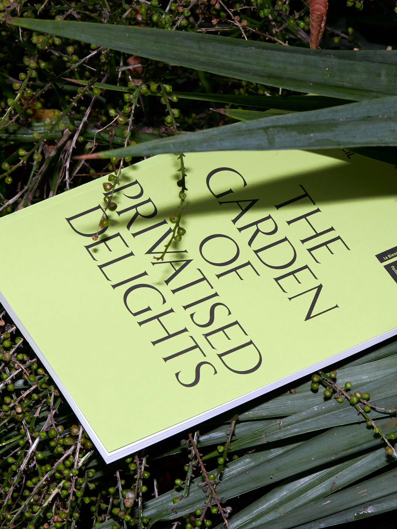
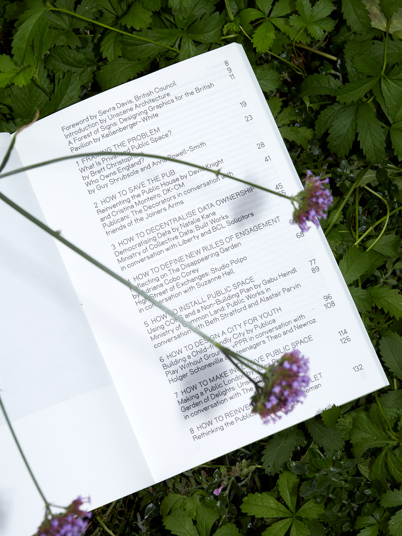
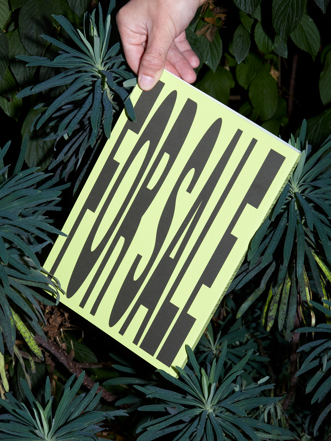
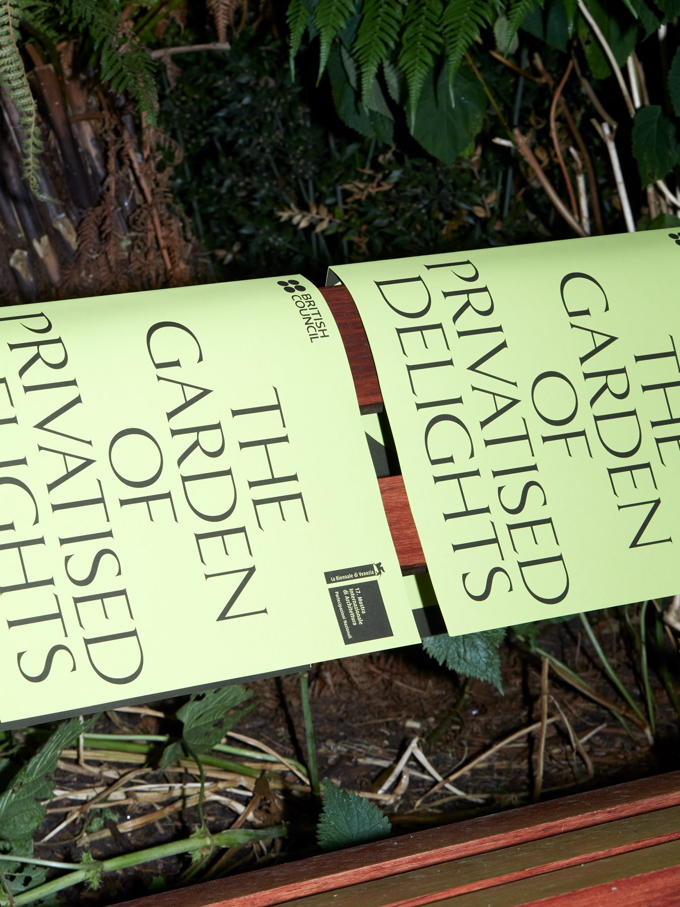
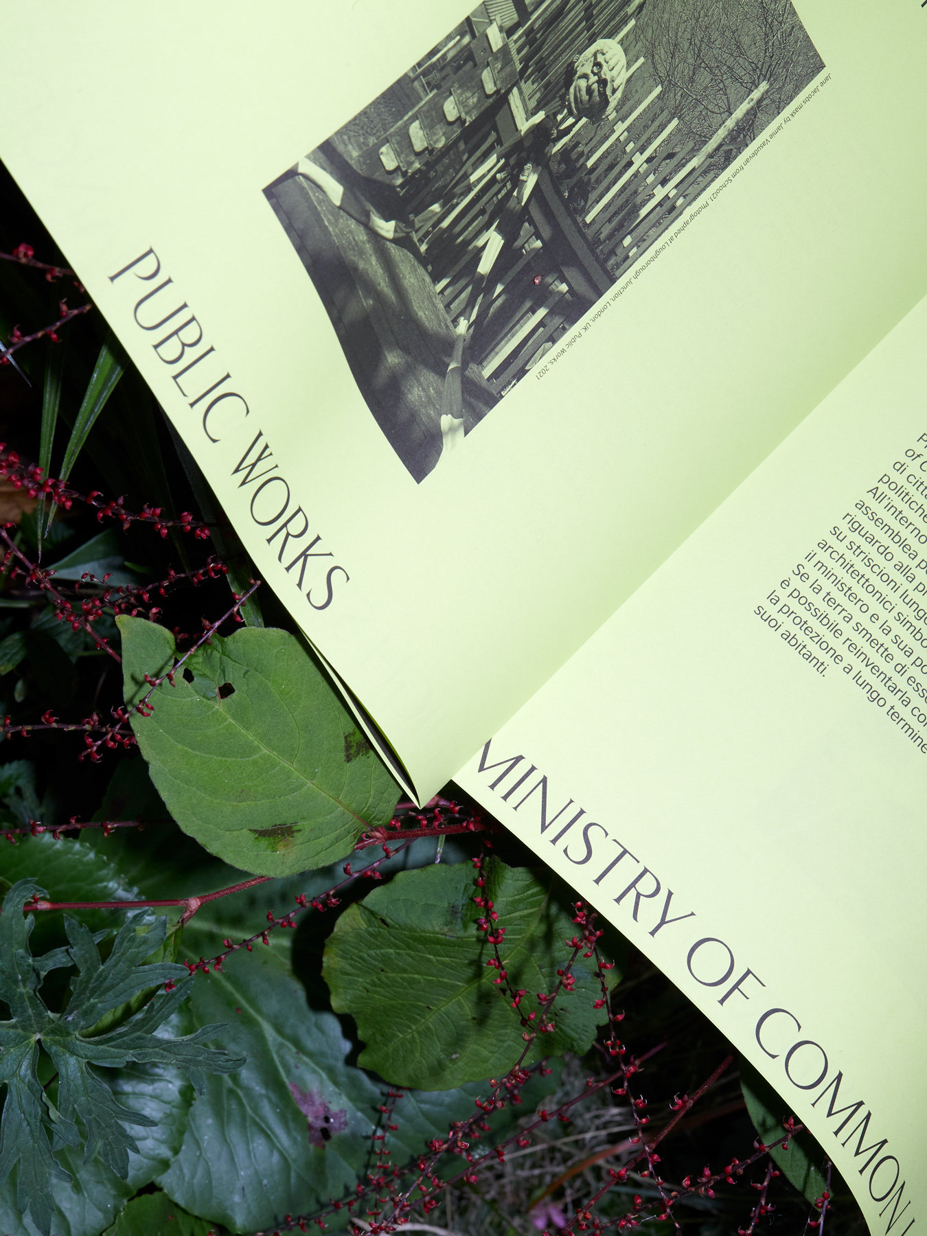
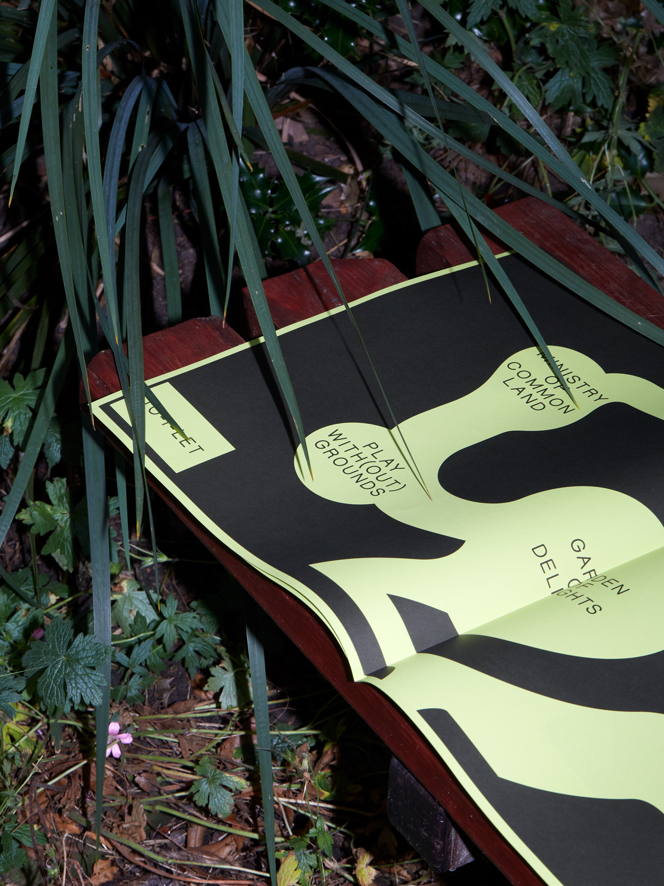
Kellenberger–White designed the exhibition graphics, scenography, marketing campaigns and catalogue for the British Pavilion’s presentation, ‘The Garden of Privatised Delights’, as part of the 17th International Architecture Exhibition – La Biennale di Venezia.
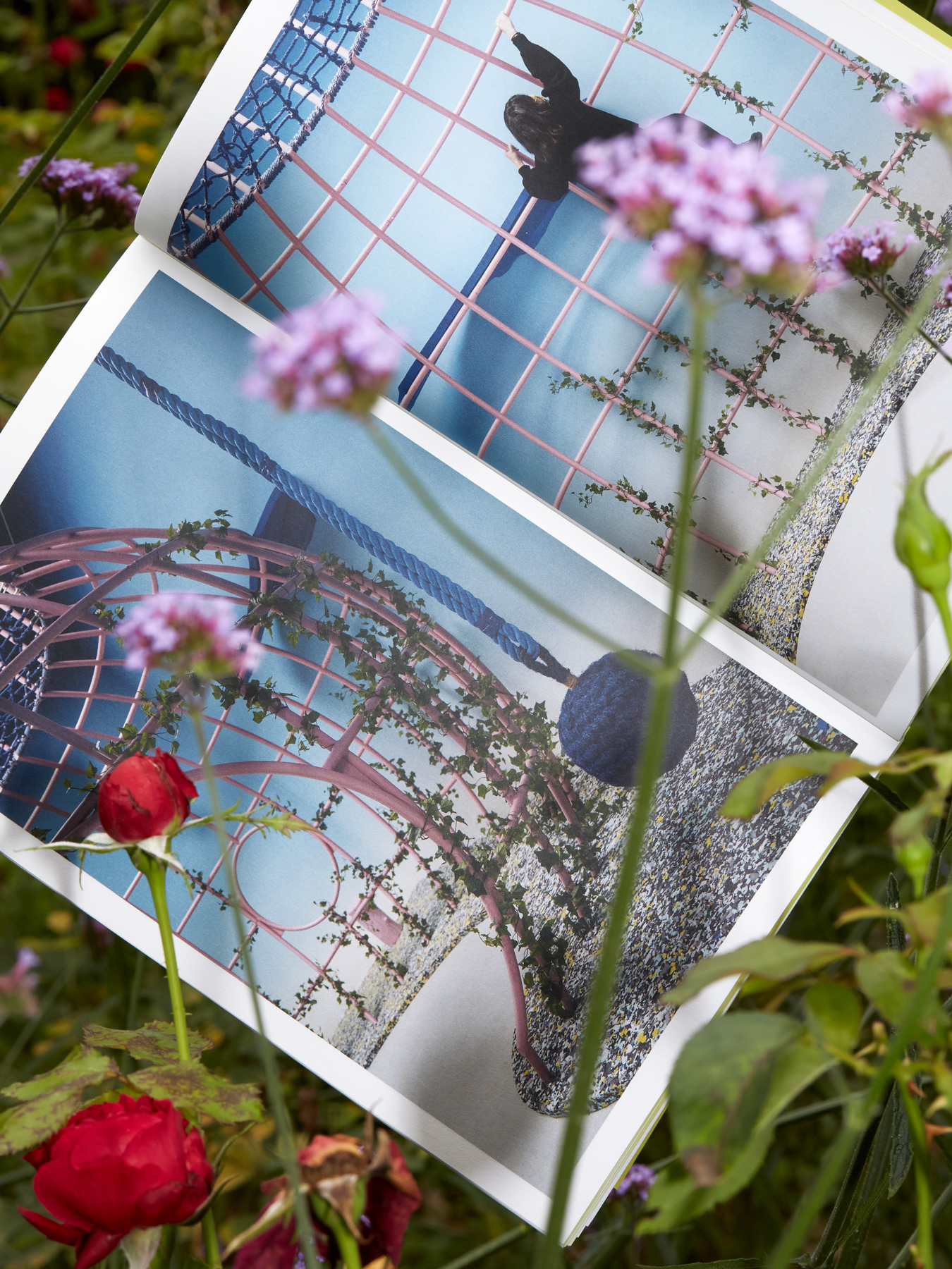
Working closely with the British Council’s team, chief curators Madeleine Kessler and Manijeh Verghese, and a series of collaborators and producers, the pavilion has been transformed. Each of the six rooms hosts an immersive installation.
Inspired by Hieronymus Bosch’s The Garden of Earthly Delights (1490–1510), the curators present a new model for the future of public space through an immersive installation, designed to engage the public in the debate. Informed by the background sky of Bosch’s triptych, we designed an intense blue gradient, hand-sprayed throughout the interior of the pavilion. In counterpoint to Bosch’s use of naturally derived pigments, we appropriated Toxic Green, a synthetic colour generated in the manufacturing process of rodent killer, as a signature colour for all marketing collateral.
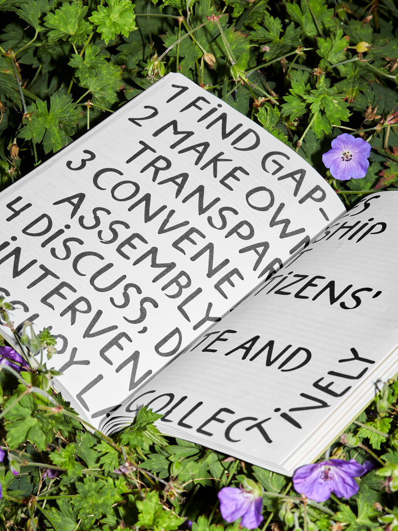
While colour was a key unifying element to the visual language, we created a family of typefaces that represent various forms of interpretation. The font collection KW Simulacra is a group of six fonts based on a series of informal moments in public signage – from Roman carved inscriptions at Pompeii, CNC wooden boards found in playgrounds, over-stretched ‘sale’ window display signage and words drawn in the dirt on car windscreens. These fonts gave form to the multiple tones of voice, information and interactions, while also populating the space as a forest of signs.
