Award: Federal Office of Culture, Switzerland, Most Beautiful Swiss Books 2016
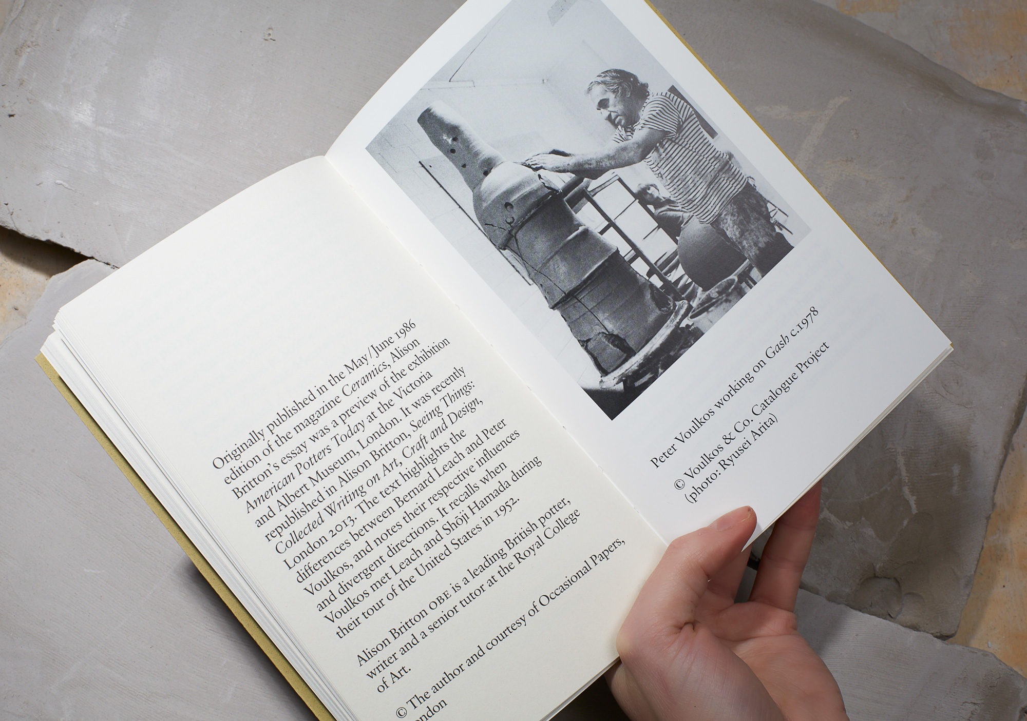
This reader accompanied a Tate exhibition on the development of ceramics studios across the 20th century. The book traces how clay was first used for pottery, the perfection of techniques over centuries in Japan and the ceramics revival in the early 20th century, led by such British potters as Bernard Leach, before describing later developments, such as US artist Peter Voulkos’s groundbreaking new sculptural approach to clay.
For our design, Kellenberger–White took inspiration from the soft cream pages and oversized text of a small, dusty old Swiss paperback passed on by Eva’s father. Our approach was to create a book that was simple and raw, yet easy to read and comfortable to hold.
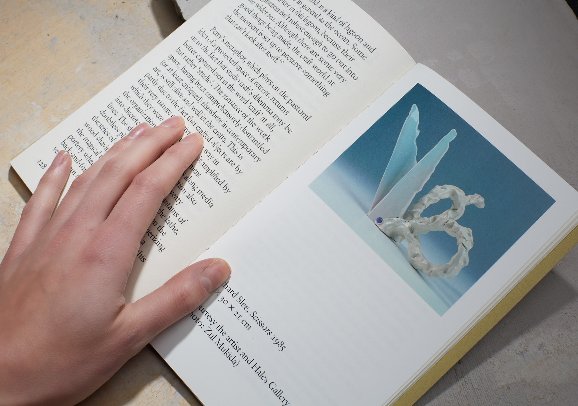
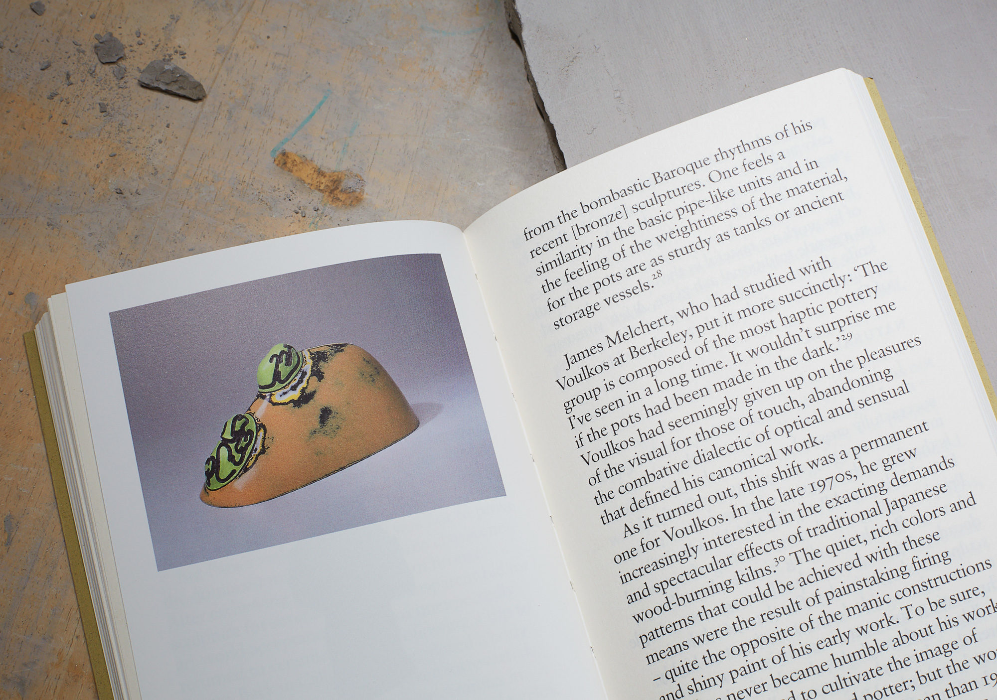
We used the Otabind process to ensure the book can open out flat and, for the main text, selected Jan Tschichold’s Sabon font – the font we found in Eva’s book – but at an unusually accommodating, warm 14pt size, rather than the rather pinched 9pt of a typical paperback.
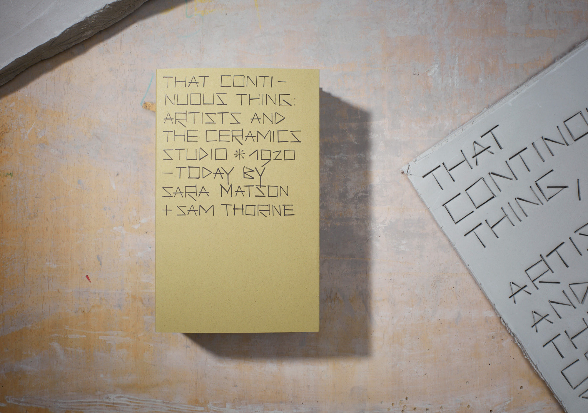
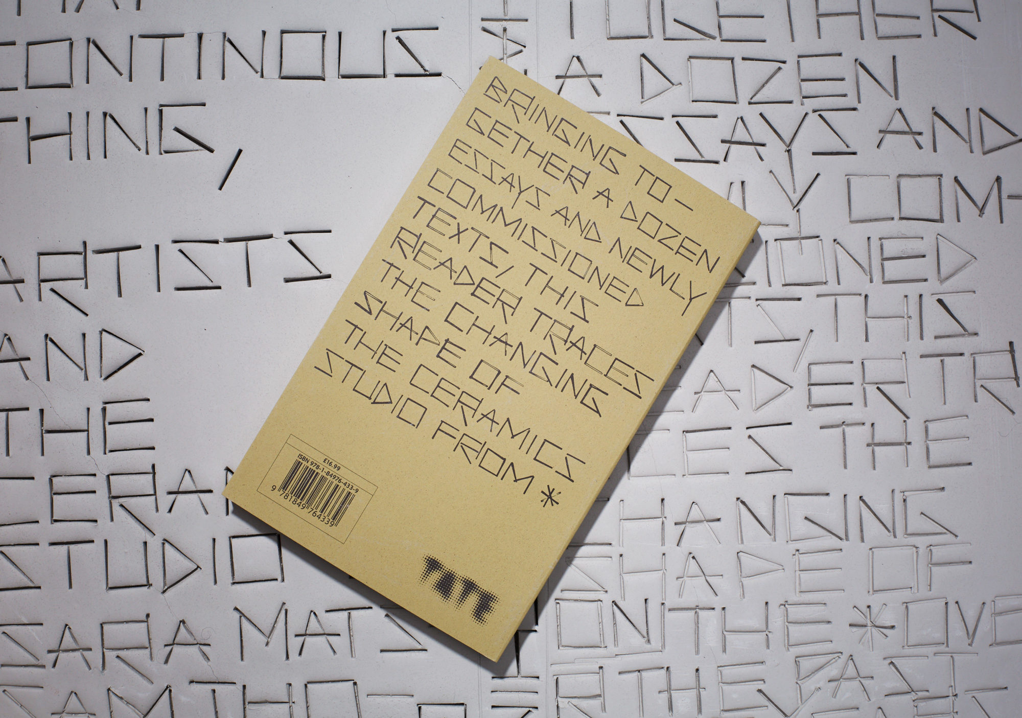
For the cover, we chose an organic mossy green recycled paper, with typography that looks as if it was constructed from the simplest, almost palaeolithic decorative gestures: a lead line-spacer, used in letterpress printing, incised a rolled-out tablet of clay to create letters in a sort of cuneiform script. Producing the typography in this way also evoked the physical imprint potters make on the bottom of their work in lieu a painter’s signature.
