1/9
Text
‘Terror and Wonder’
“A perversely enlightening exhibition” The Guardian
‘Terror and Wonder’ was the UK’s largest exhibition of Gothic literature, celebrating the many British literary masterpieces in the genre, as well as modern interpretations of the Gothic in contemporary pop culture.
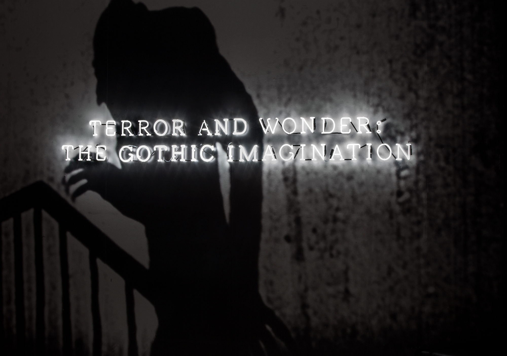
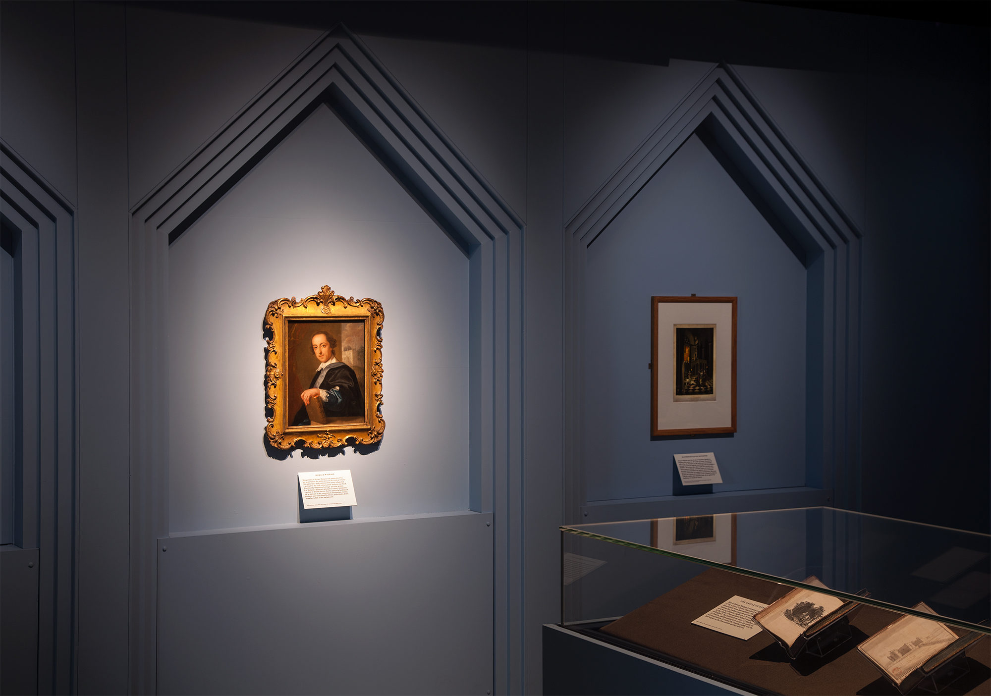
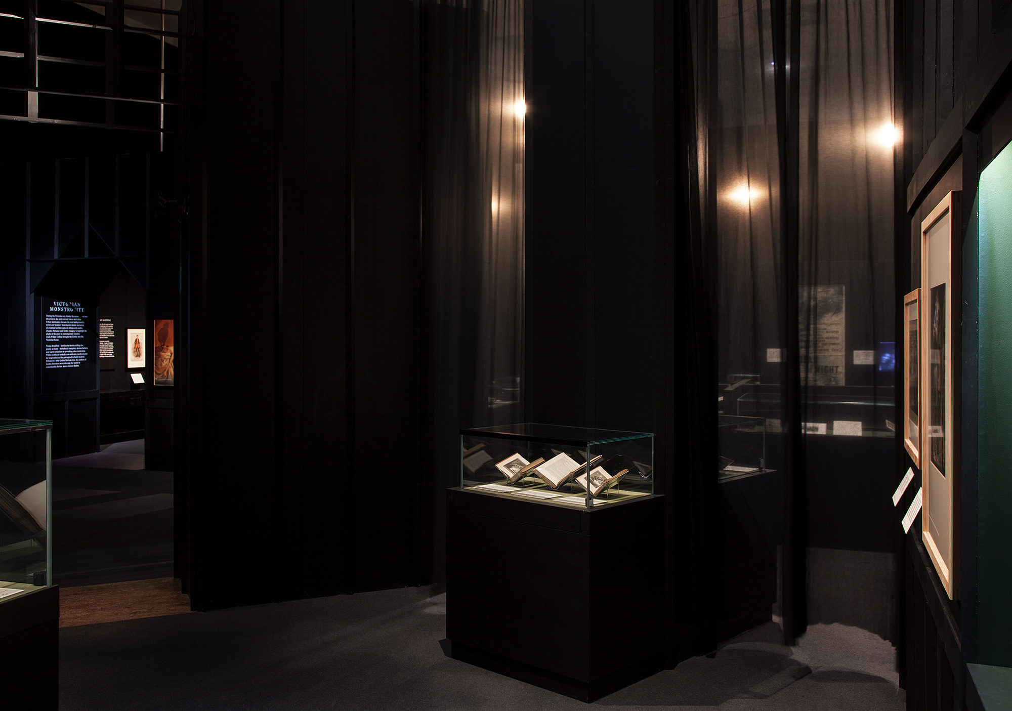
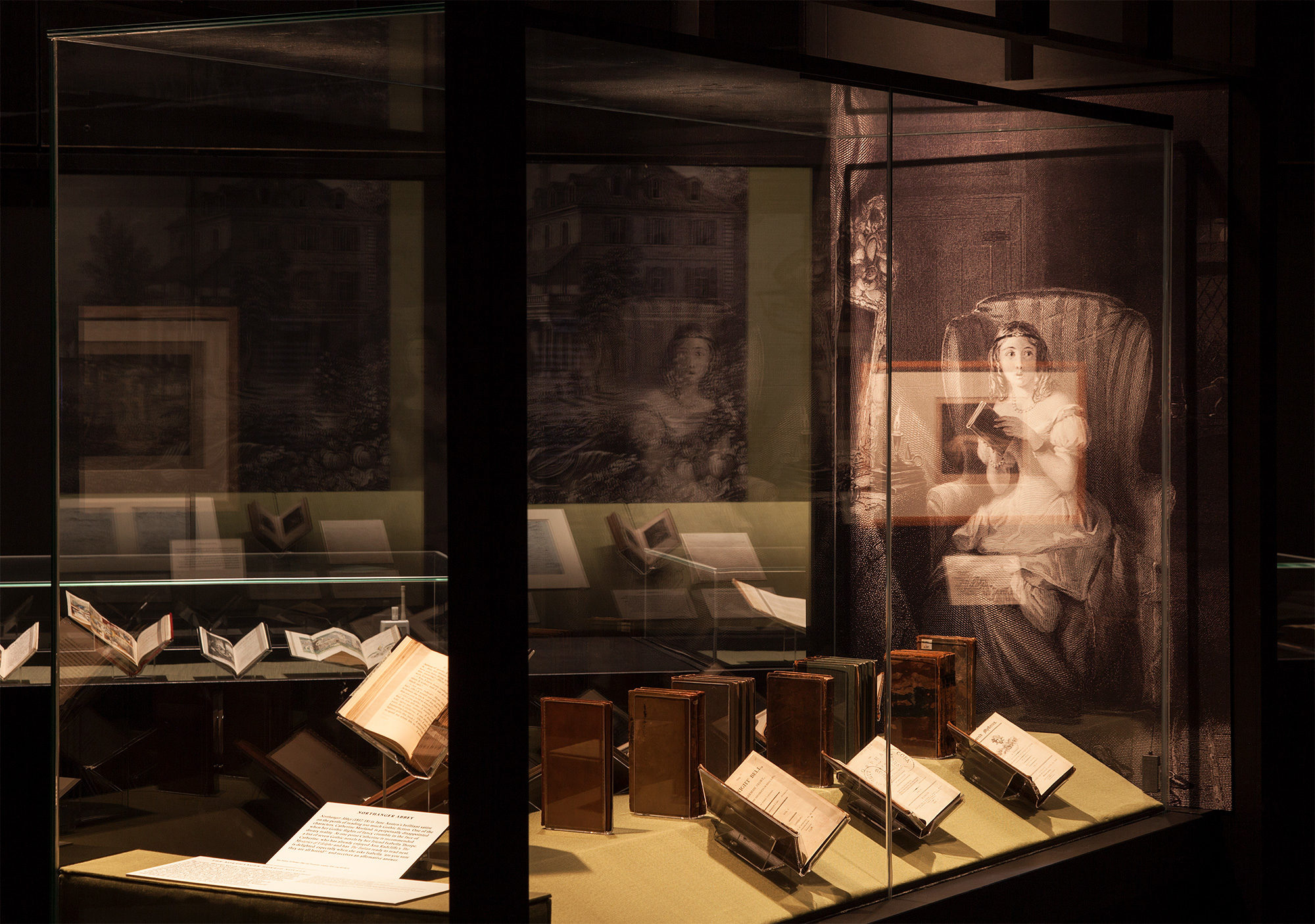
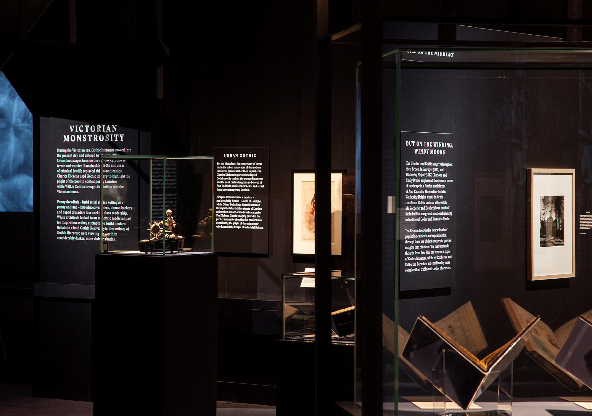
Working with London-based architects OMMX, Kellenberger–White designed a comprehensive scheme of exhibition graphics, which included a special neon entrance sign, introduction and section panels, and captions, as well as a section-by-section colour scheme, developed in partnership with the architects and the British Library exhibition team. The design deliberately played on the visual mood of the exhibits: for example, the rooms and corridors dedicated to Dracula were lined from floor to ceiling in a deep blood red.
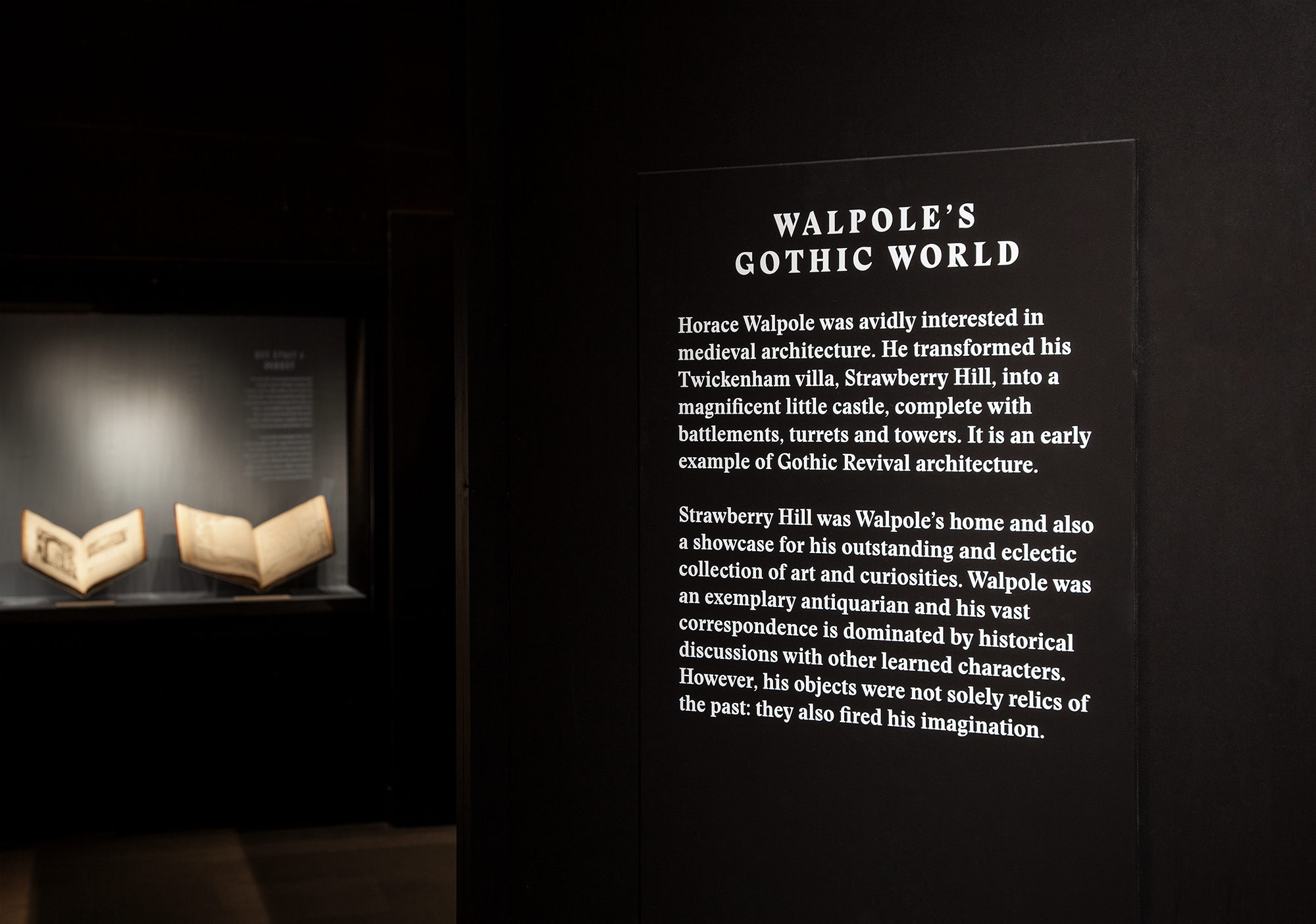
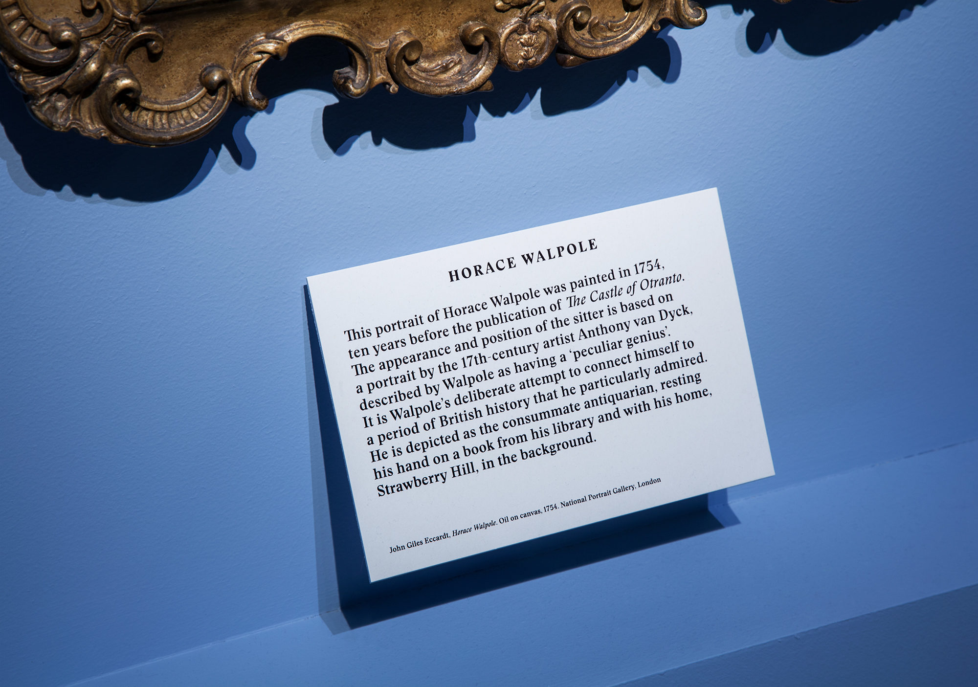
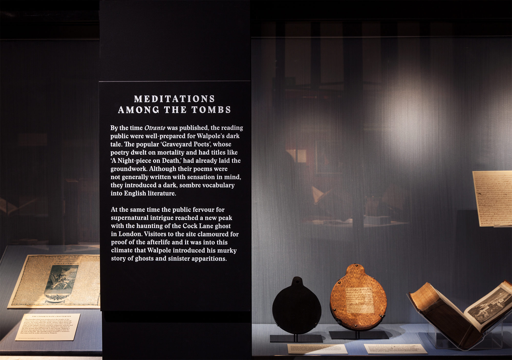
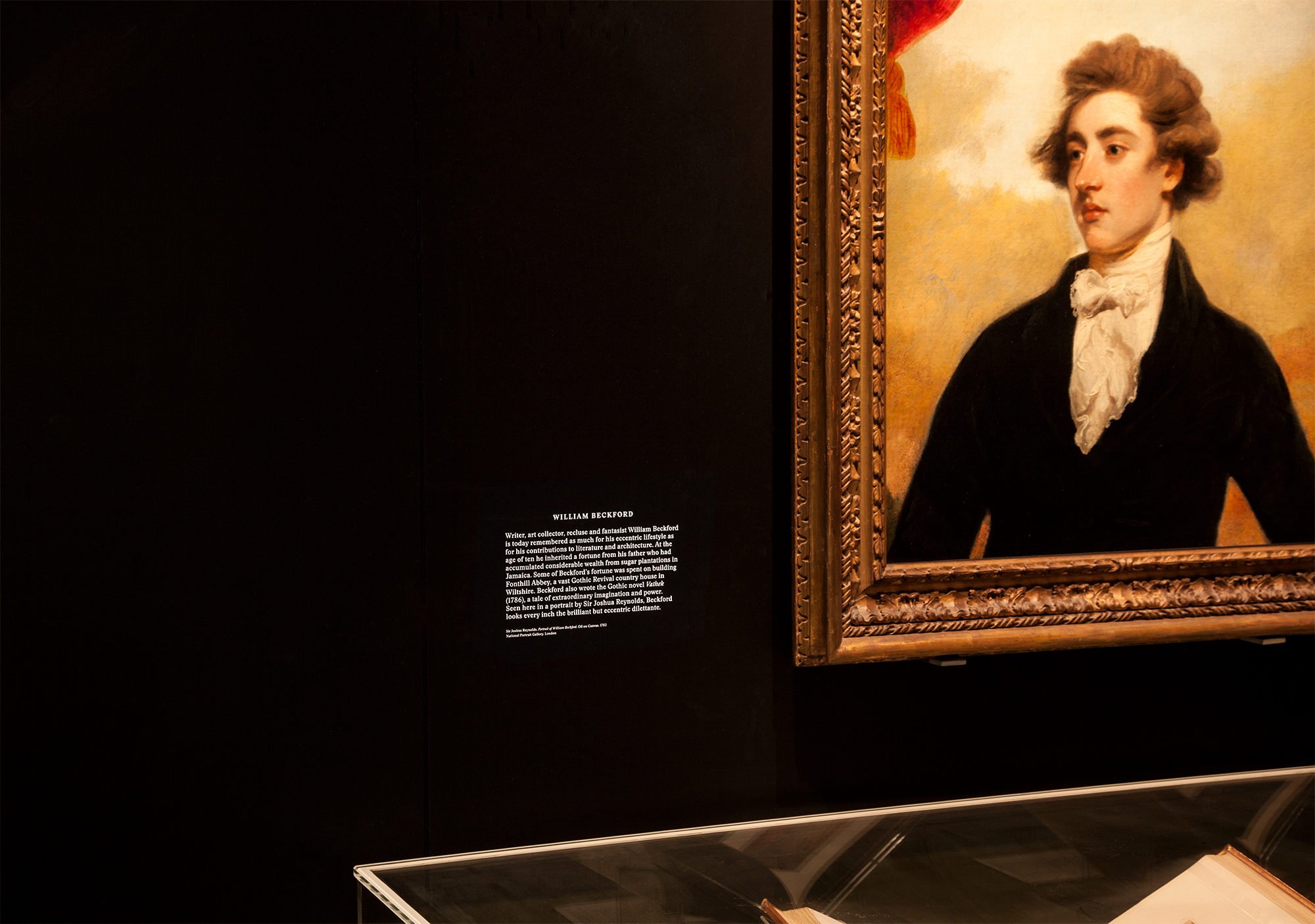
The exhibition graphics sought to enhance the eerie tone of the exhibition rooms. Using the new typeface Stanley Bold, characterised by its sharp counter forms, the text panels were produced on hand-painted wooden panels – evocative of bucolic Victorian churches and school halls, while their layout and proportions subtly hinted at the ultimate Gothic motif of tombstones.
For the neon signage, Kellenberger–White redrew a special hairline font that was optimised for the purpose. The neon enriched the special characteristics of the chosen Stanley font, while also evoking the image of night-time street scenes and seedy alleyways frequently occupied by modern-day characters of the Gothic underworld.