1/9
Text
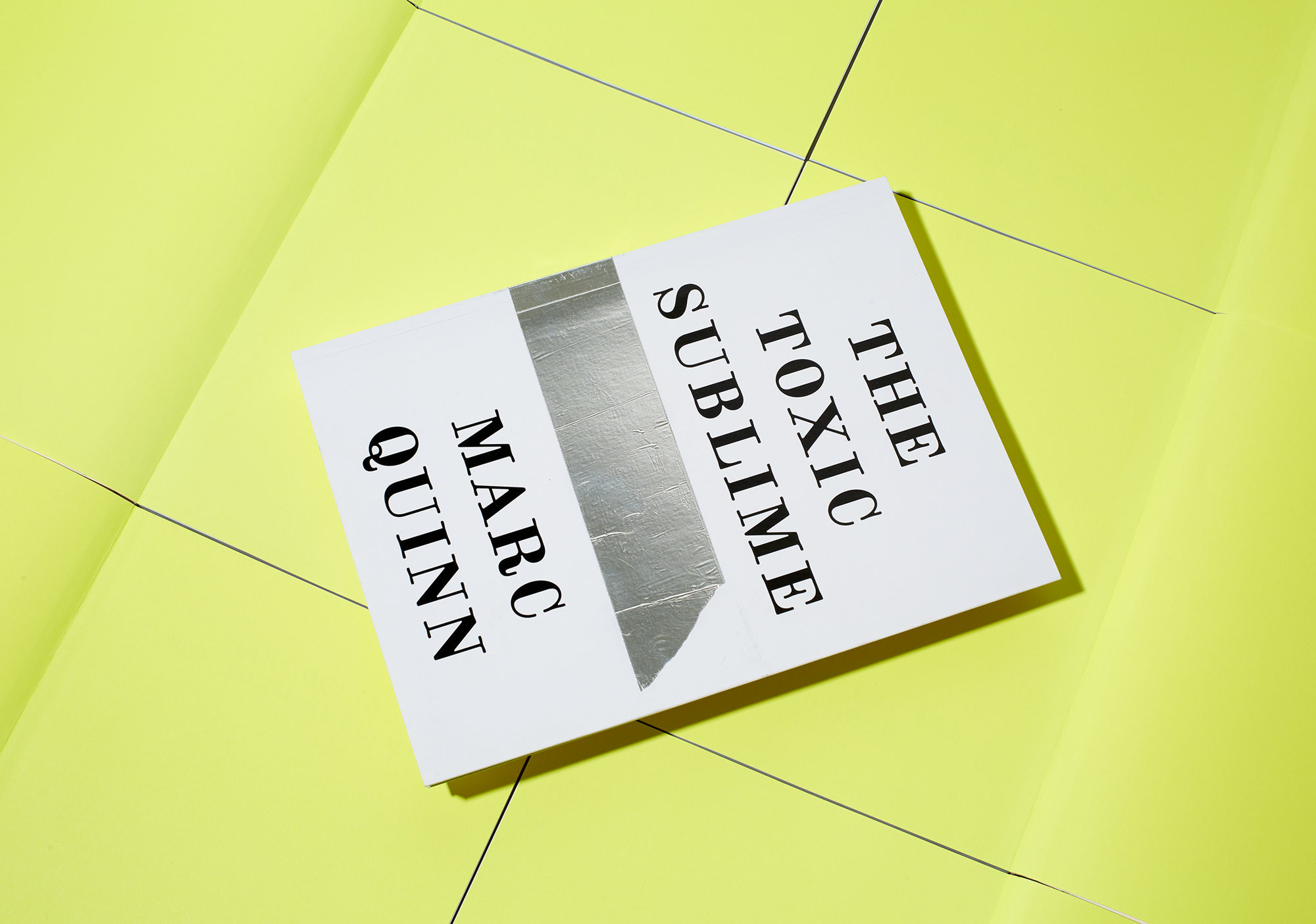
Marc Quinn, ‘The Toxic Sublime’
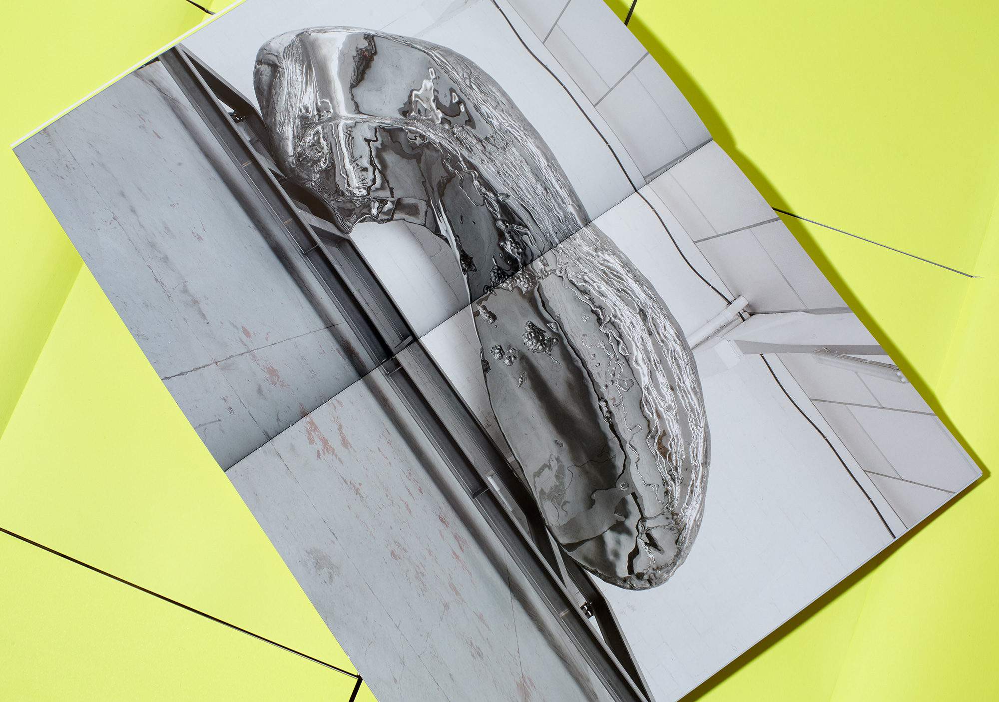
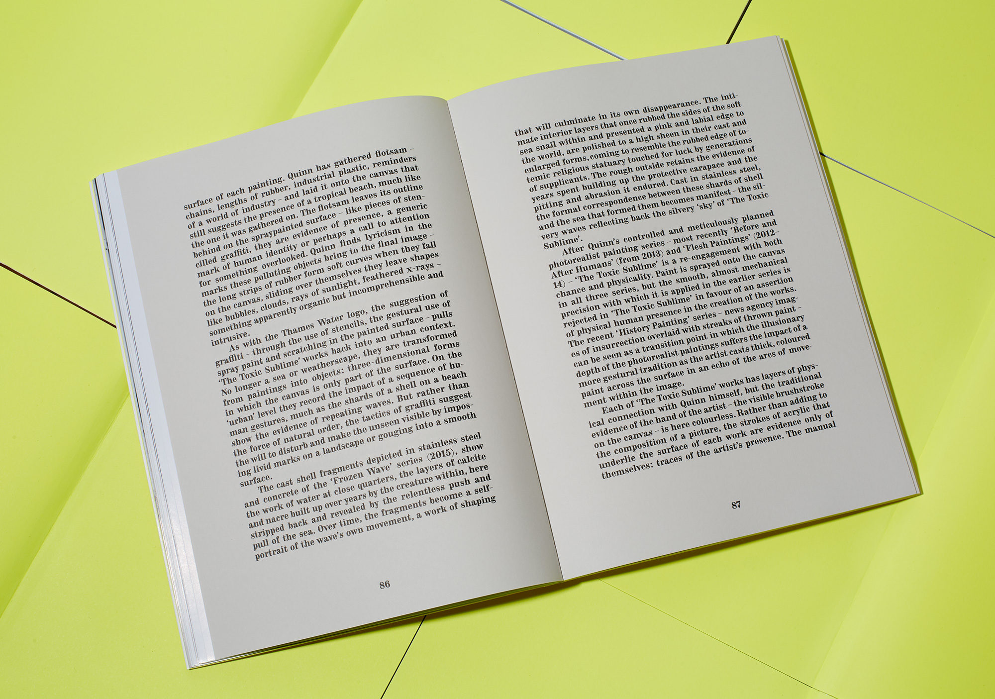
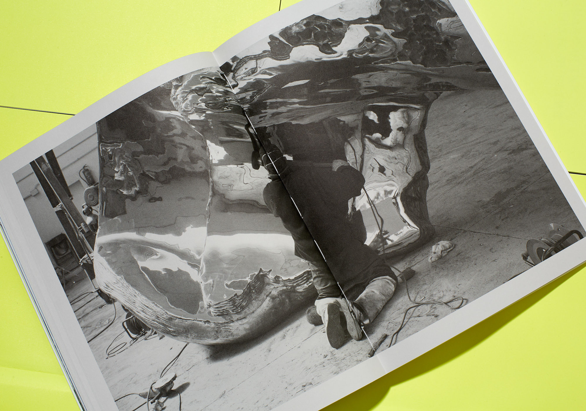
White Cube presented an exhibition of new work by Marc Quinn, the culmination of two years of investigation into natural phenomena and our distanced and complex relationship with the environment. In ‘Broken Sublime’, the artist presented us with two stainless-steel sculptures modelled from real shells that had been broken into by people, so as to extract the flesh within – a reminder that our relationship with nature is, and always will be, shaped by basic human urges.
To create the catalogue for this exhibition, we re-examined both type design and approaches to packaging in search for parallels to the way that Quinn created his paintings and sculpture by reinterpreting images and objects.
For the text and cover, we used a Lineto font called Purple. Rather than use a faithful modern-day digital reproduction of a classic font, this was an original reproduction made of Antiqua from a very small 7pt letterpress specimen sheet. By digitally scanning the printed sheet and scaling it up, the temporal sequence of the printing process itself was captured – this reminded us of Quinn making gigantic sculptures from small shells. The form of the font looks enlarged, gothic perhaps, and is oddly beguiling.
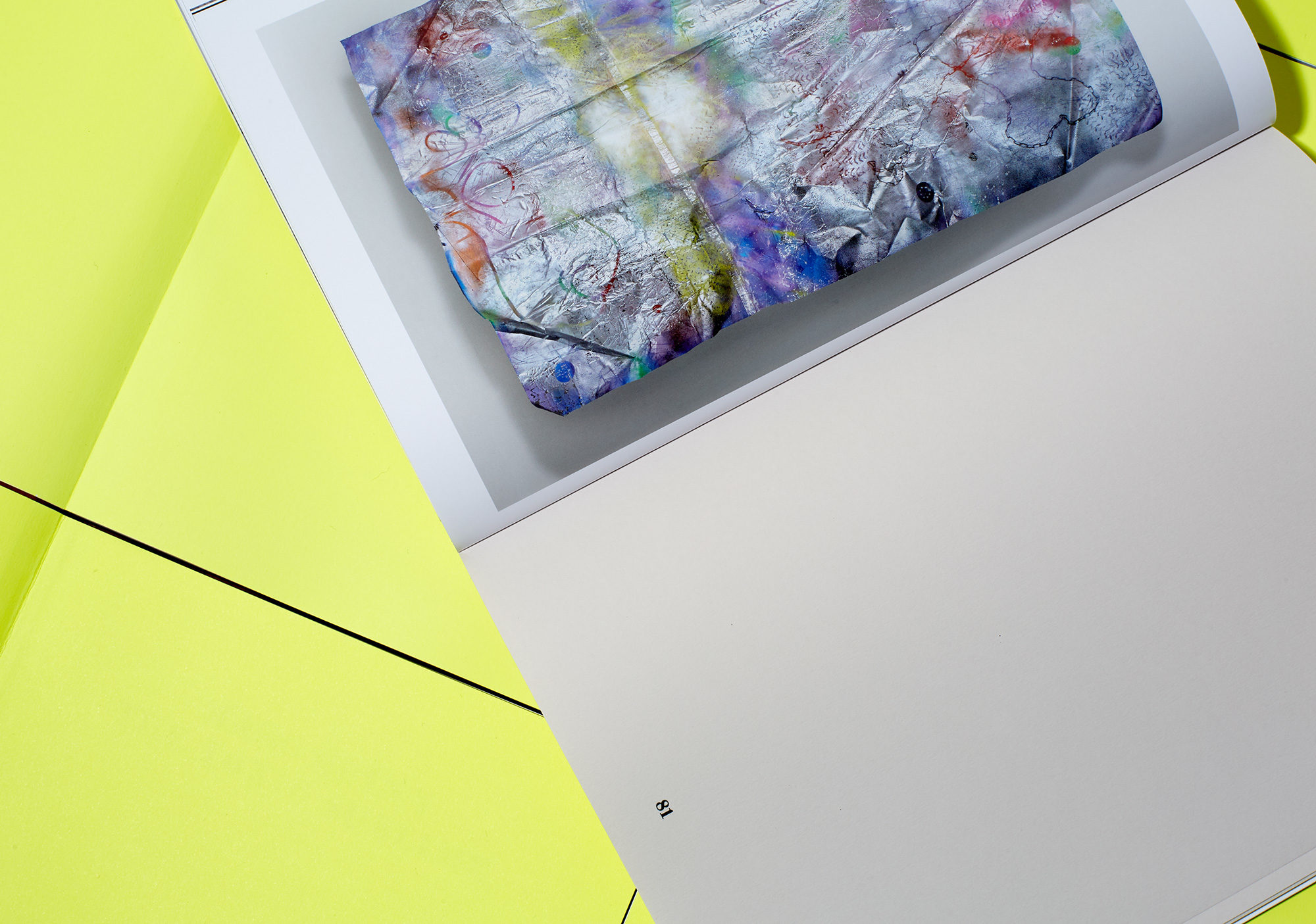
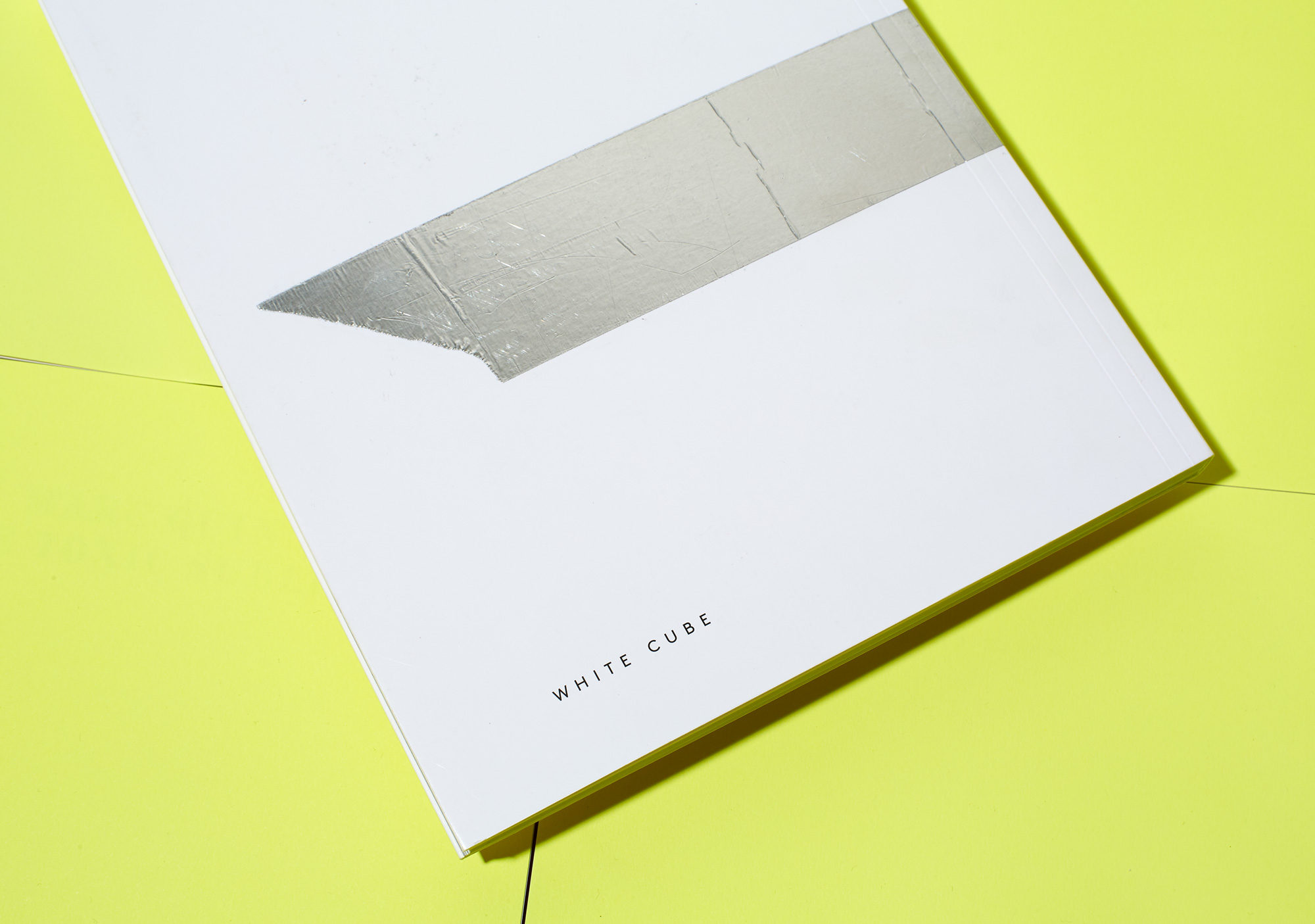
The material chosen for the cover was cigarette packaging paper, with aluminium 3M aeronautical tape – the same as Quinn used for his ‘Broken Series’ paintings – applied to each cover by hand.