1/1
Text
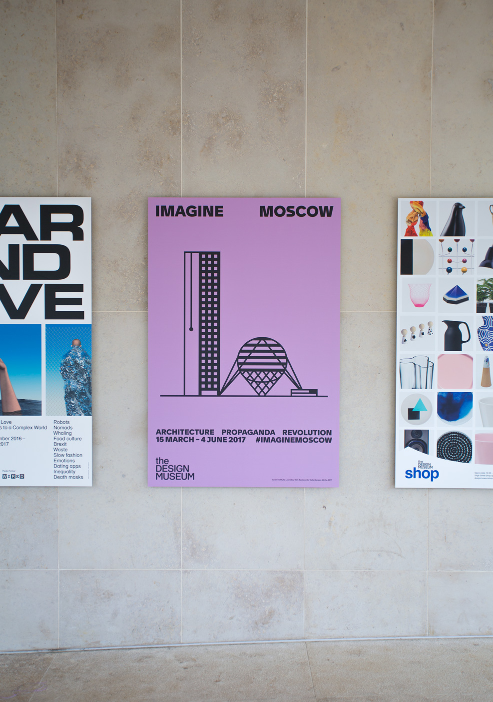
‘Imagine Moscow’ campaign
The Constructivists’ embrace of graphic design in the early 20th century, and of the poster specifically, made the visual language we created for ‘Imagine Moscow’ particularly pertinent when it came to producing the marketing materials. We continued the exhibition’s graphic language, designed to evoke Constructivist principles and techniques, across invitations, posters and billboards. With the bold geometric forms of the typeface Apax, we typeset the main title on repeat in the manner of a street poster. For the colours we chose red and black, prominent in early modernist graphic design, together with an unusual lavender grey that we discovered in a rare poster by El Lissitzky. The layouts and illustration style we adopted to visualise the six unrealised buildings on which the exhibition was based, were inspired by the constraints imposed by the wooden and metal blocks used for compositing and printing at the time.