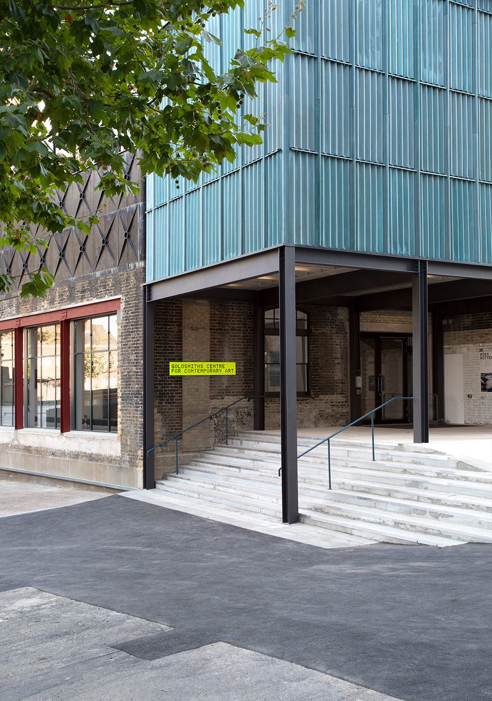
Converted from the boiler house and laundry rooms of a heritage-listed Victorian bathhouse in New Cross, south London, Goldsmiths CCA is a major new contemporary art centre for the city. In designing it, architecture collective Assemble opted for a series of interventions that frame details from the building’s past: internal walls have been left raw to reveal geological layers of patched masonry, glazed bricks, iron beams and sawn-off lintels.
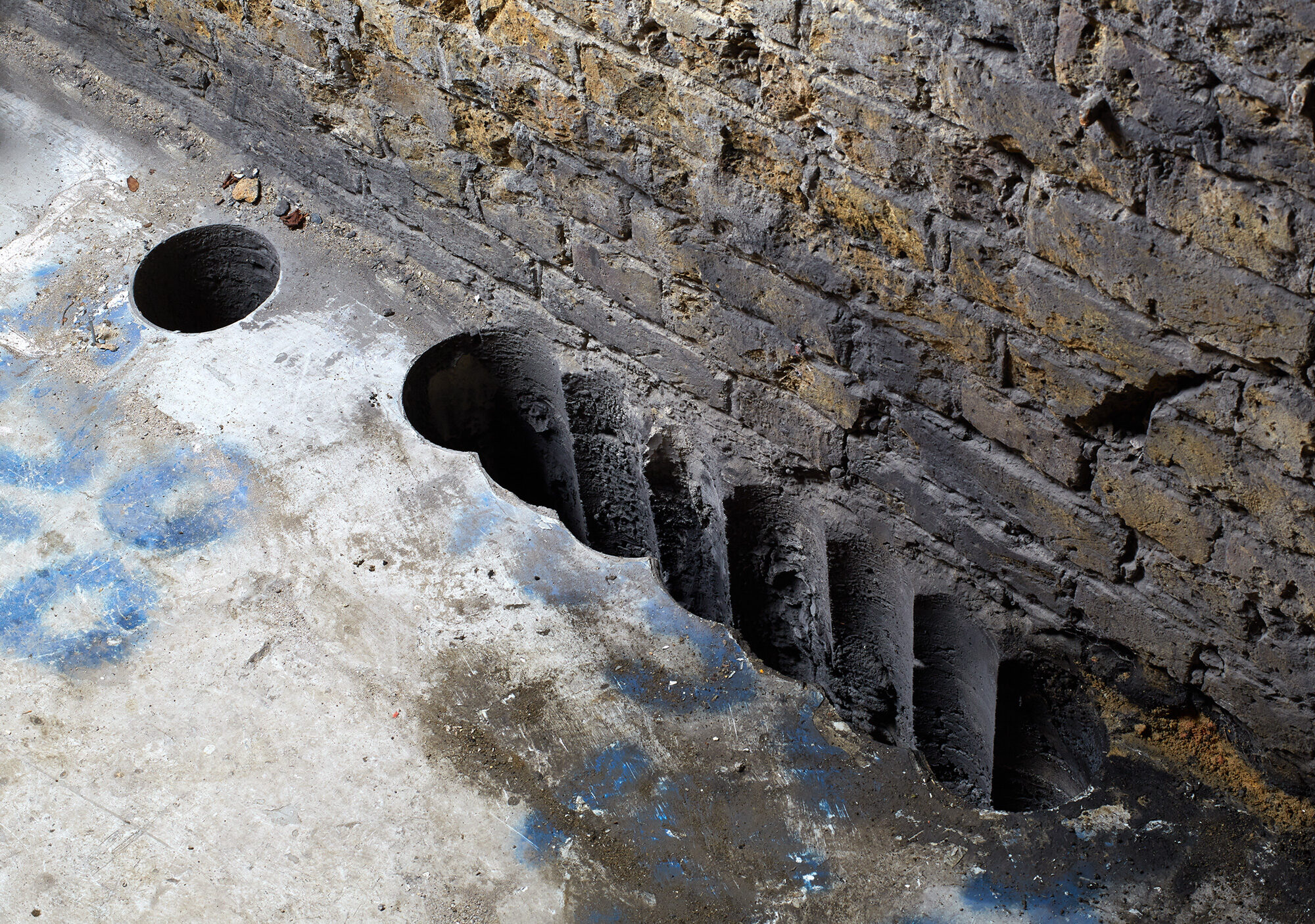
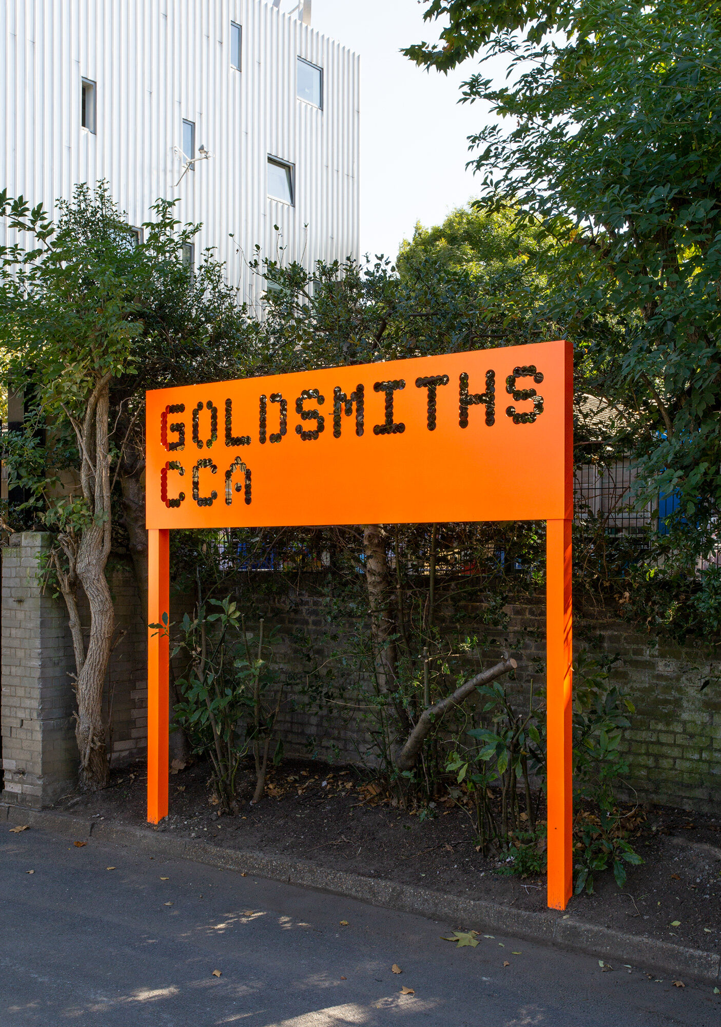
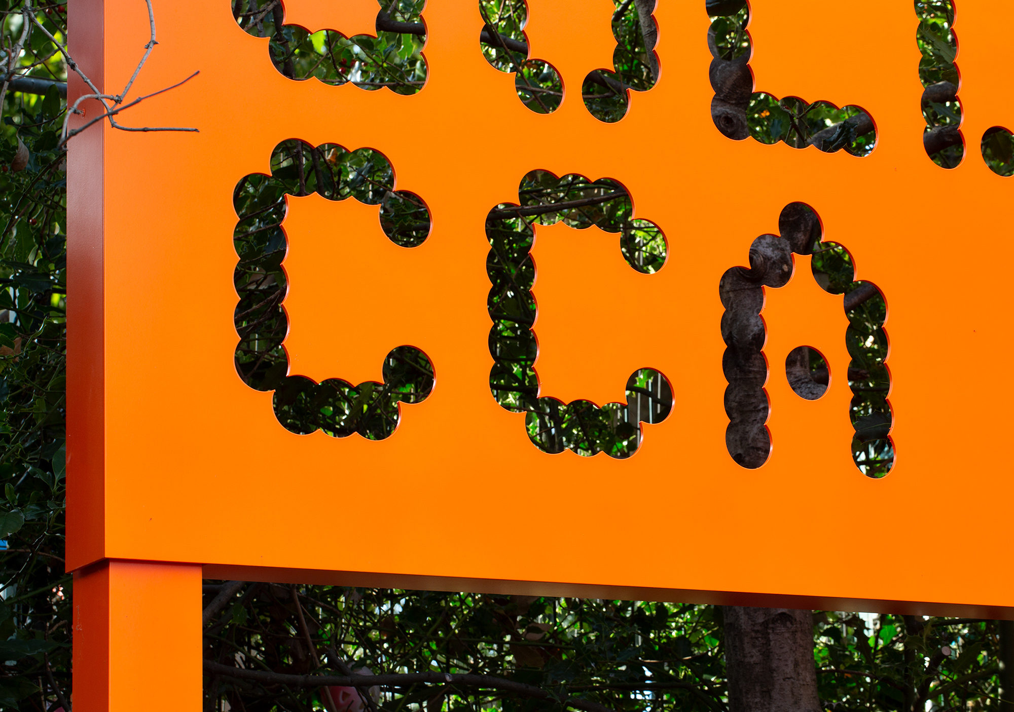
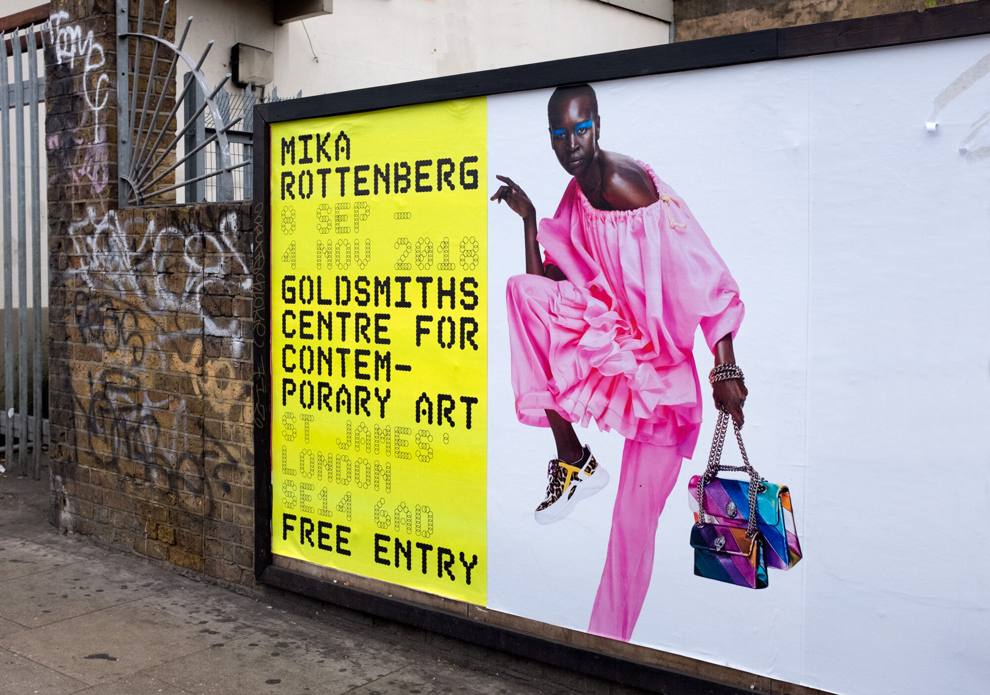
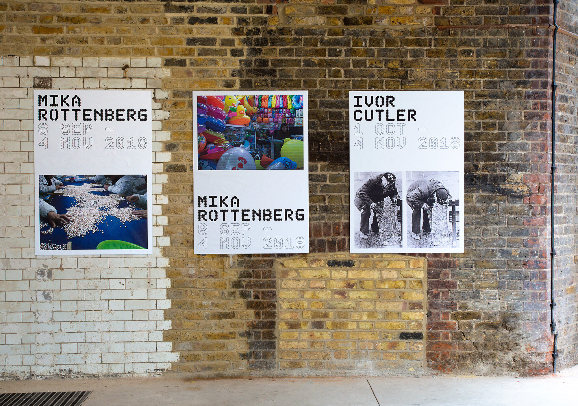
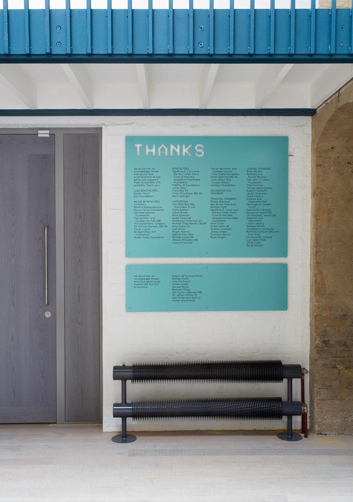
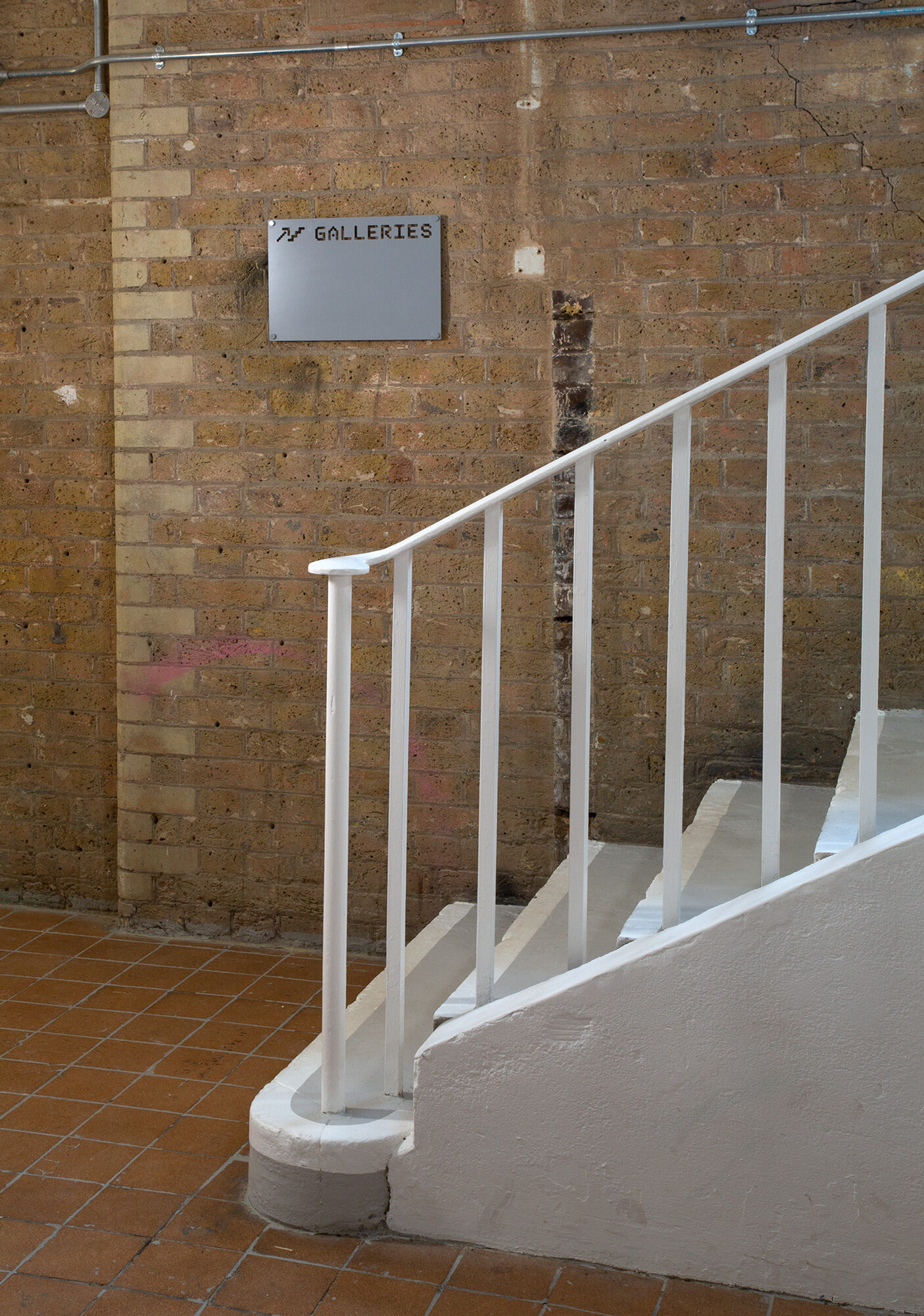
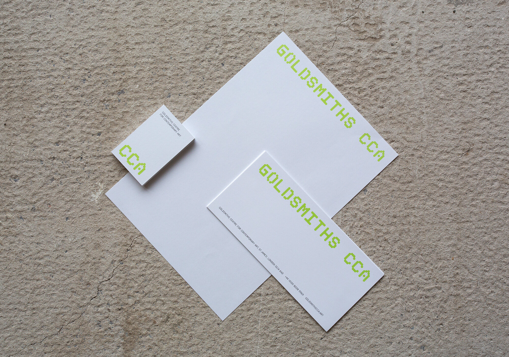
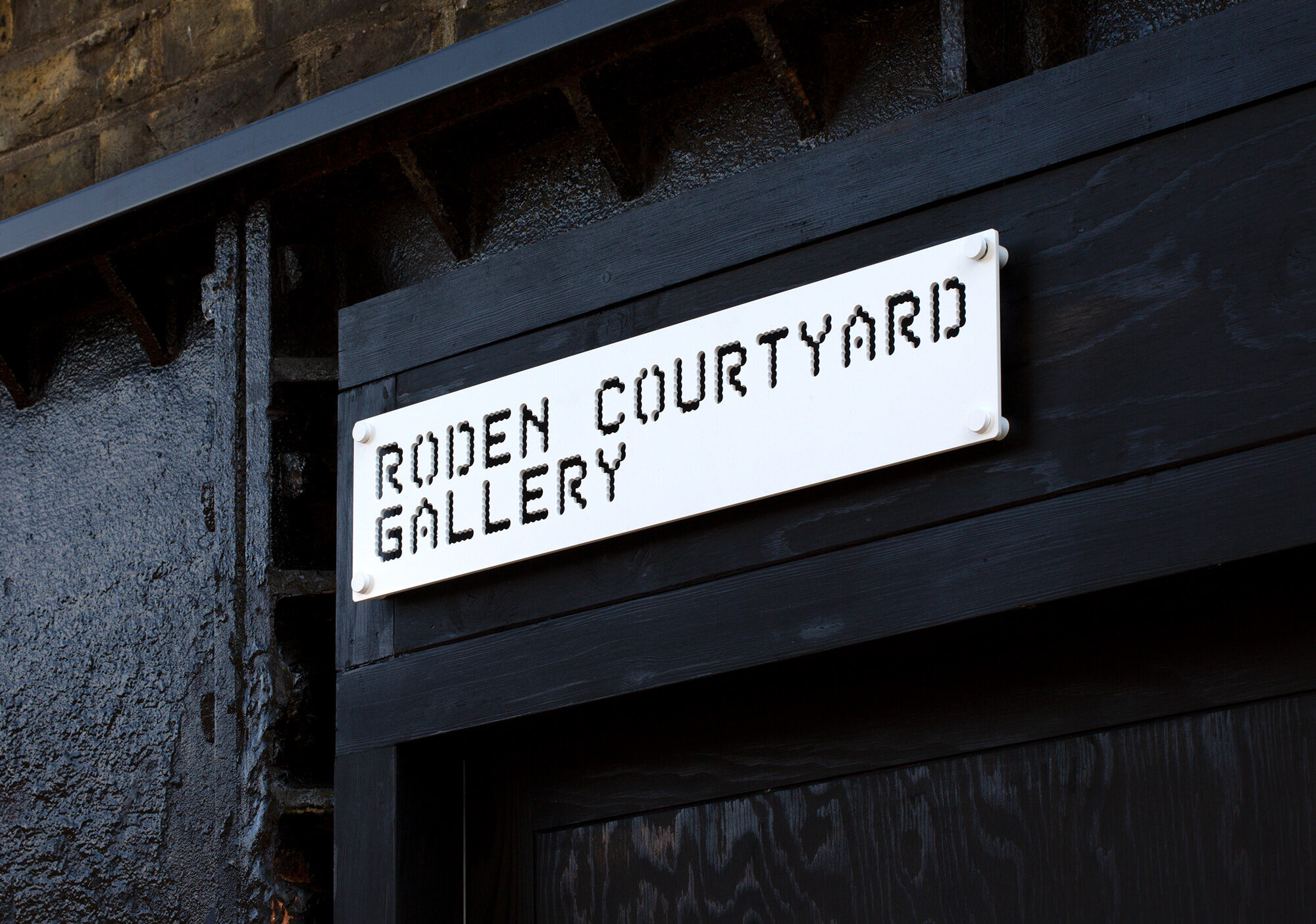
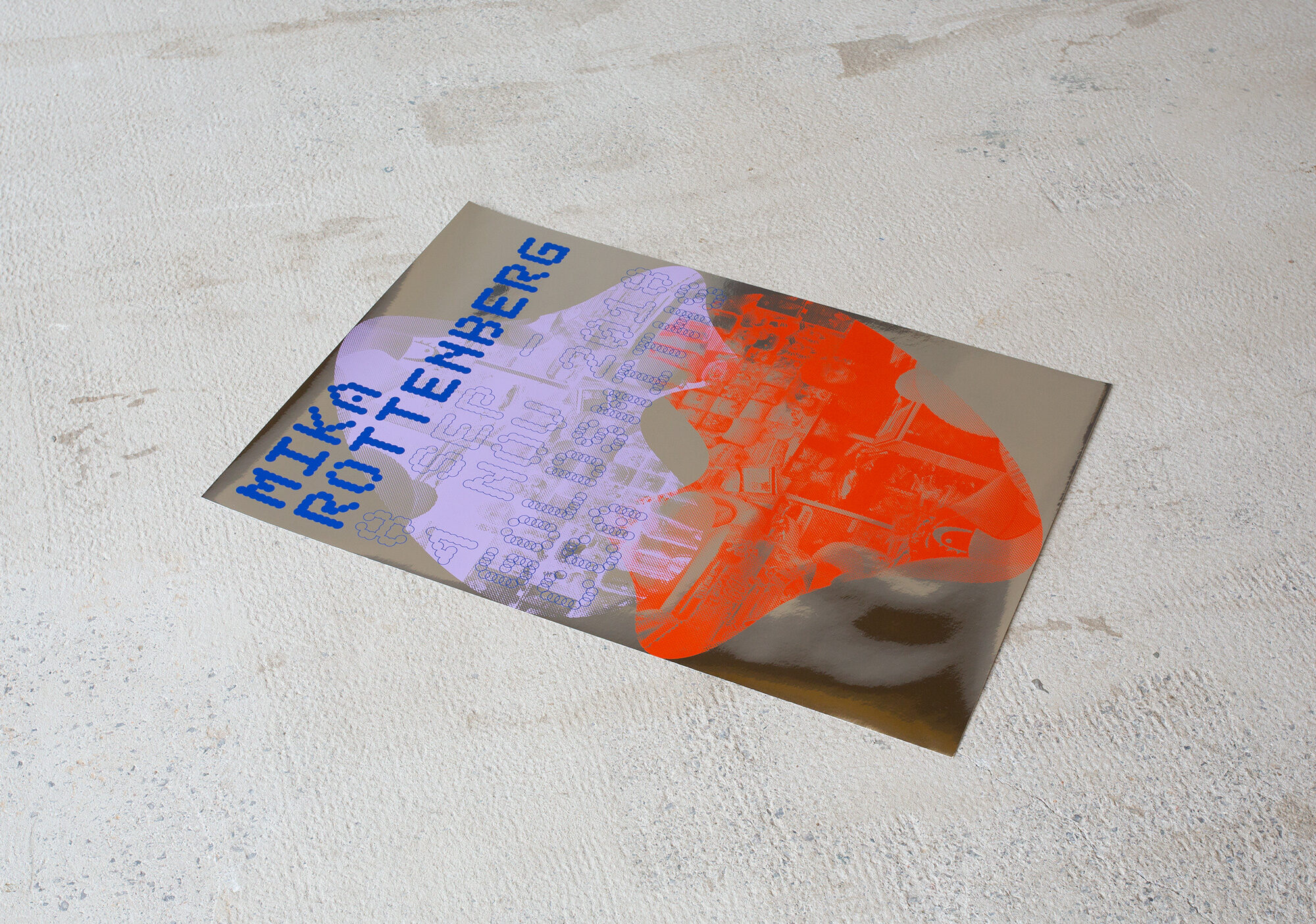
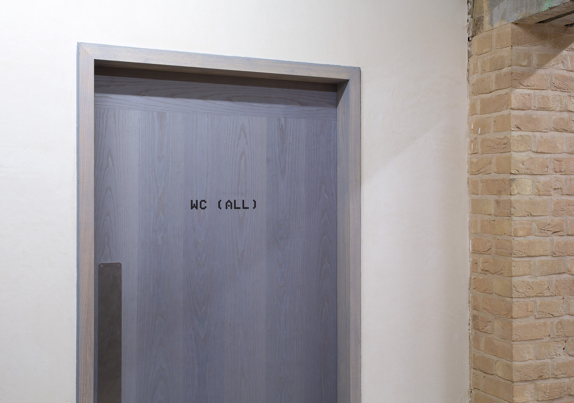
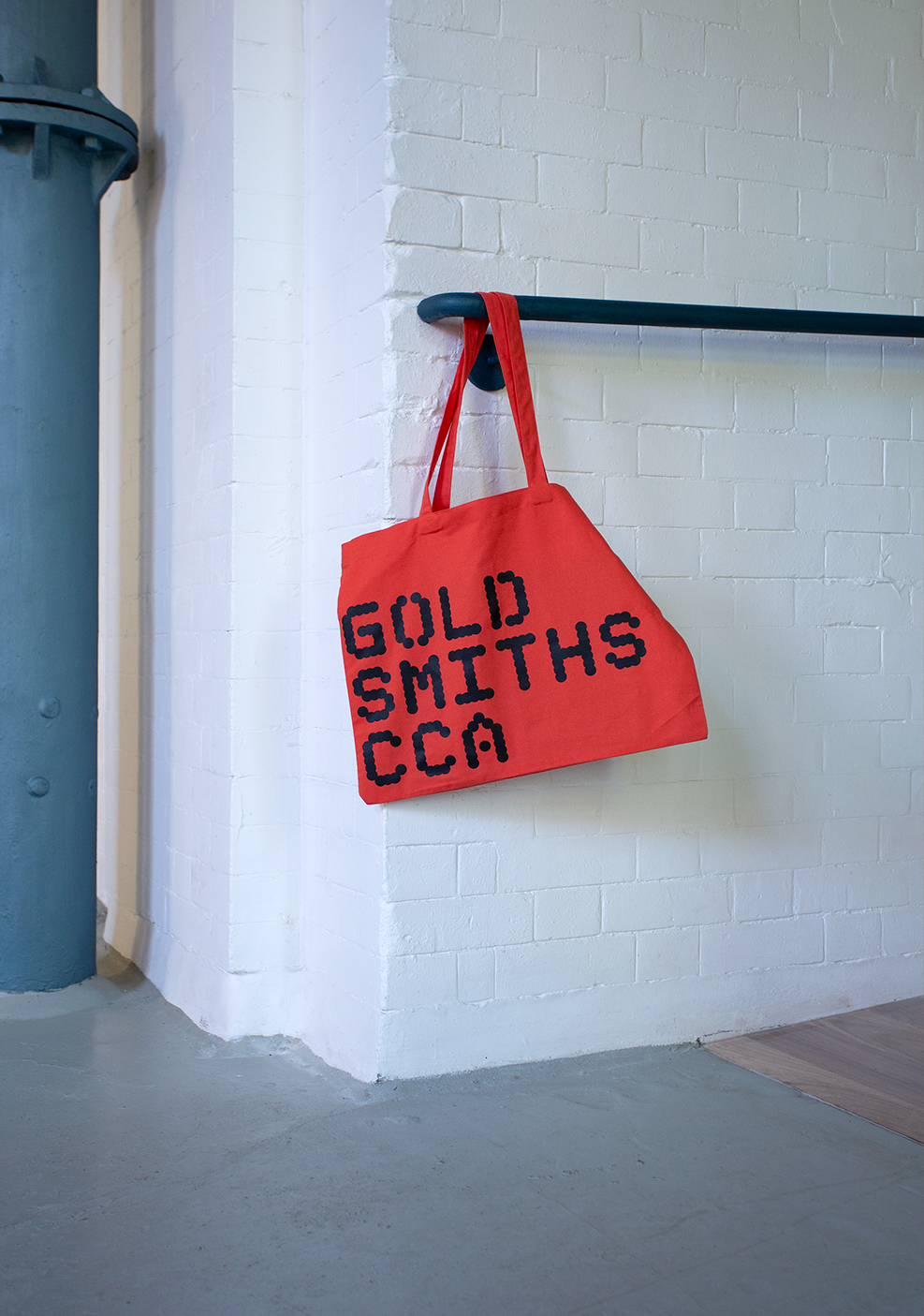
On an early site visit, we discovered haphazard, overlapping holes – some new, some from the 19th century – core-drilled into the concrete floor to lay water pipes and cables. To us, these connected with Assemble’s definition of the building as a series of human interventions made over time: the holes were evidence of the building’s constant evolution. To bring this and the workings of the building to the fore, we formalised the holes into three versions of a typeface. These became the basis of the gallery’s visual identity, which we applied to the gallery’s signage, website and guidelines for marketing and exhibition graphics.
For the visual identity’s subsidiary font, we drew a contrasting and angular typeface, derived from CAD, while the idea of core-drilling holes was carried through to our design for the website – clicking on an image creates a “hole”. Finally, by choosing a series of fluorescent colours for the laser-cut, spray-painted metal exterior signage (the interior signage matches the more muted palette of the architecture), we sought to establish CCA’s visual identity as just another layer of human intervention in the long life of the building.
