1/9
Text
Frieze Foundation identity and campaigns
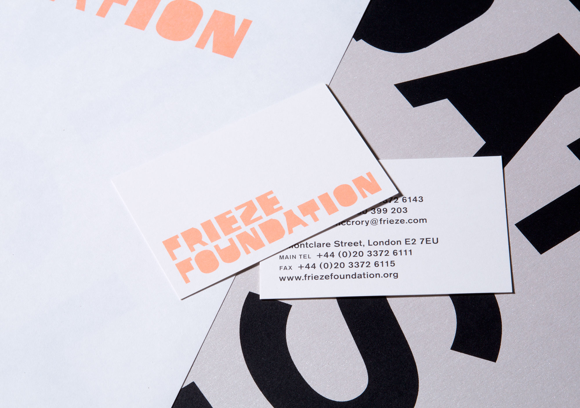
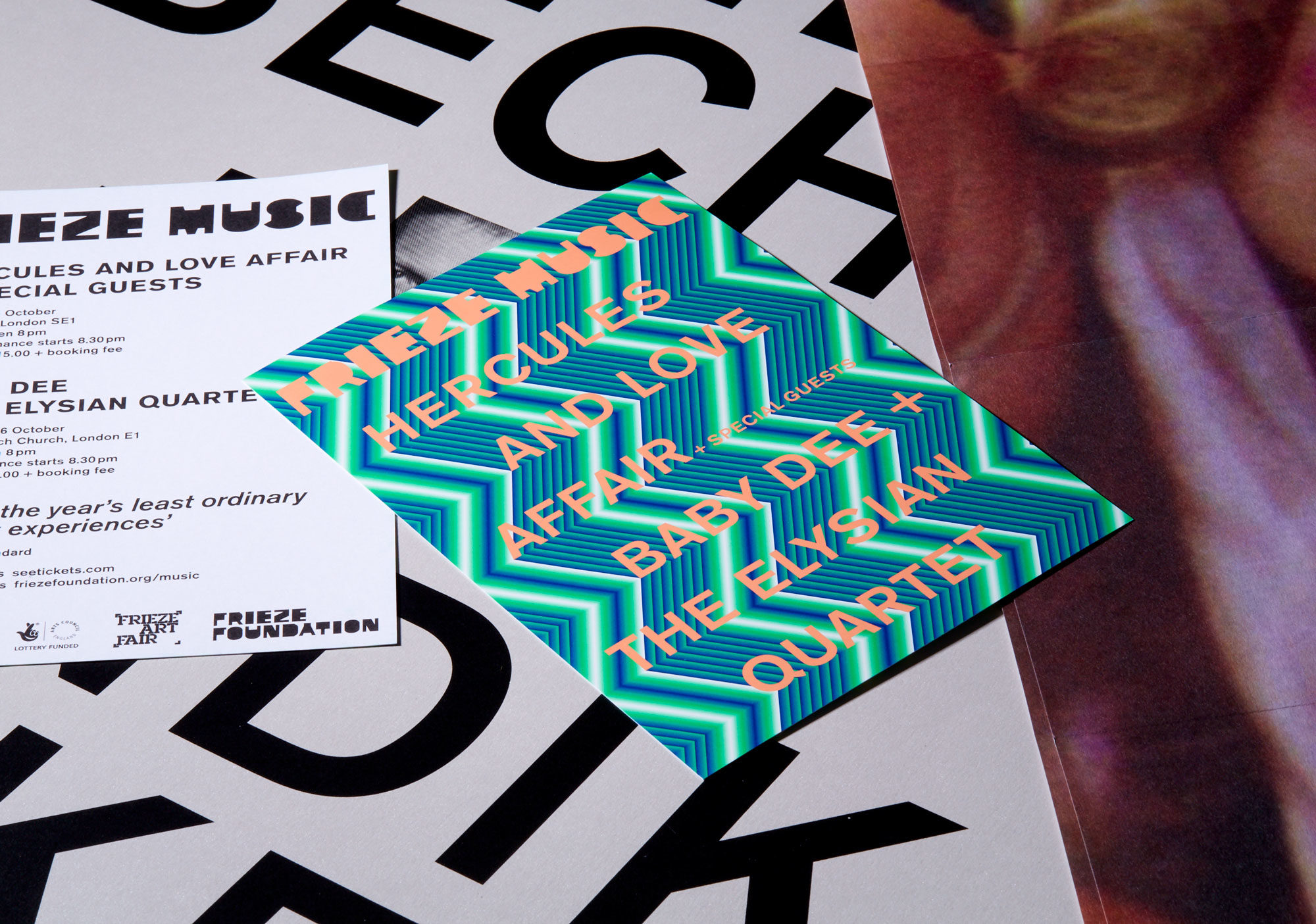
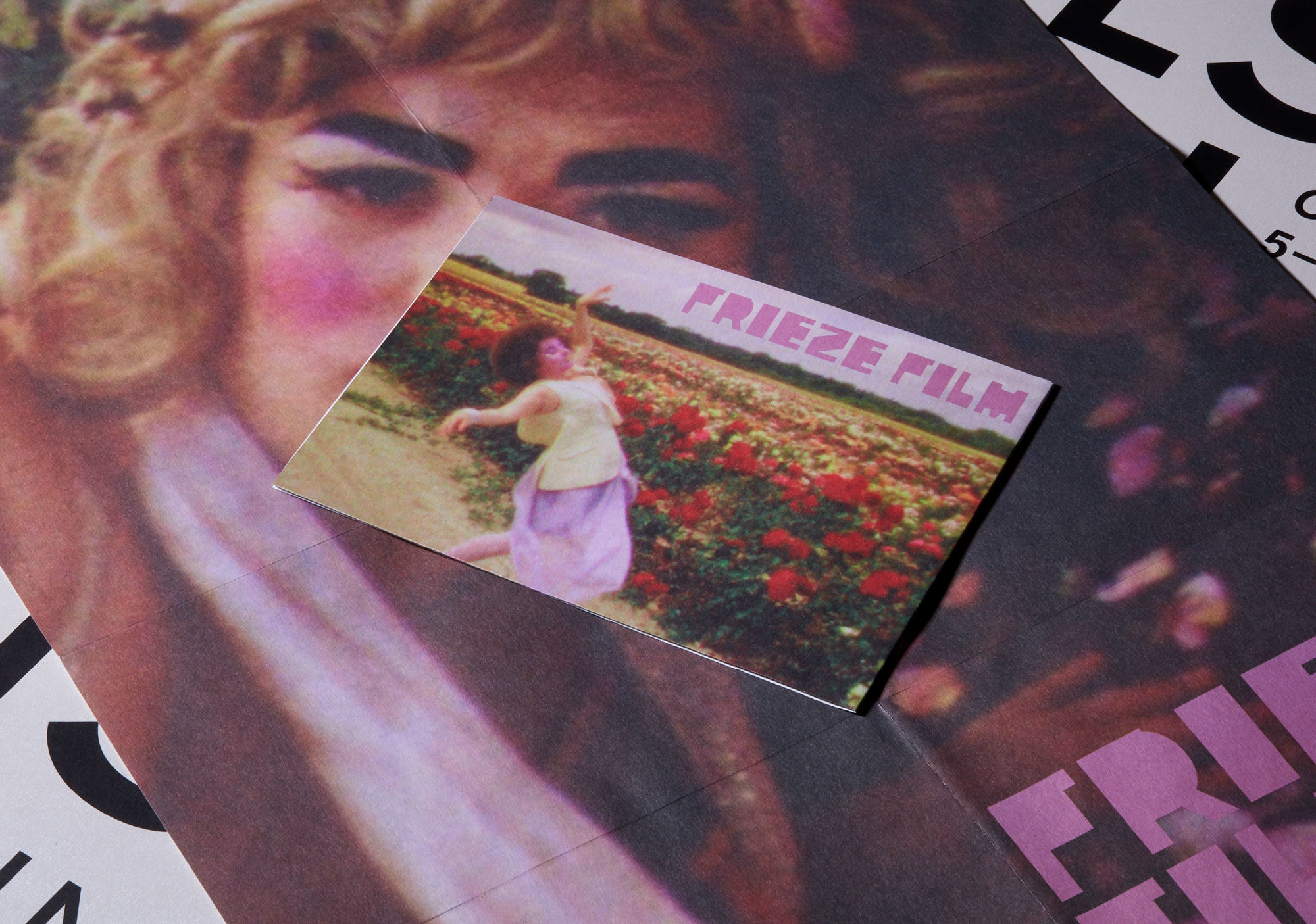
Frieze Foundation is a non-profit organisation responsible for the curated programme at Frieze Art Fair, comprising artist commissions (Frieze Projects), talks (Frieze Talks), films (Frieze Film), music (Frieze Music) and education (Frieze Education).
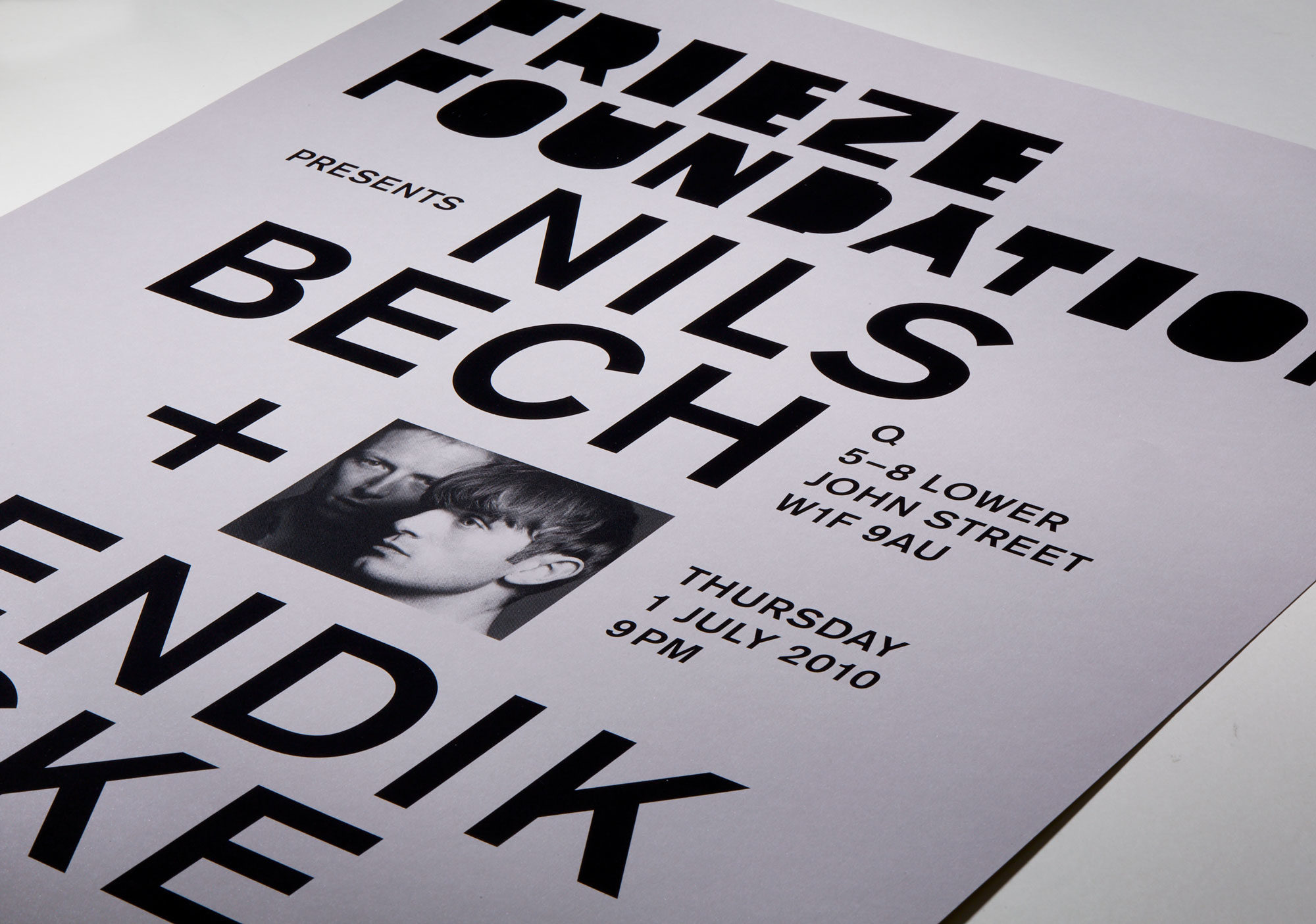
Kellenberger–White were commissioned to create an identity responding to the Foundation’s expanding off-site programme, which was led by their newly appointed curator Sarah McCrory. The identity is typographic and made for both print and digital environments. The design concept for the letterforms was inspired by art historian and critic Thomas Crow’s idea of “art pushing against the architecture that houses it” (‘Contemporary Art Versus Its Envelope: Competition and Co-Evolution’, Frieze Talks 2005, Saturday 22 October).
The starting point of the design was an image of blocks that could represent any flat architectural space, or even a plan of the gallery booths at Frieze Art Fair. Frieze Foundation is everything that goes on beyond and between these blocks, and pushes against them; this idea was visually translated into a bold letter pushing against its surrounding blocks.
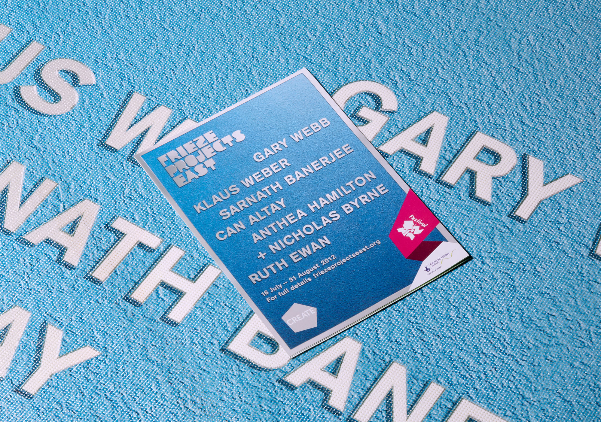
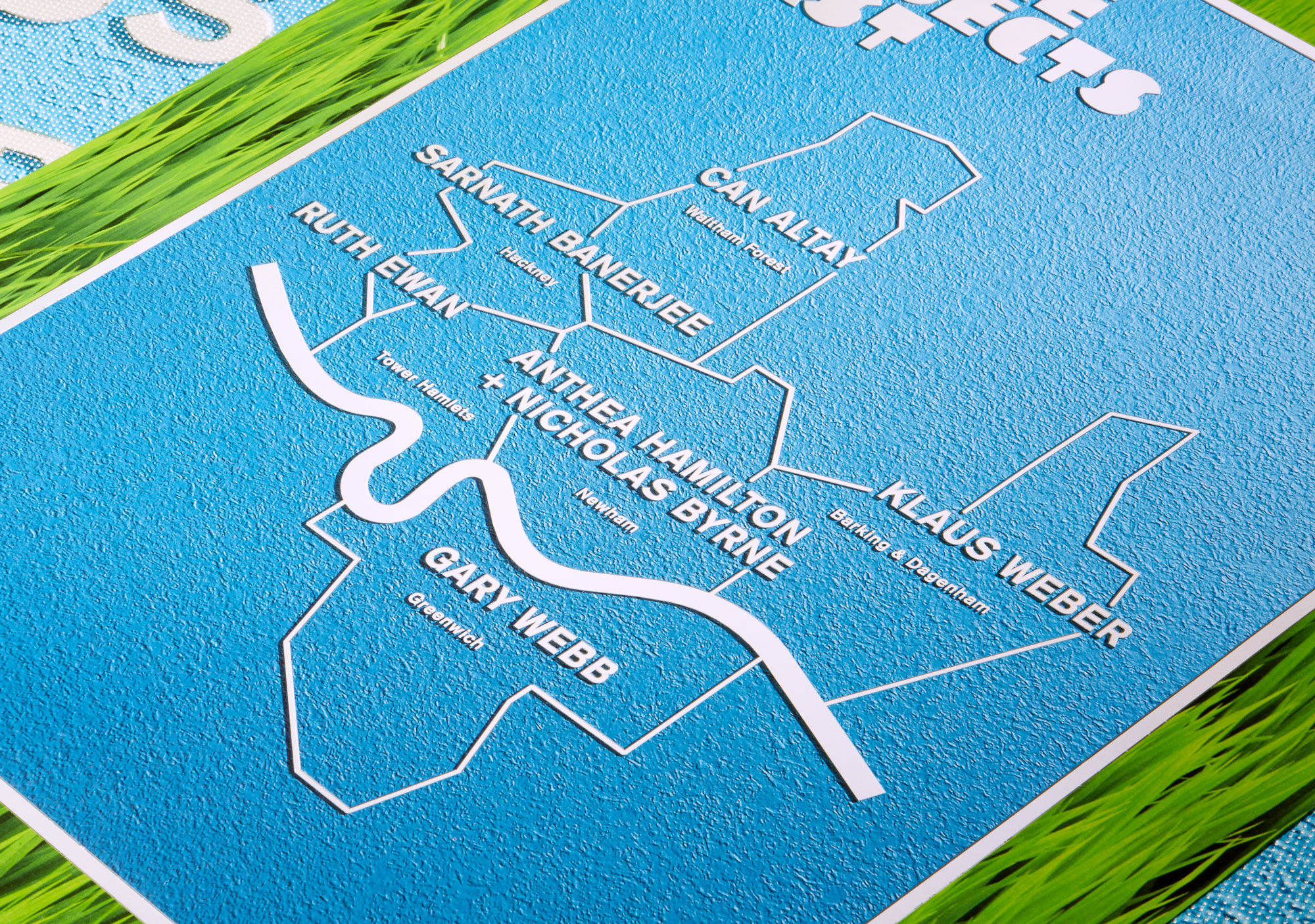
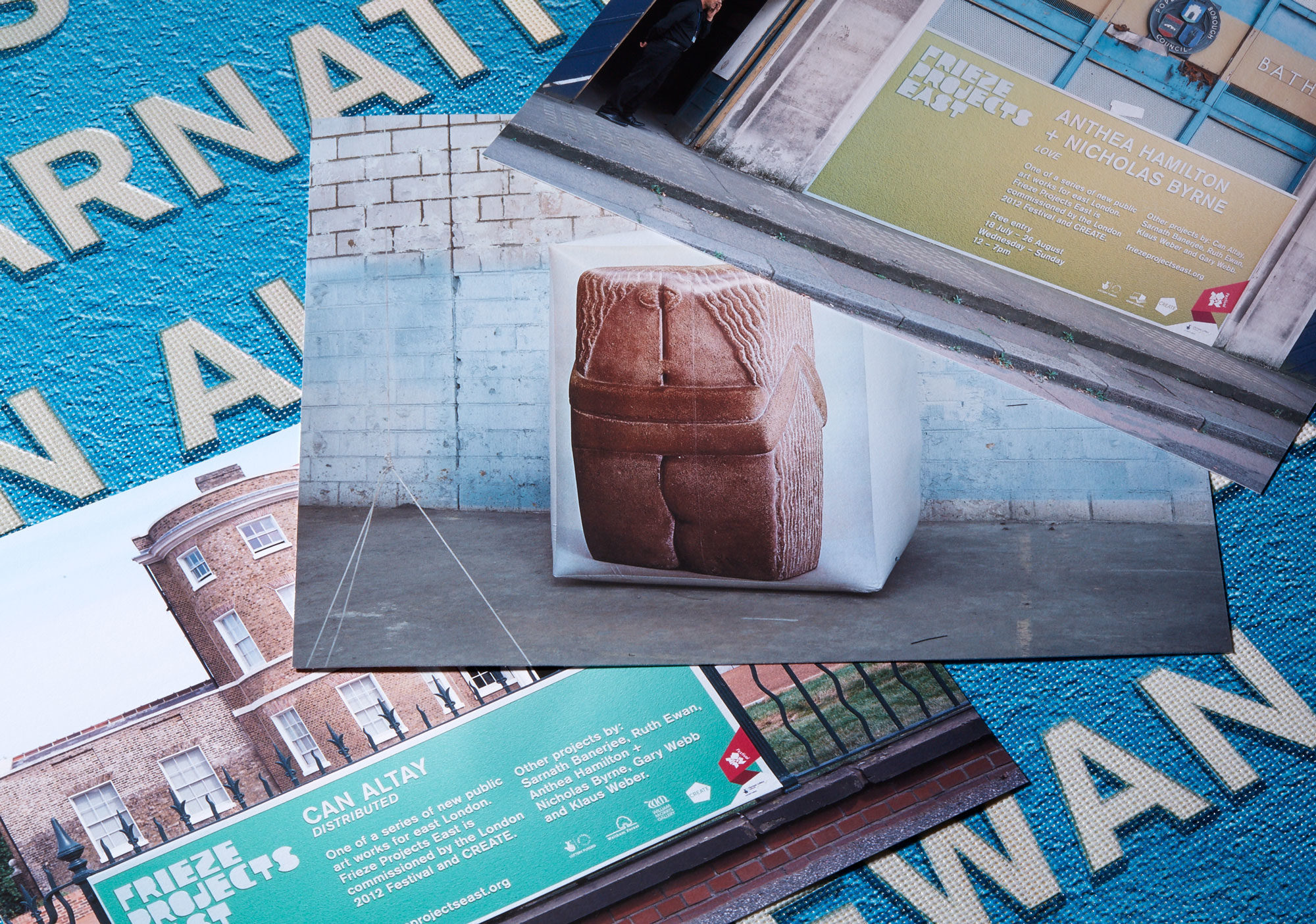
This concept was subsequently extended for campaigns in 2011 for Frieze Film and in 2012 for Frieze Projects East and Frieze Projects New York.
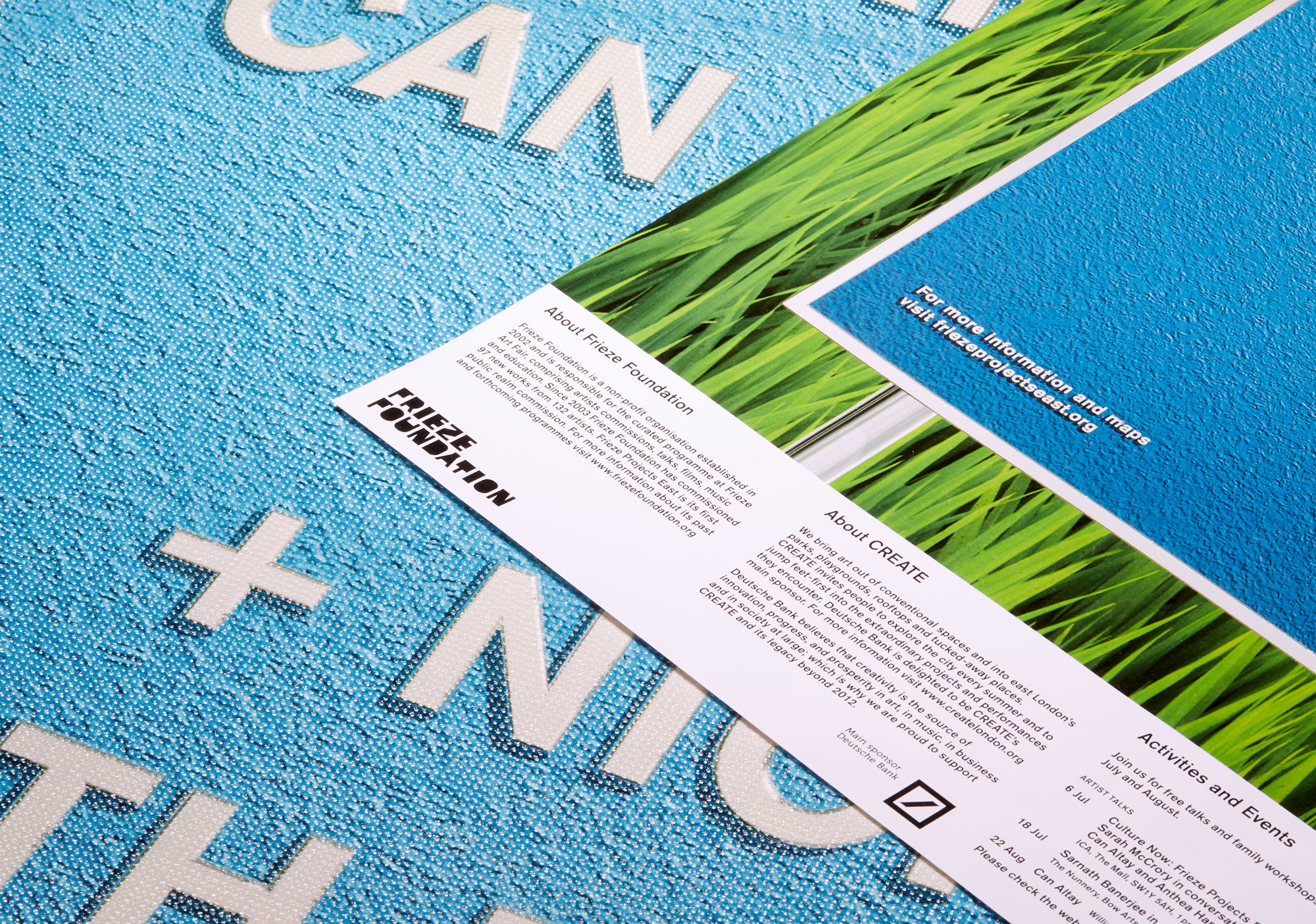
Frieze Projects East was a series of new public art projects commissioned by the London 2012 Festival and Create. Kellenberger–White designed the online and print marketing campaign.
The campaign identity embraced the look of a “cultural trail” mapping the newly commissioned public art projects hosted throughout the Olympic boroughs. The artistic projects were spectacular in scale and embraced public participation – and together with the graphic campaign, the visibility of these projects changed the day-to-day look and feel of parks, derelict buildings and streets.
Kellenberger–White studied the typography and materials characteristic of traditional signage on outdoor nature trails and devised an identity that imitated the appearance of these in a digital language.
The Frieze Foundation’s blocky letterforms were used to spell out “Frieze Projects East” on a CGI illustration of an embossed brass plaque. Variations on the campaign image included playful CGI landscape elements, such as a grass lawn, to reference the outdoor locations of many of the projects.