1/7
Text
‘Design Interactions 2009’
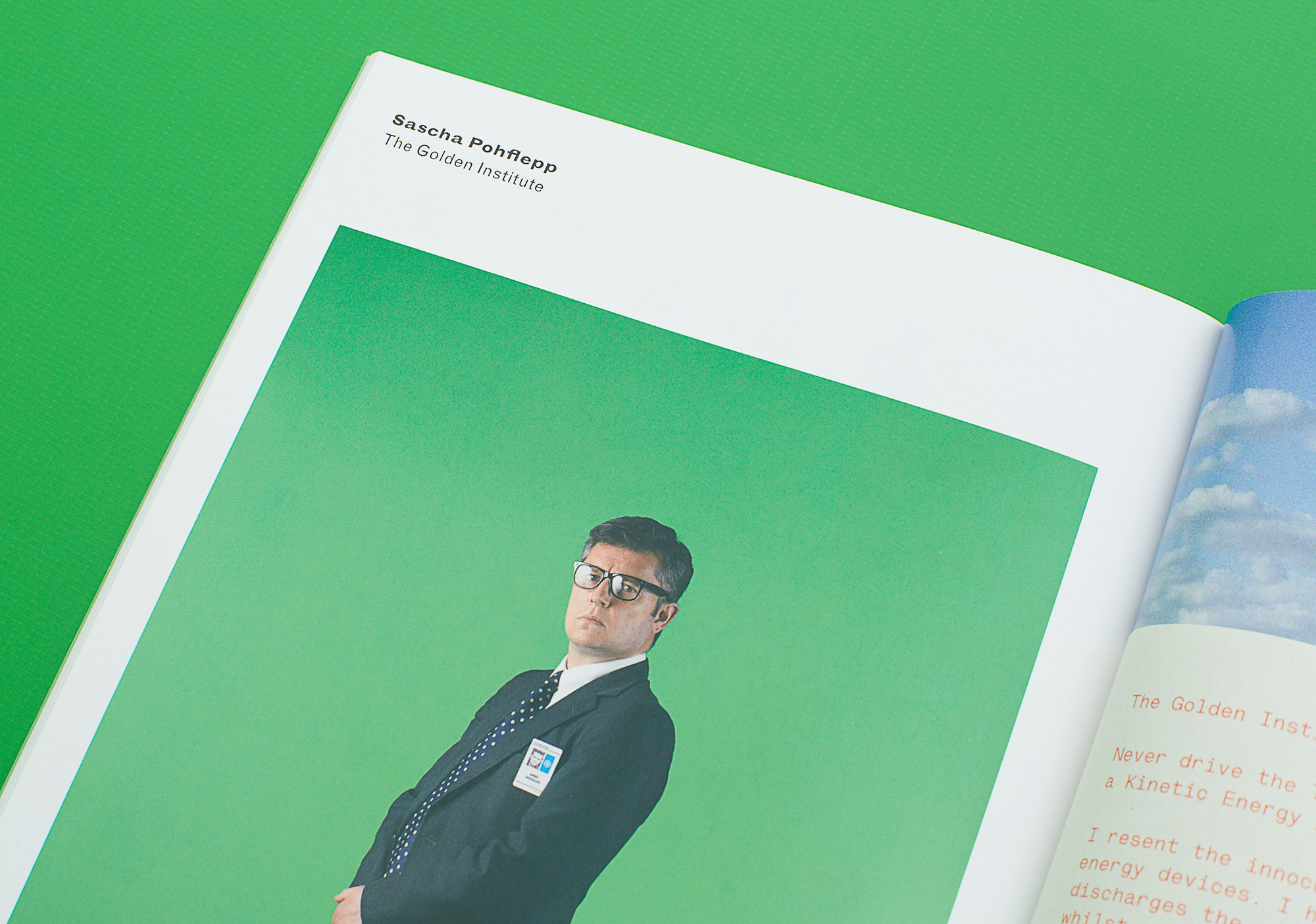
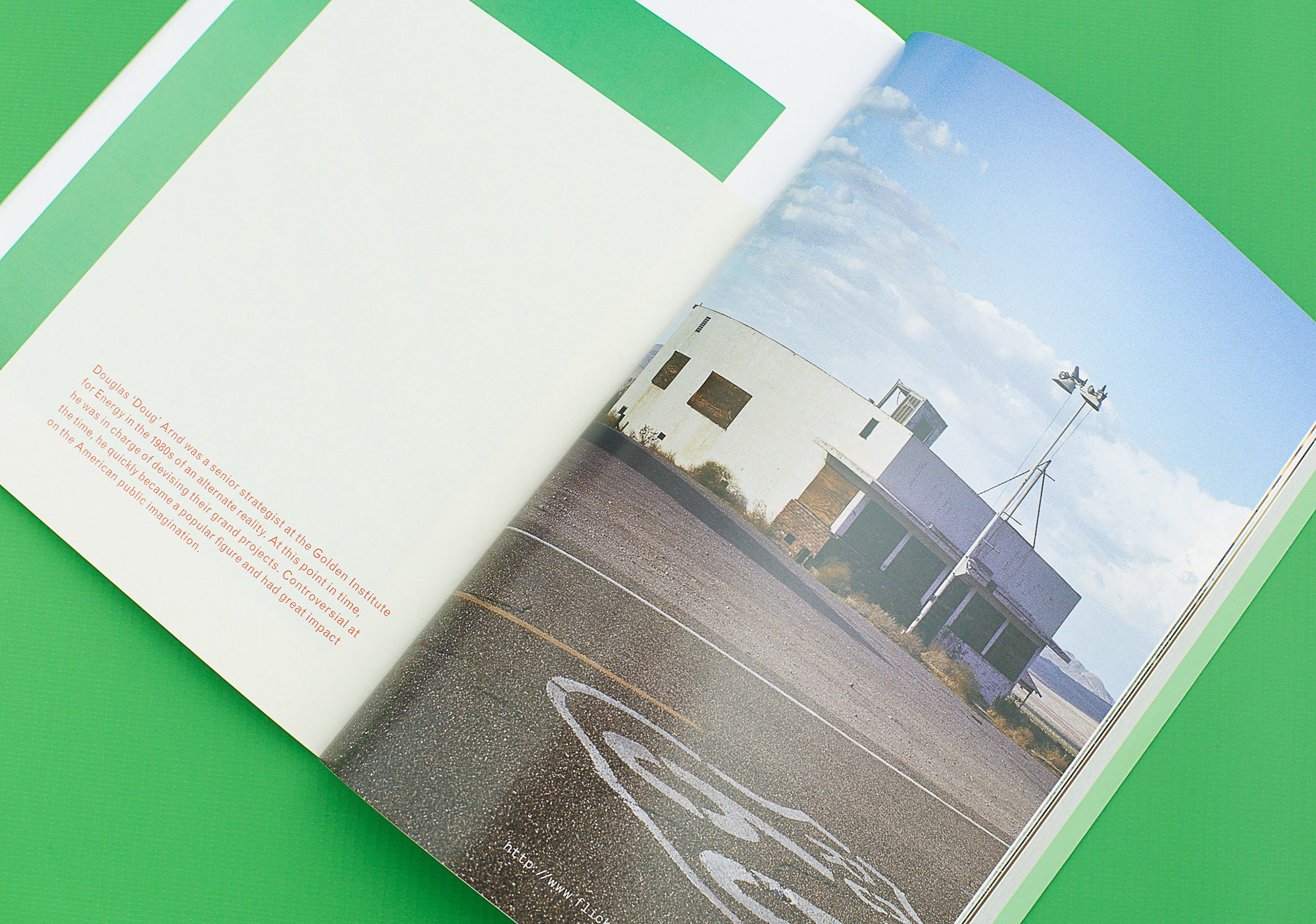
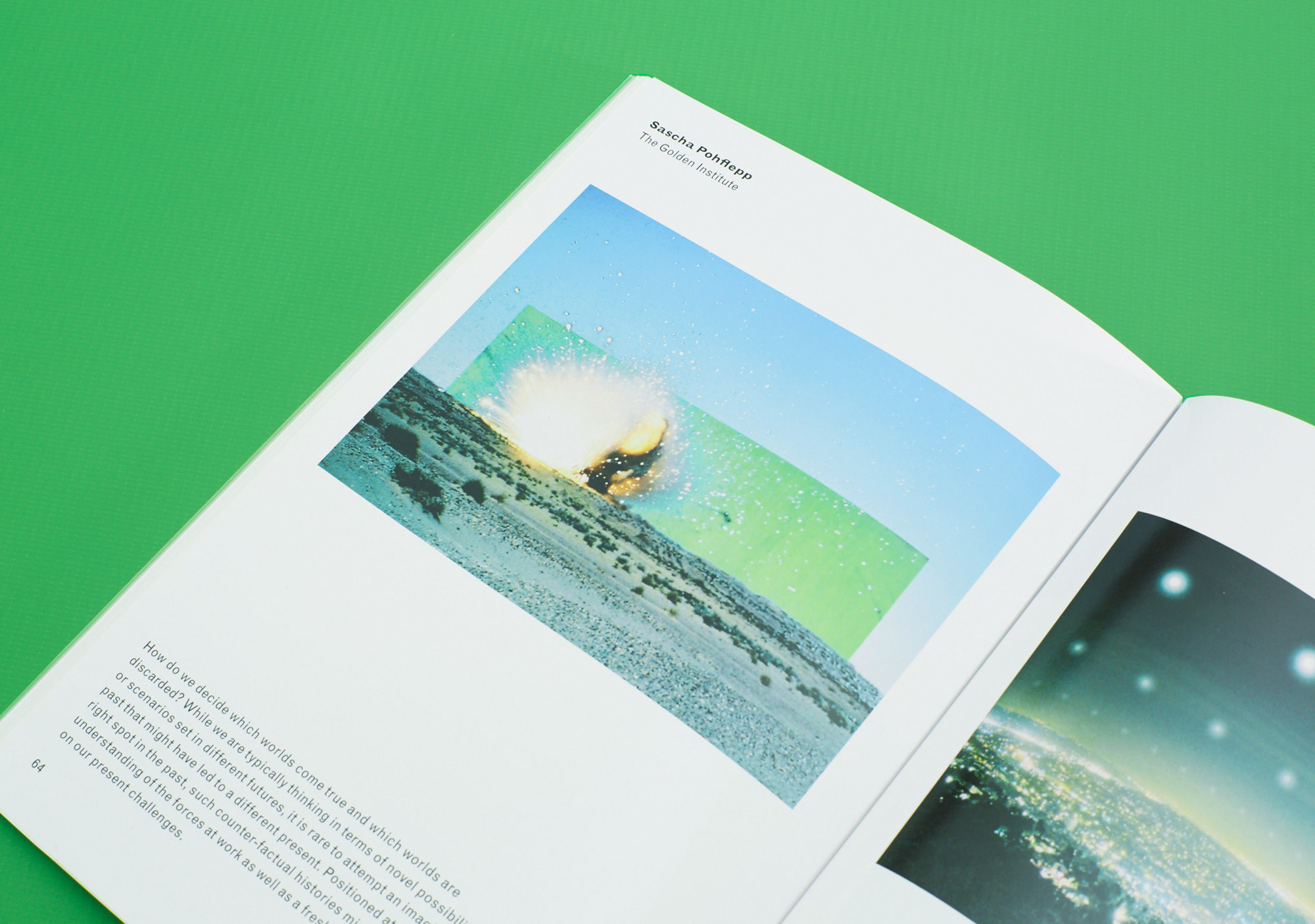
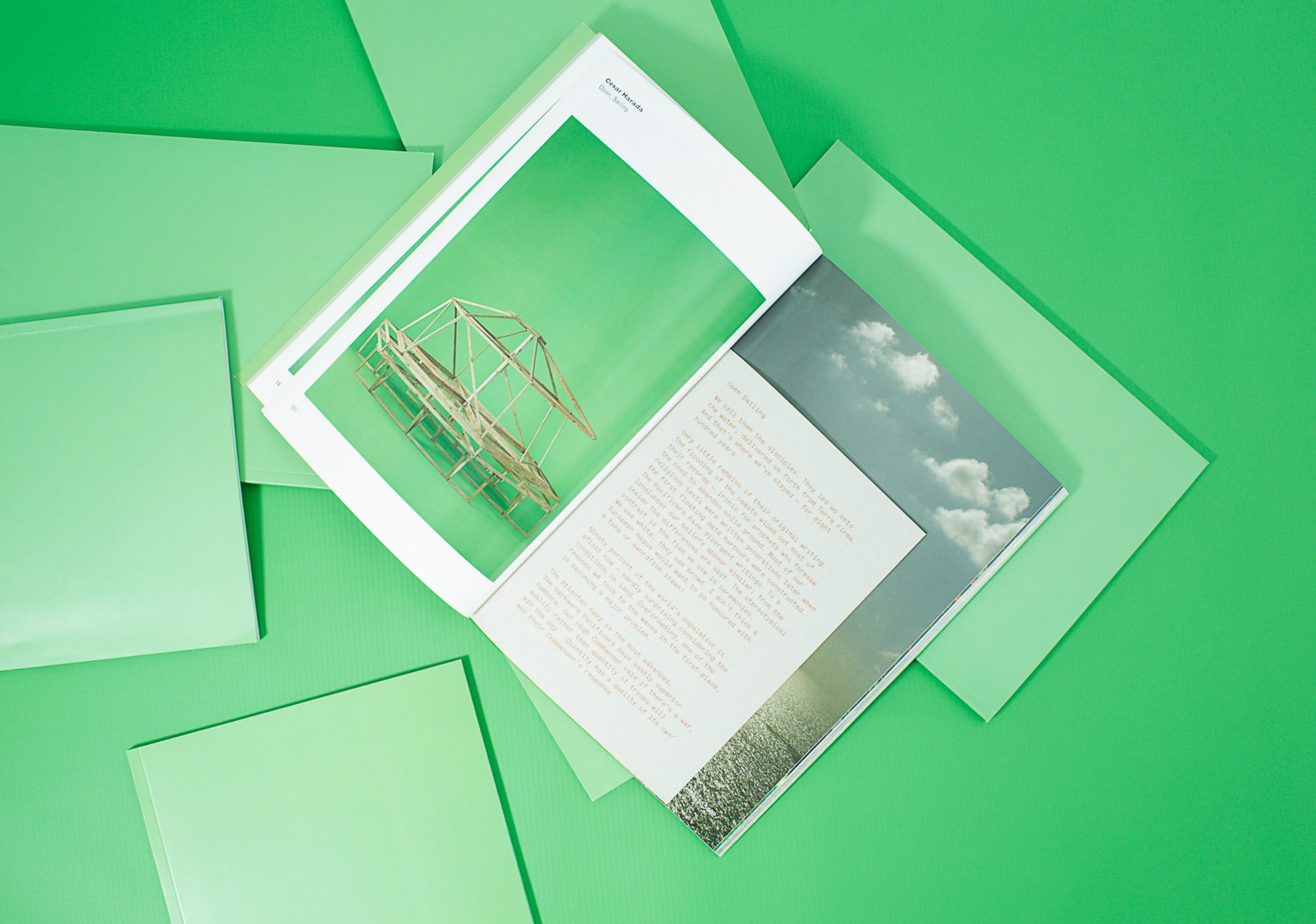
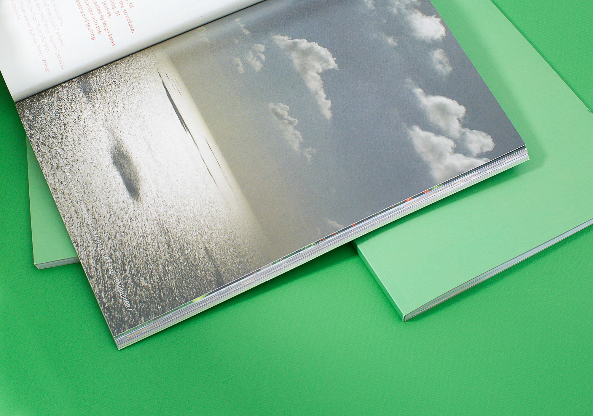
The book’s design centred around a three-part spread that invited the reader to imagine a scenario for each prototype object. Working with the theme of exposing the process of image-making, Kellenberger–White picked up on the idea of the green screen used in film and television post-production to project an isolated object into any possible environment. The students’ prototype objects were photographed against a chroma key green backdrop. Writer Alex Burrett was commissioned to write short stories exploring hypothetical encounters with the objects; the stories were illustrated by found images from the internet, which served as location shots for the objects.
Drawing inspiration from comparable 1960s publications exploring technology and society, a widely used modernist sans serif, Monotype Grotesque, was chosen for the main text throughout the book – in one size and a variety of weights. The typewriter font Lettera set the tone for Burrett’s futuristic fiction, thereby evoking the image of a writer at their desk.