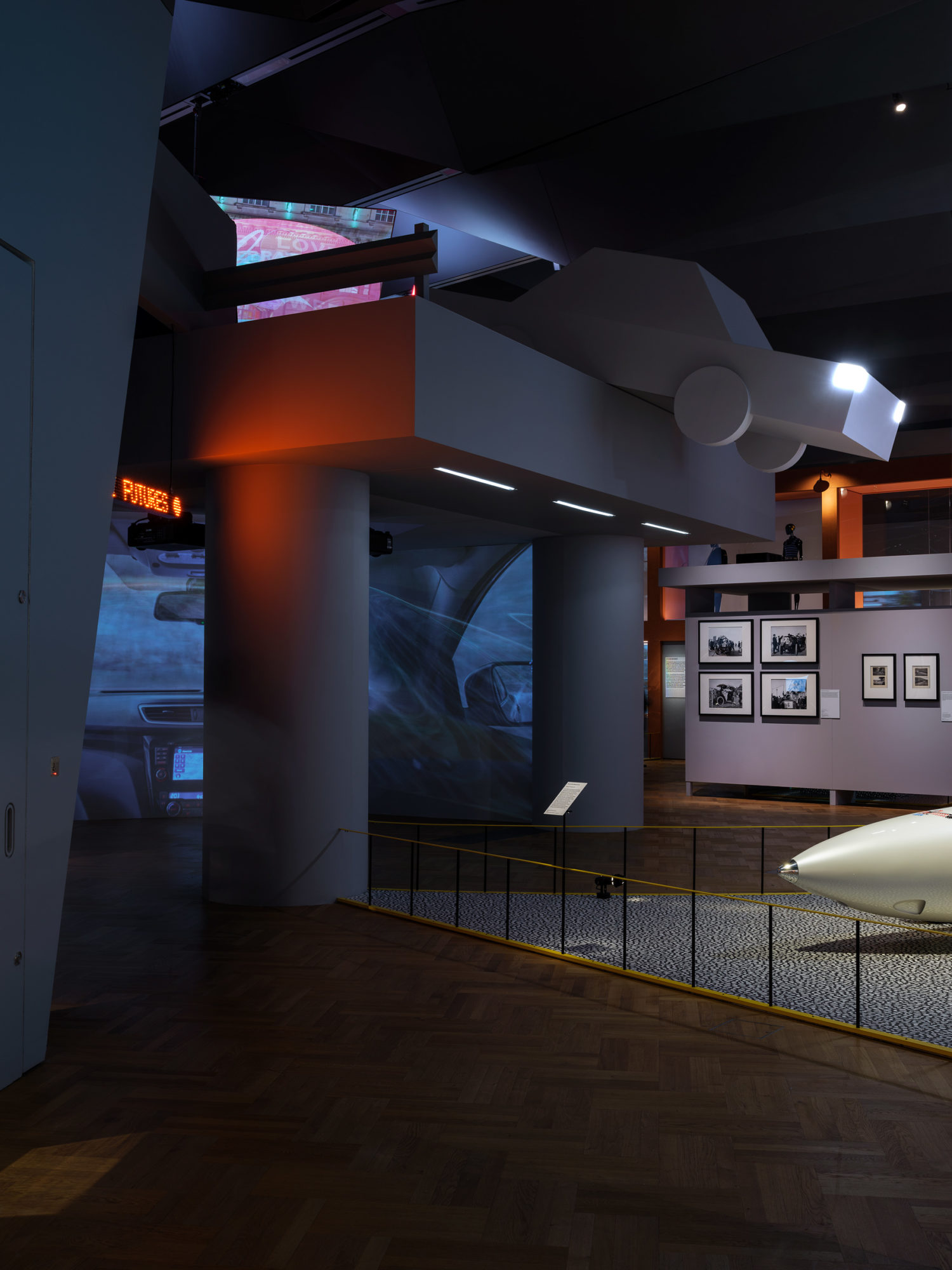
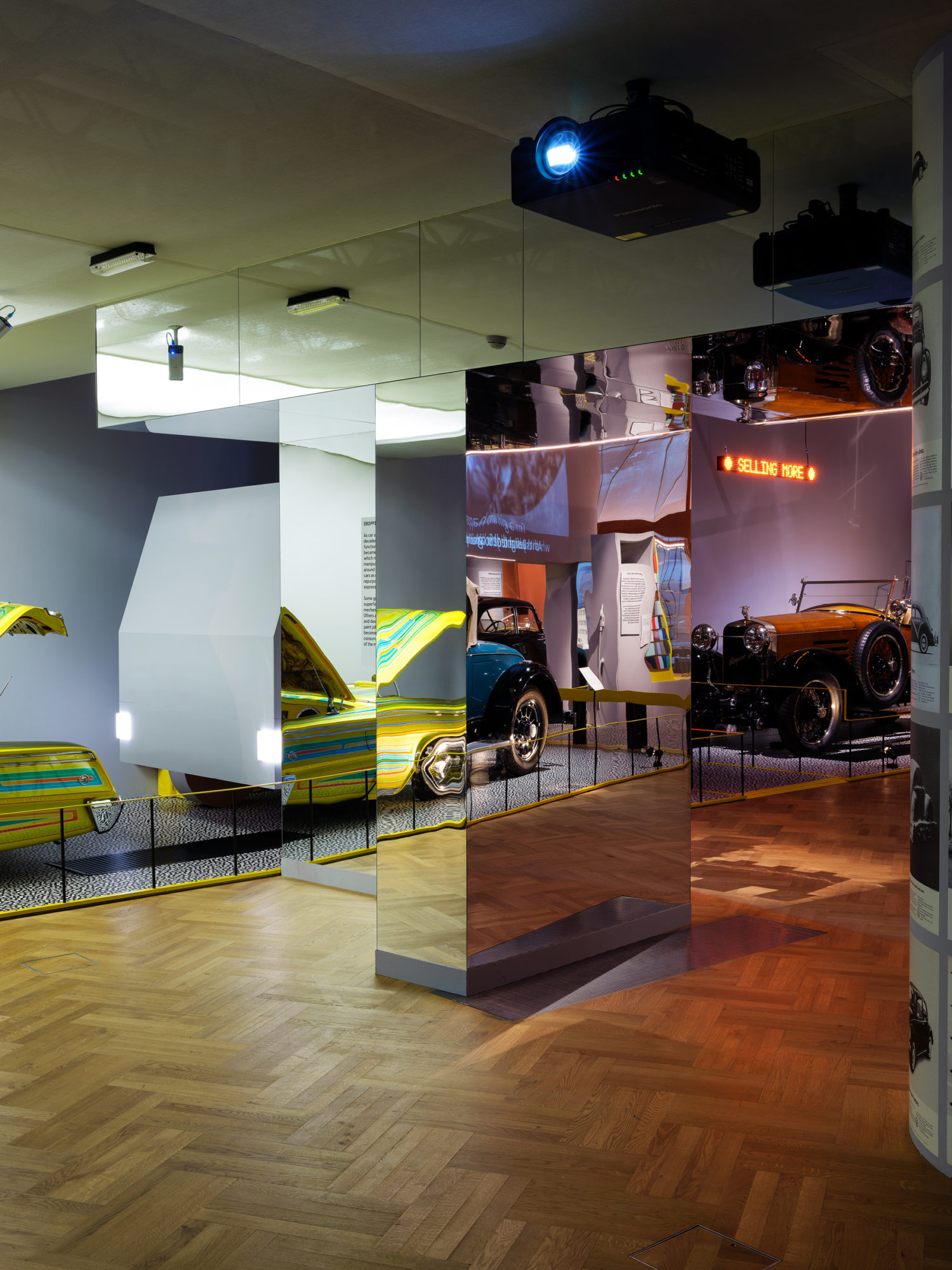
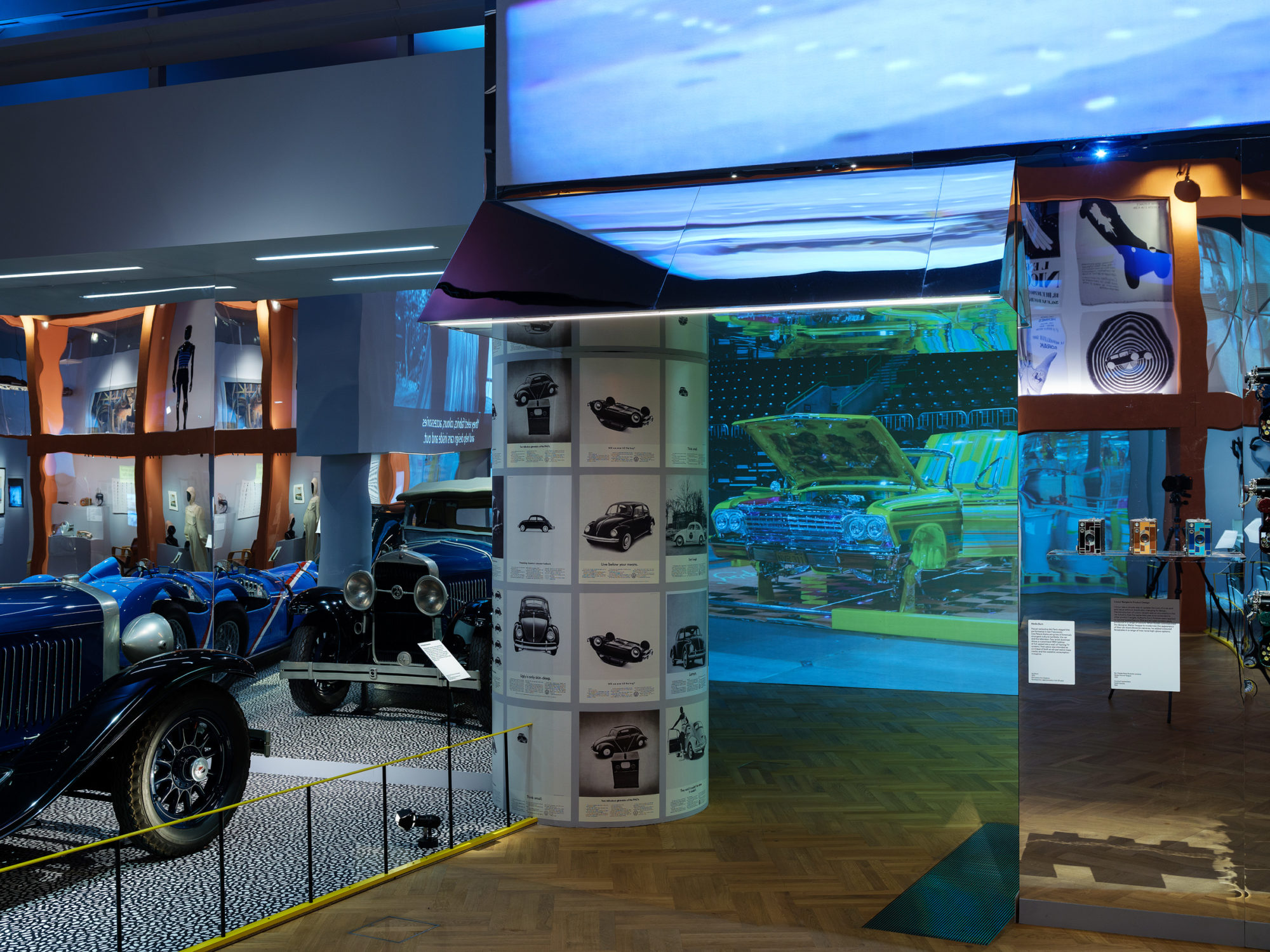
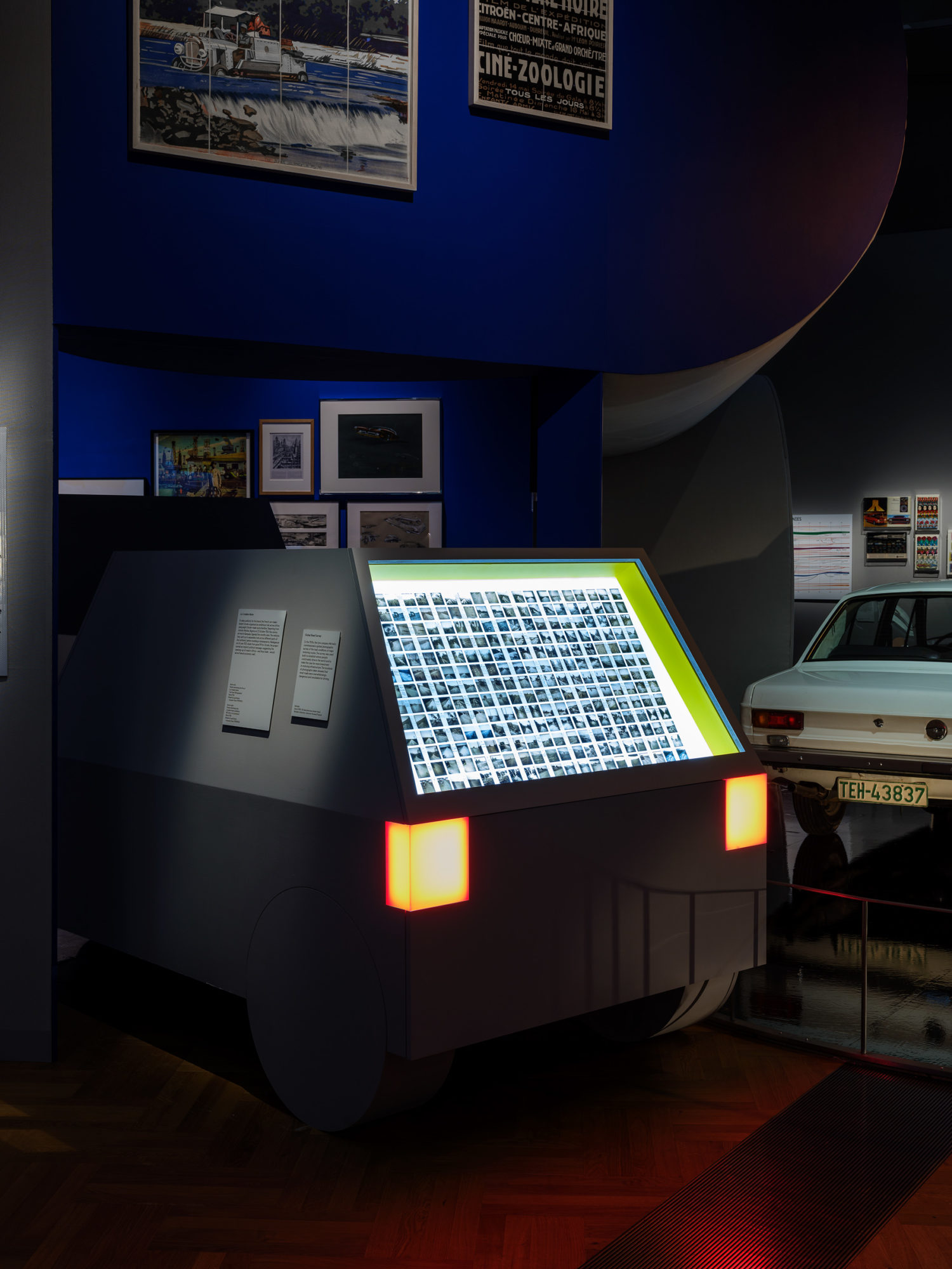
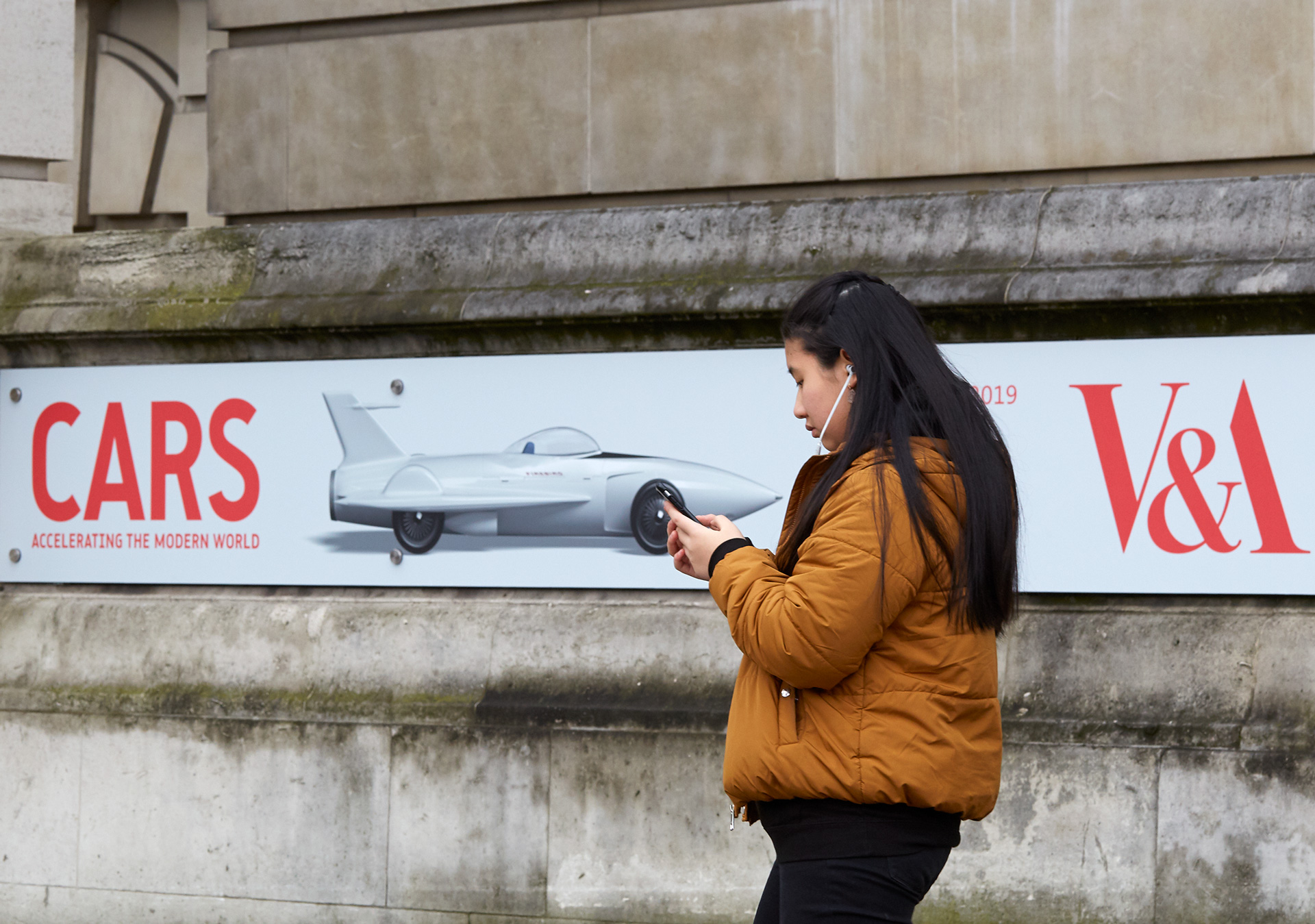
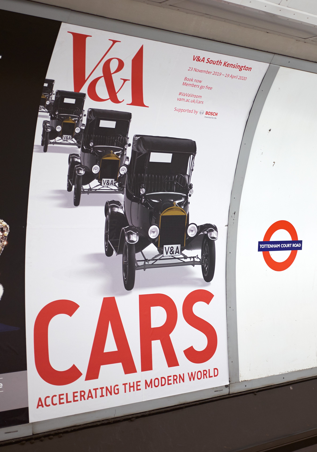
The V&A’s 2020 exhibition ‘Cars: Accelerating the Modern World’ explored how, in its brief 130-year history, the design of one object has transformed manufacturing, how we move, cities, environments and economies.
The exhibition design by OMMX replaced conventional plinths and captions with a playful large-scale motorway environment in the spirit of a Jacques Tati movie set. An intricate network of underpasses, oversized petrol bowsers, simplified car forms and giant billboards formed the backdrop of the exhibition.
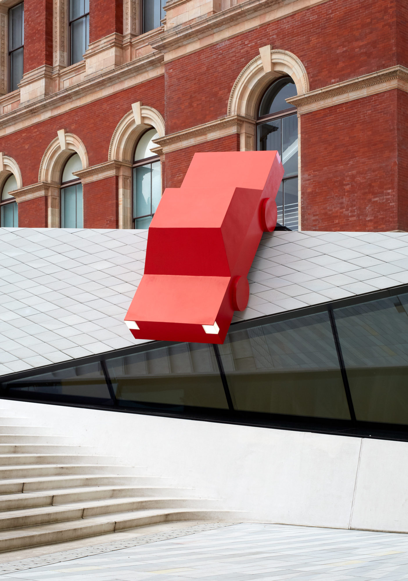
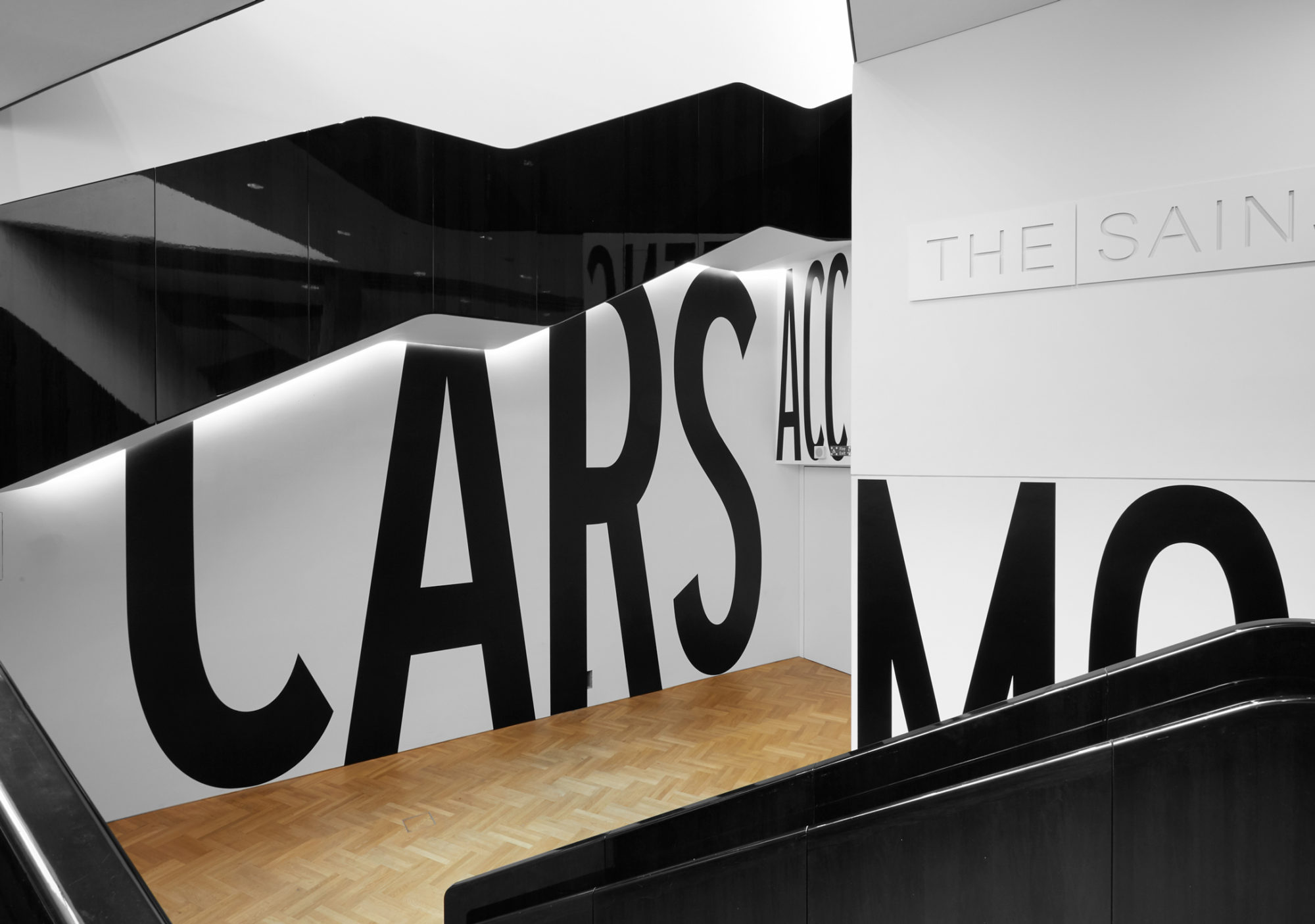
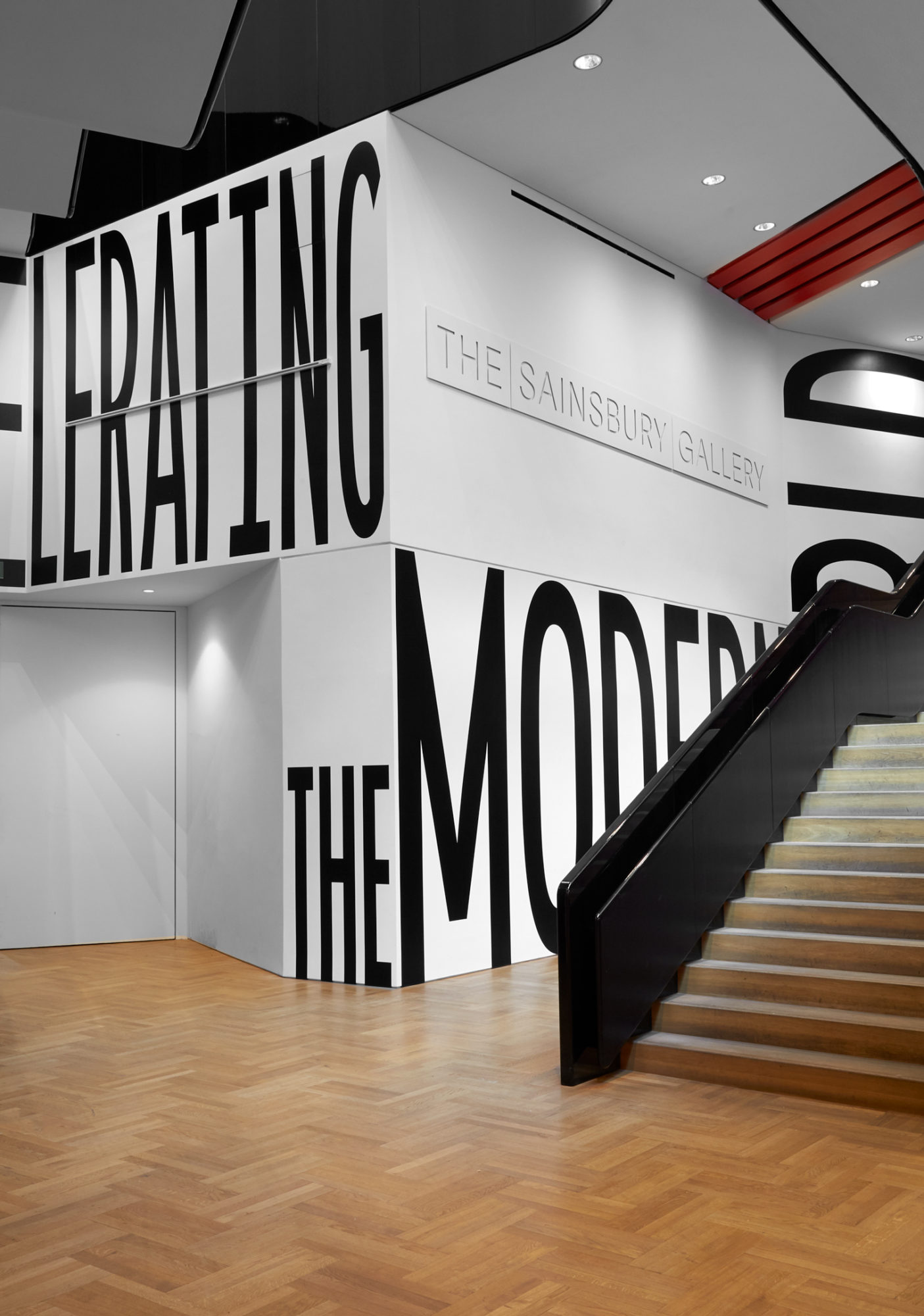
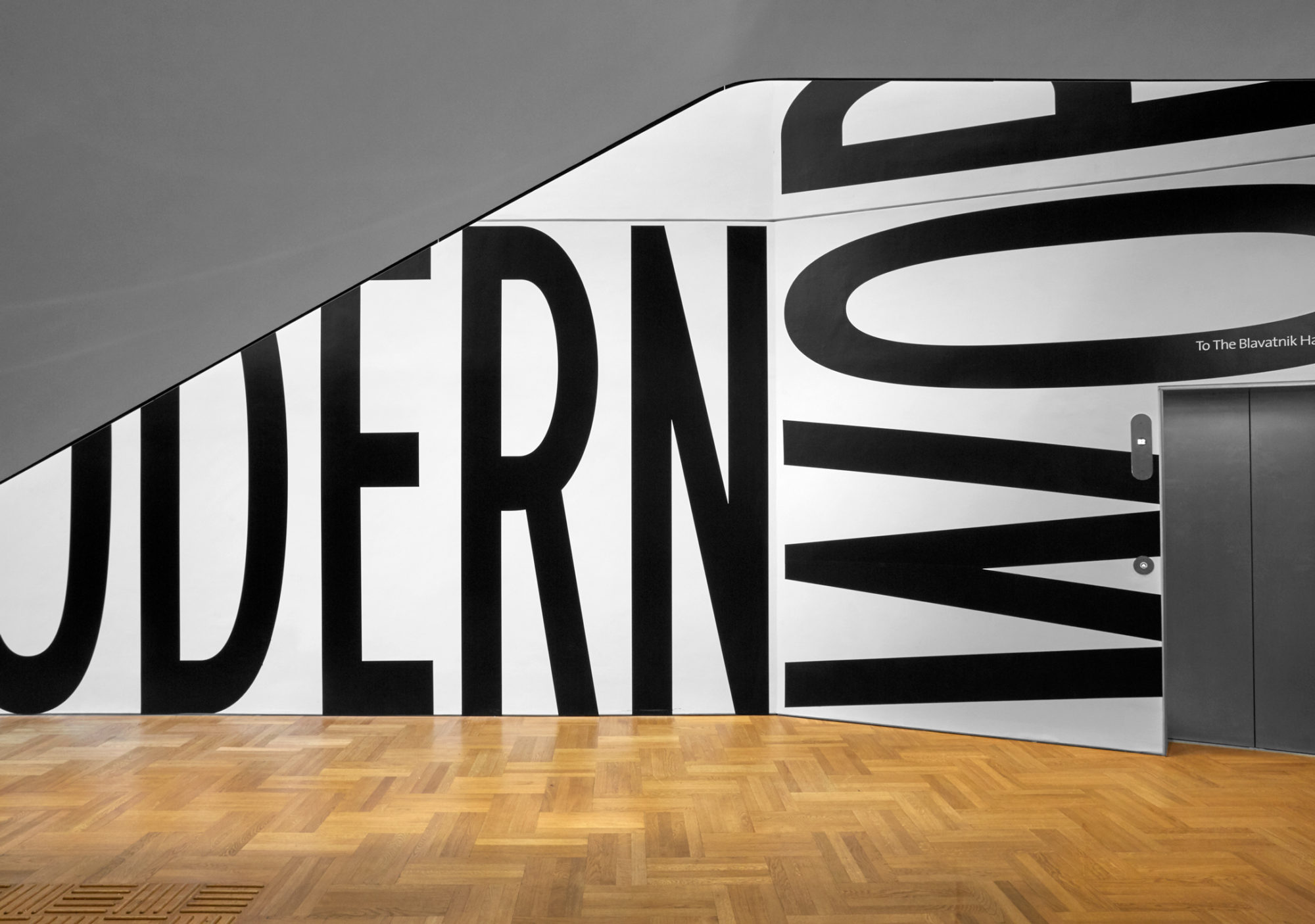
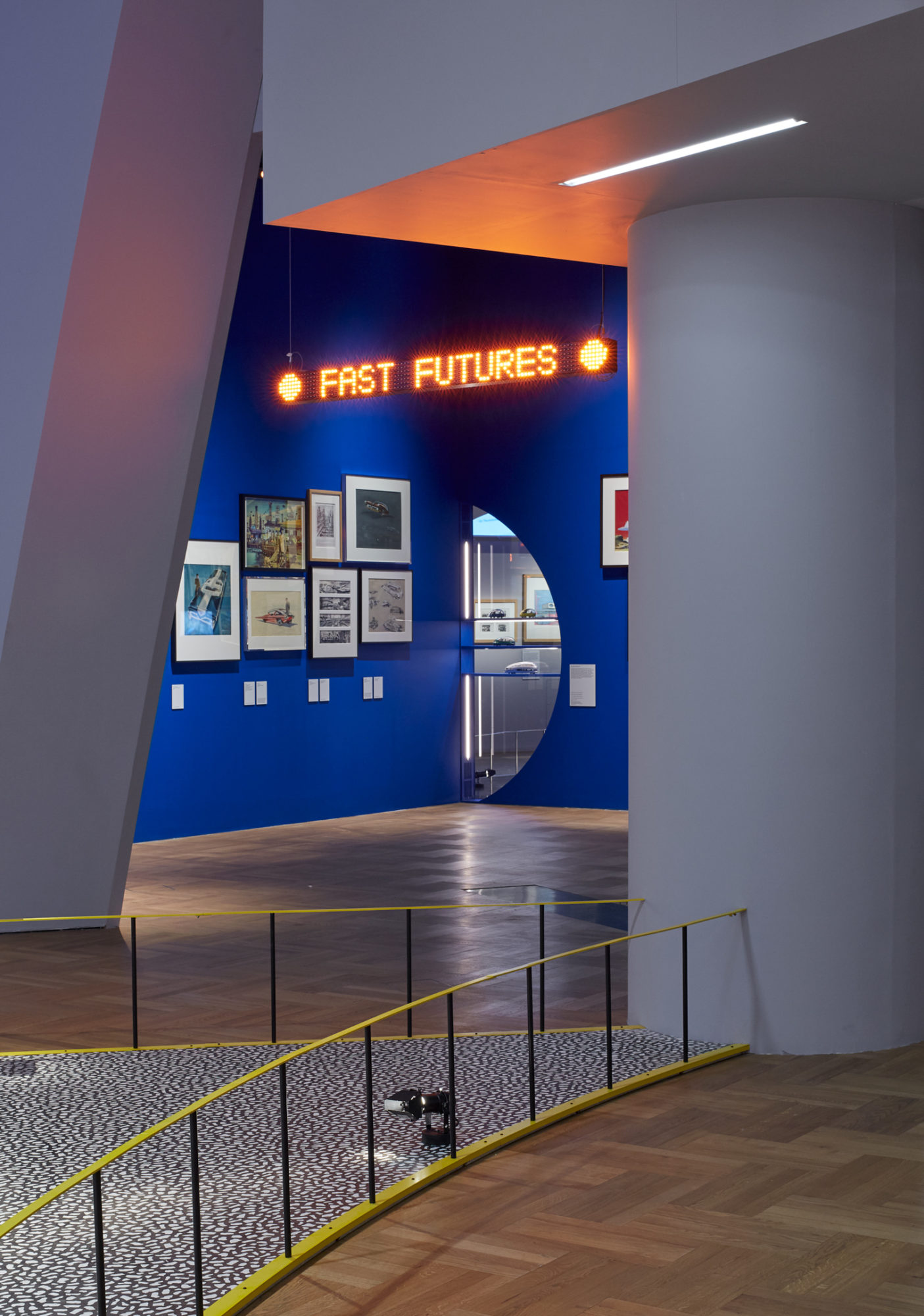
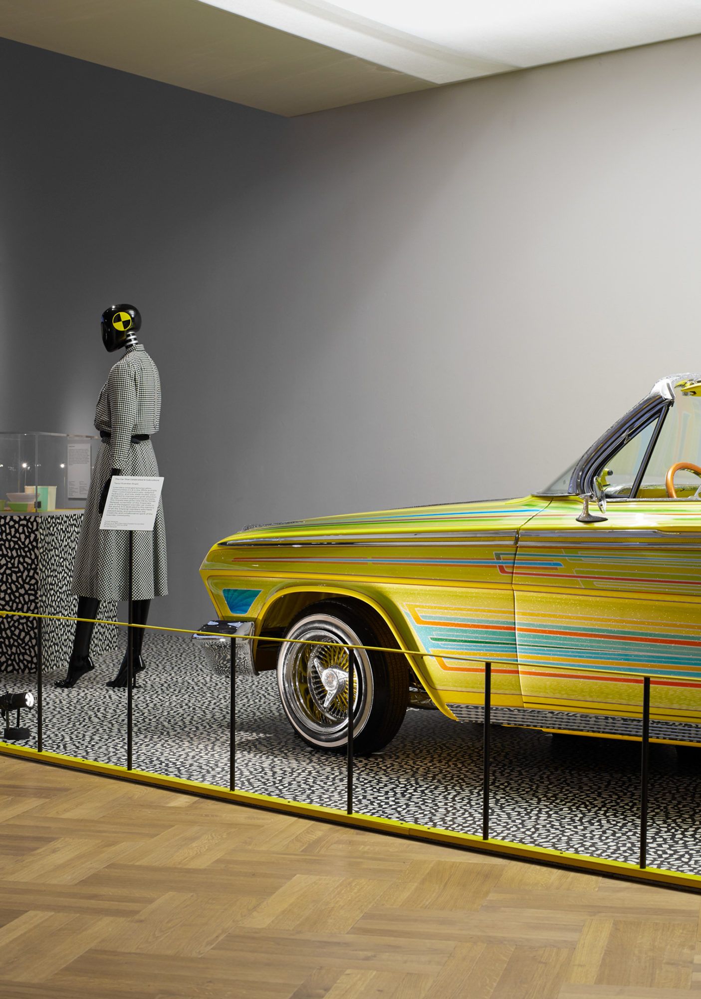
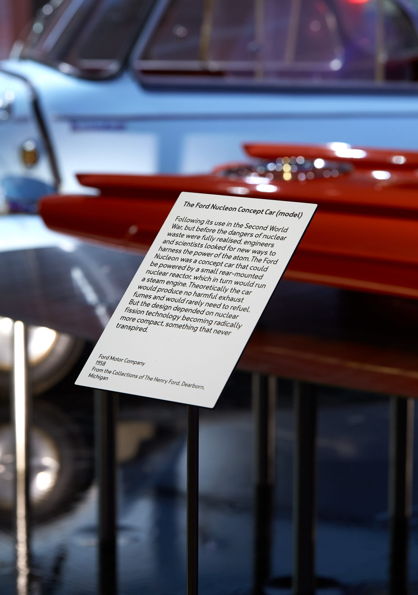
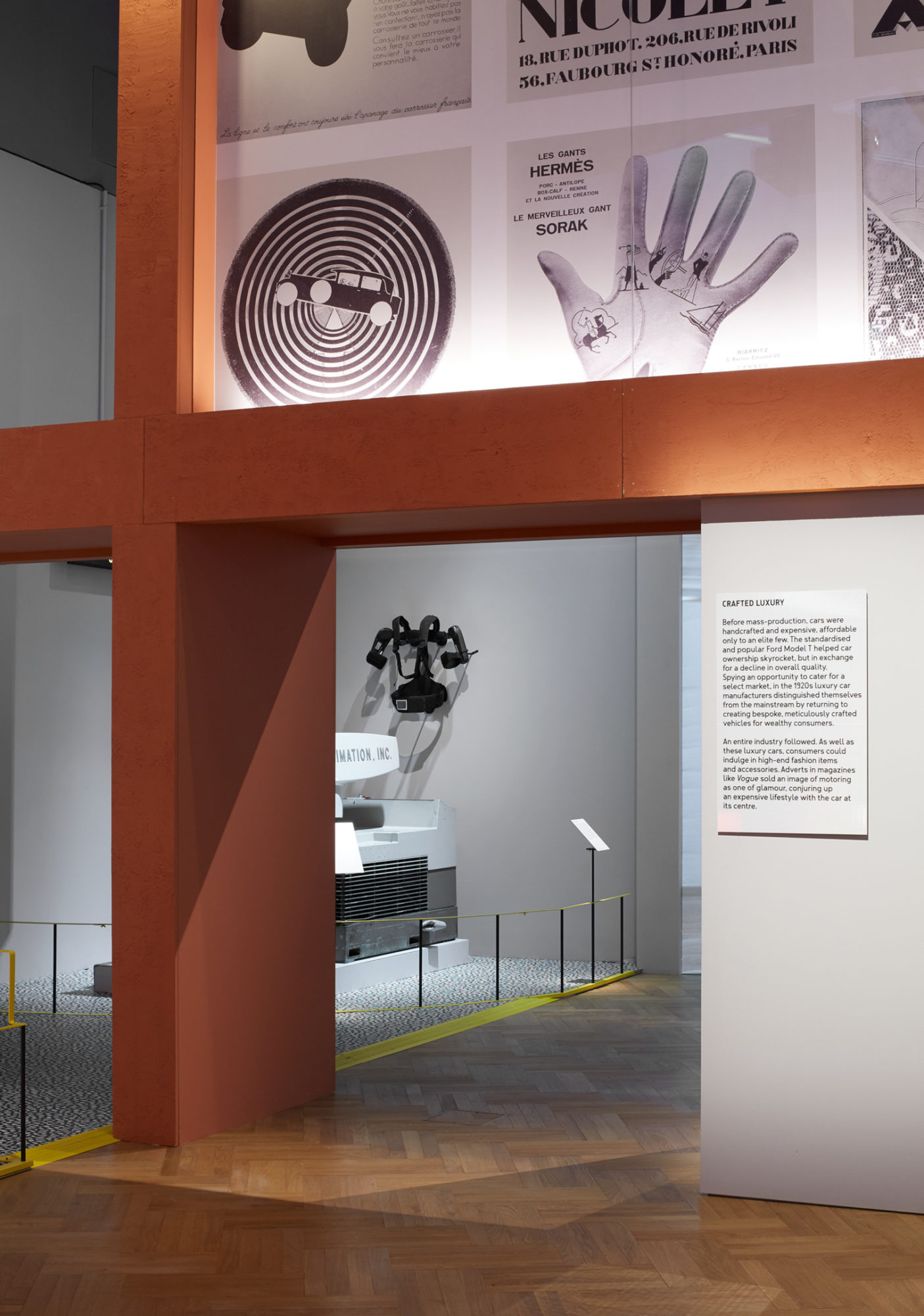
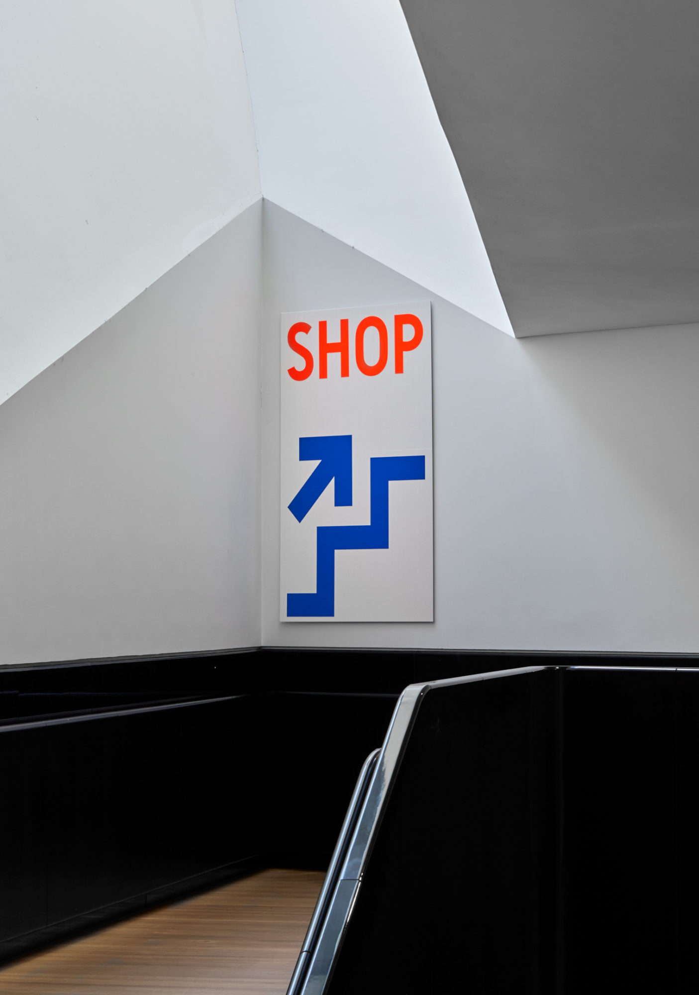
We designed the exhibition graphics to complement this approach utilising materials and visual languages from car culture. We catapulted the visitor into a highway vignette upon entry. In the gallery courtyard, a red car form teetered on the kiosk roof, a Variable Message Sign, customarily used on road sides, flashed with the exhibition title, and black-and-white stripes inspired by Battenburg markings, the high-visibility patterns used to distinguish police cars and ambulances, directed the visitor inside. These markings continued in colour on a series of hanging boards lining the staircase leading to the gallery. Downstairs, the winding black bannister culminated in a large-scale black-and-white typographic installation of the exhibition title across all the walls of the gallery foyer. We typeset the title in KW Japan, a typeface we designed from an alphabet we discovered on Japanese number plates. We printed exhibition texts throughout the gallery on diamond-pattern white reflective sheeting commonly used on UK traffic signs. Bespoke floating LED strips announced section titles while large format tv screens provided real-time statistics about cars. We also designed a black-and-white pattern based on tarmac for flooring.
The combined effect was to immerse the visitor in an archetypal world brimming with artefacts and text, encountered by the visitor as if through a windscreen.
