‘The world’s most accessible museum?’
The New York Times
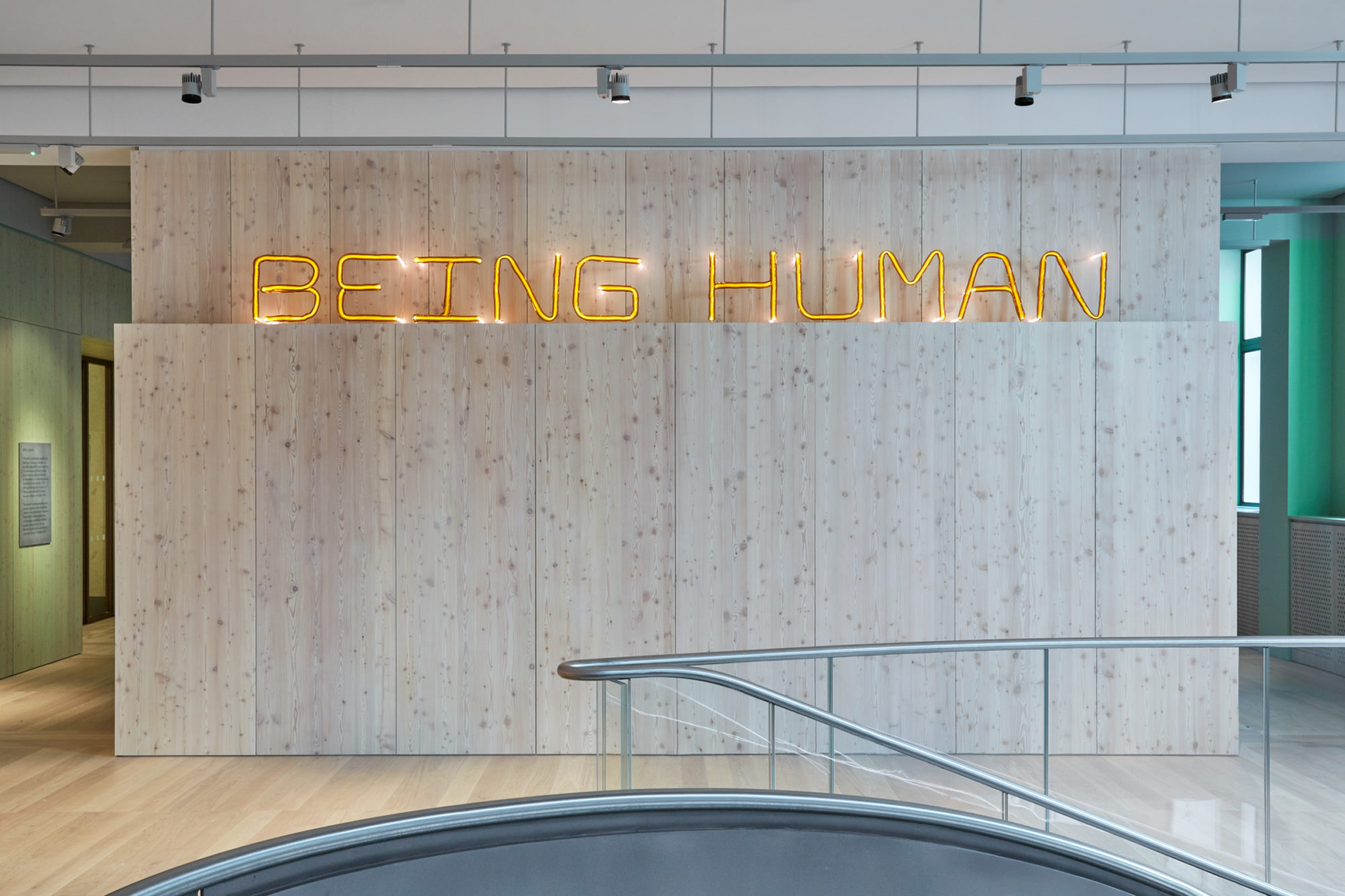
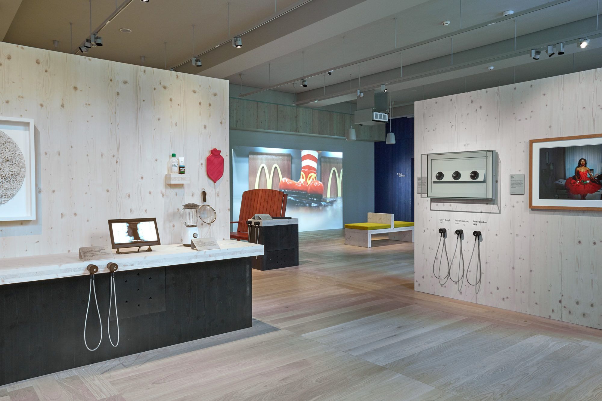
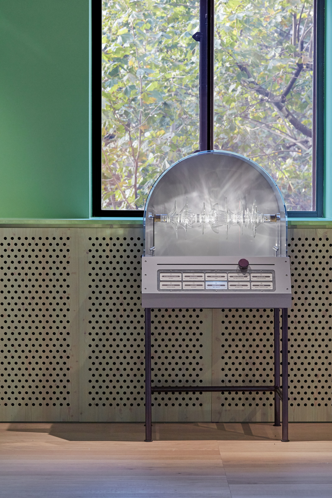
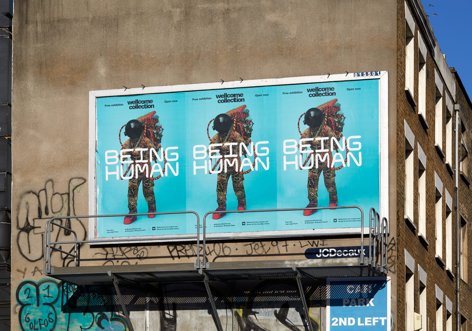
‘Being Human’, the Wellcome Collection’s new permanent gallery, explores ideas of trust, identity and health. Divided into four sections – Genetics, Minds & Bodies, Infection and Environmental Breakdown – the display presents 50 artworks and objects that reflect on our hopes and fears about new medical knowledge, and our changing relationships with each other and the wider world.
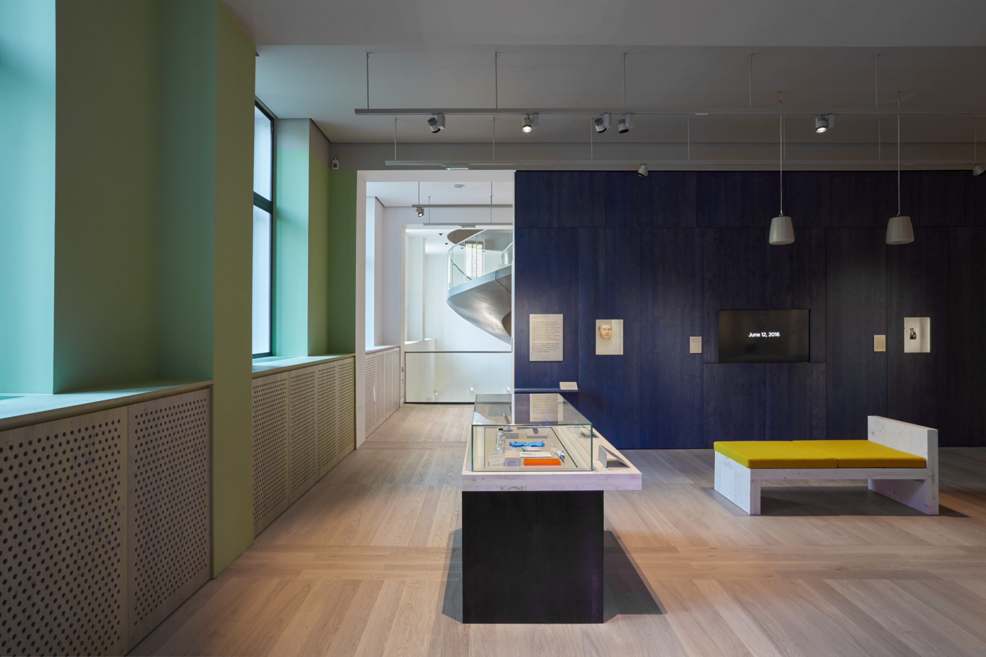
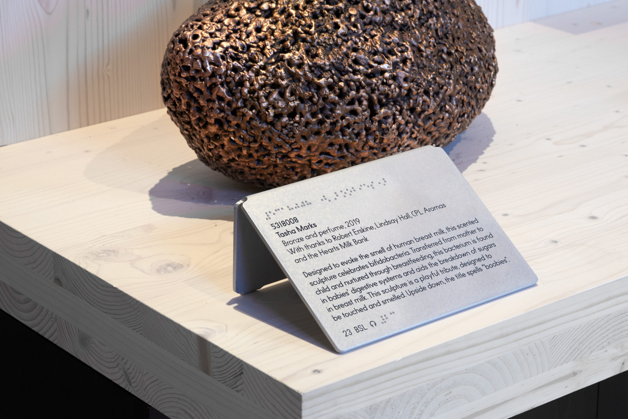
Working as a collaborative team with a number of specialists, including the architecture collective Assemble, we designed a gallery that is warm, tactile and engaging. All graphics and interpretation designs were produced by hand, with the process of making made visible. Many of our materials underwent physical transformations – for example, aluminium captions were heavily sanded to create a stone-like appearance.
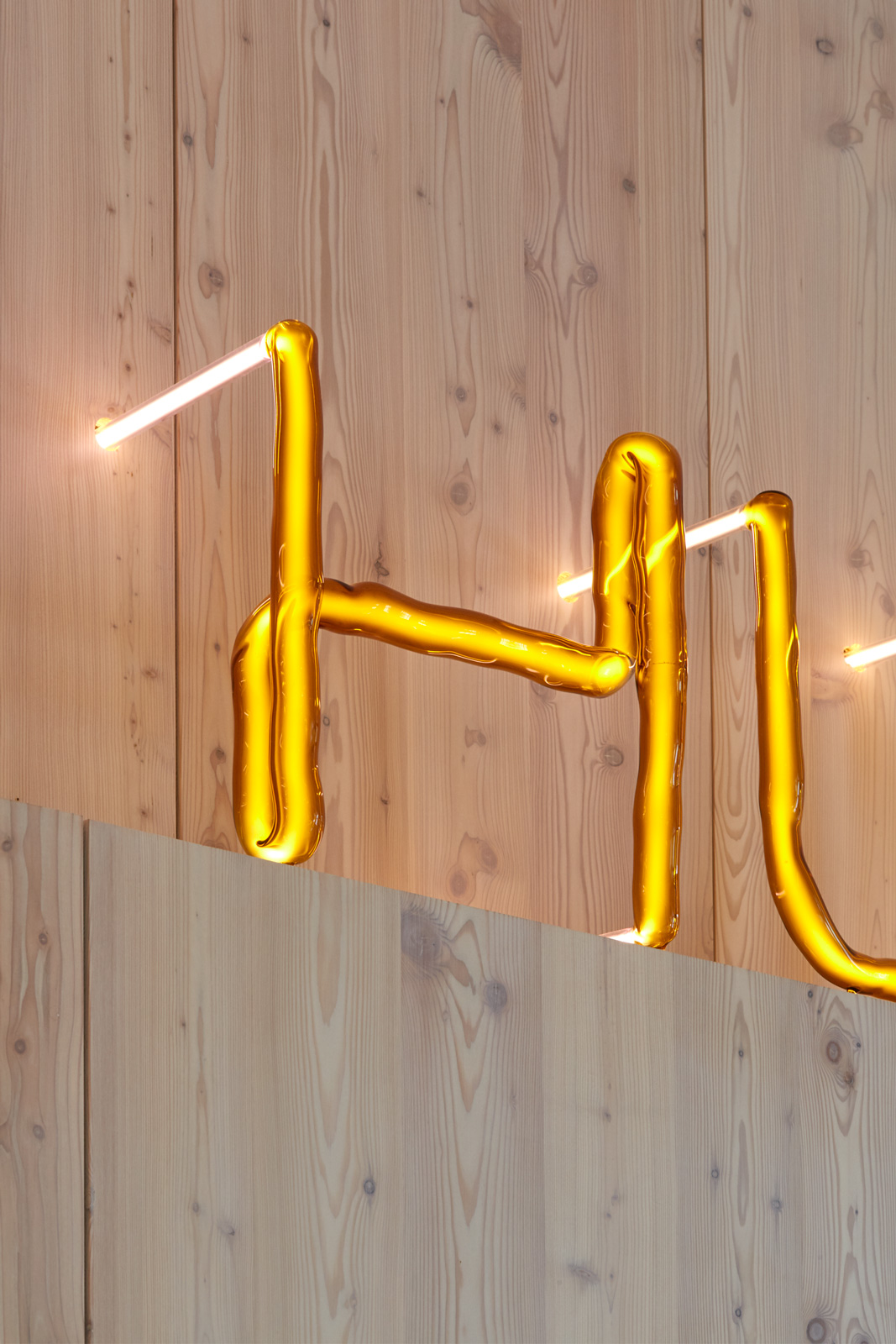
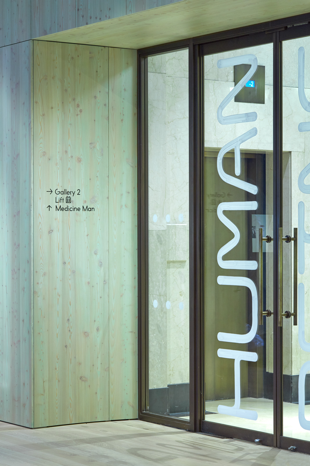
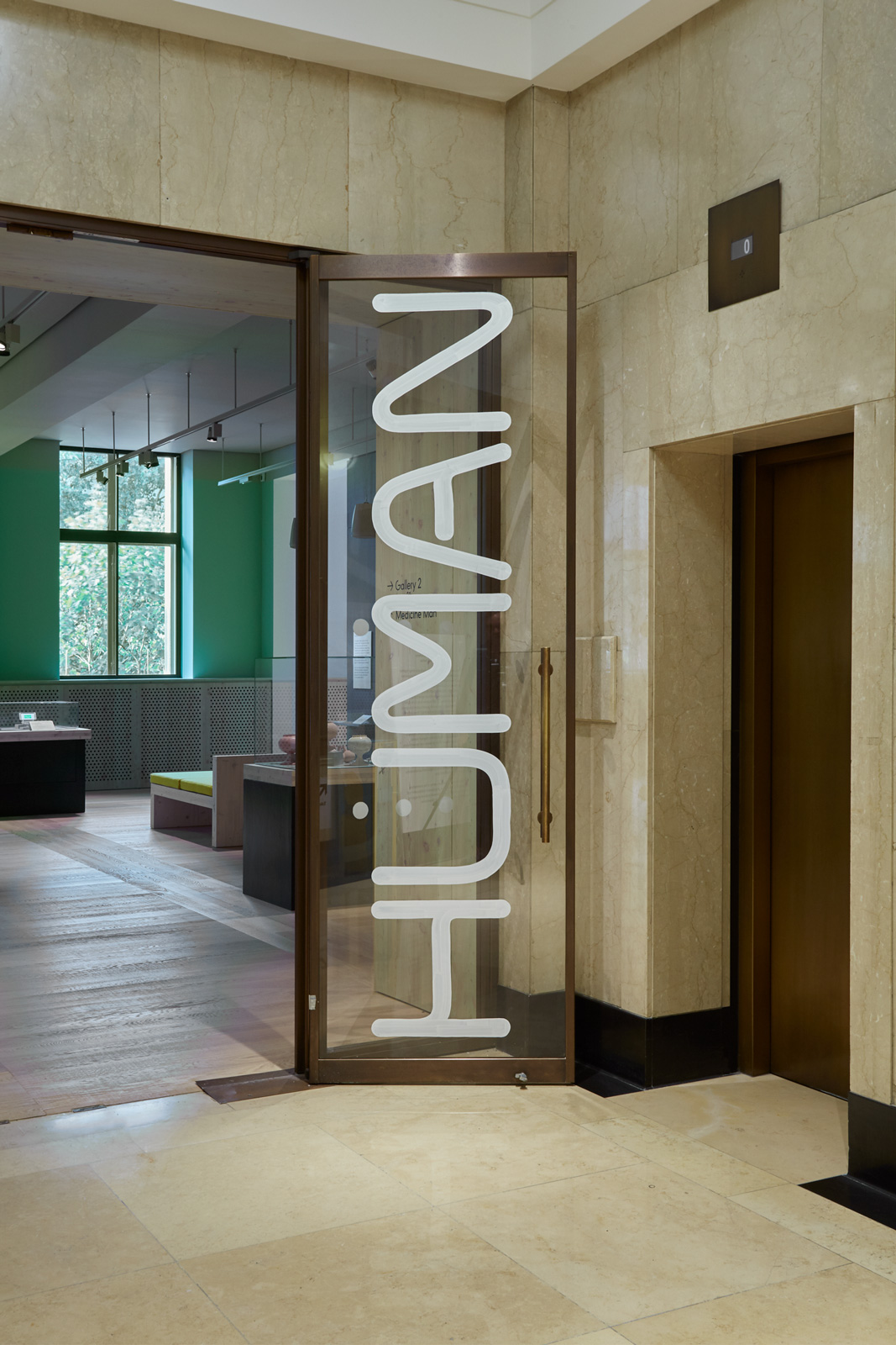
For the main exhibition title, we worked with artist Jochen Holz, who blew our tubular typeface in amber glass. Much of the larger signage was hand-painted, with a translucent white paint used to emphasise brushstrokes on the glass entrance doors and on the indigo-stained, cross-laminated timber walls. Our secondary typeface, a geometric humanist typeface called KW Plotter, was applied throughout the interpretation design, along with hand-mounted Raster Braille.
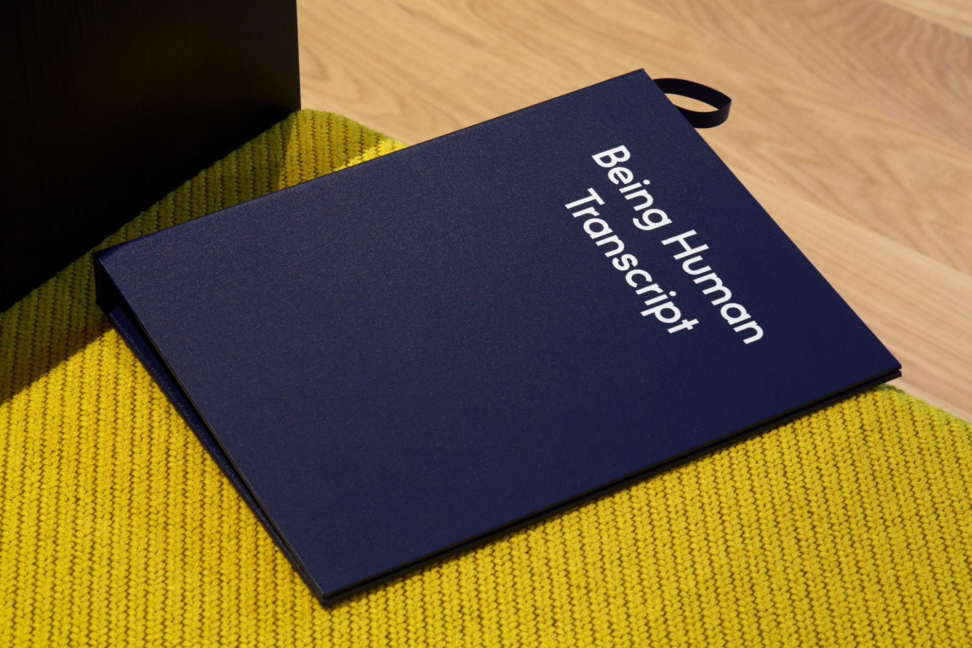
Everything in ‘Being Human’ follows leading accessibility standards. Texts and interpretation design were iteratively tested in workshops with the University of Leicester Research Centre for Museums and Galleries and other specialists. All texts were written with reference to the social model of disability, and the museum’s interpretation is mingled with other voices and experiences.
