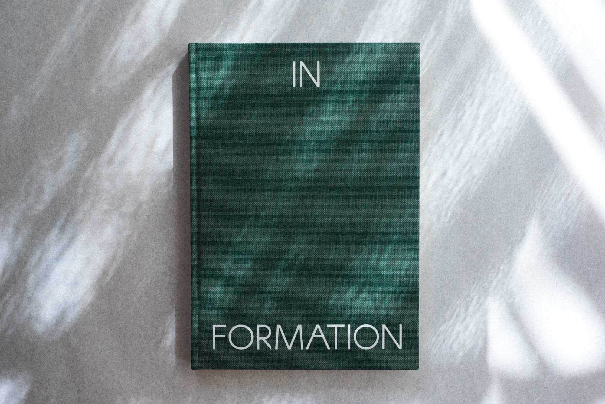
British sculptor Antony Gormley wanted ‘a robust book with clear material properties’ to accompany his 2019 exhibition. We designed a hard-cover volume in burnished evergreen buckram that is every bit as sturdy and monumental as the weighty oxidised metal blocks comprising the body of work the book contains.
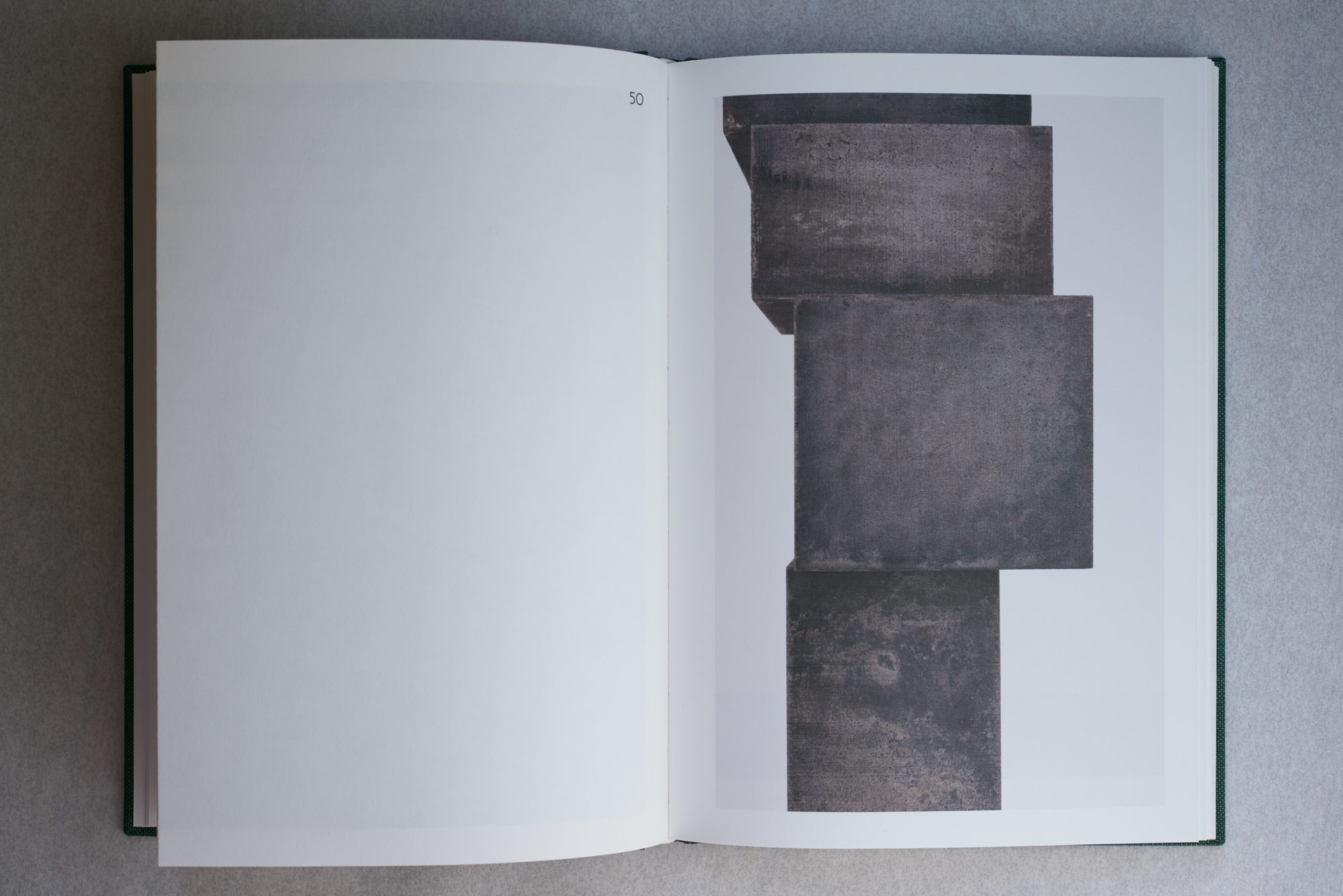
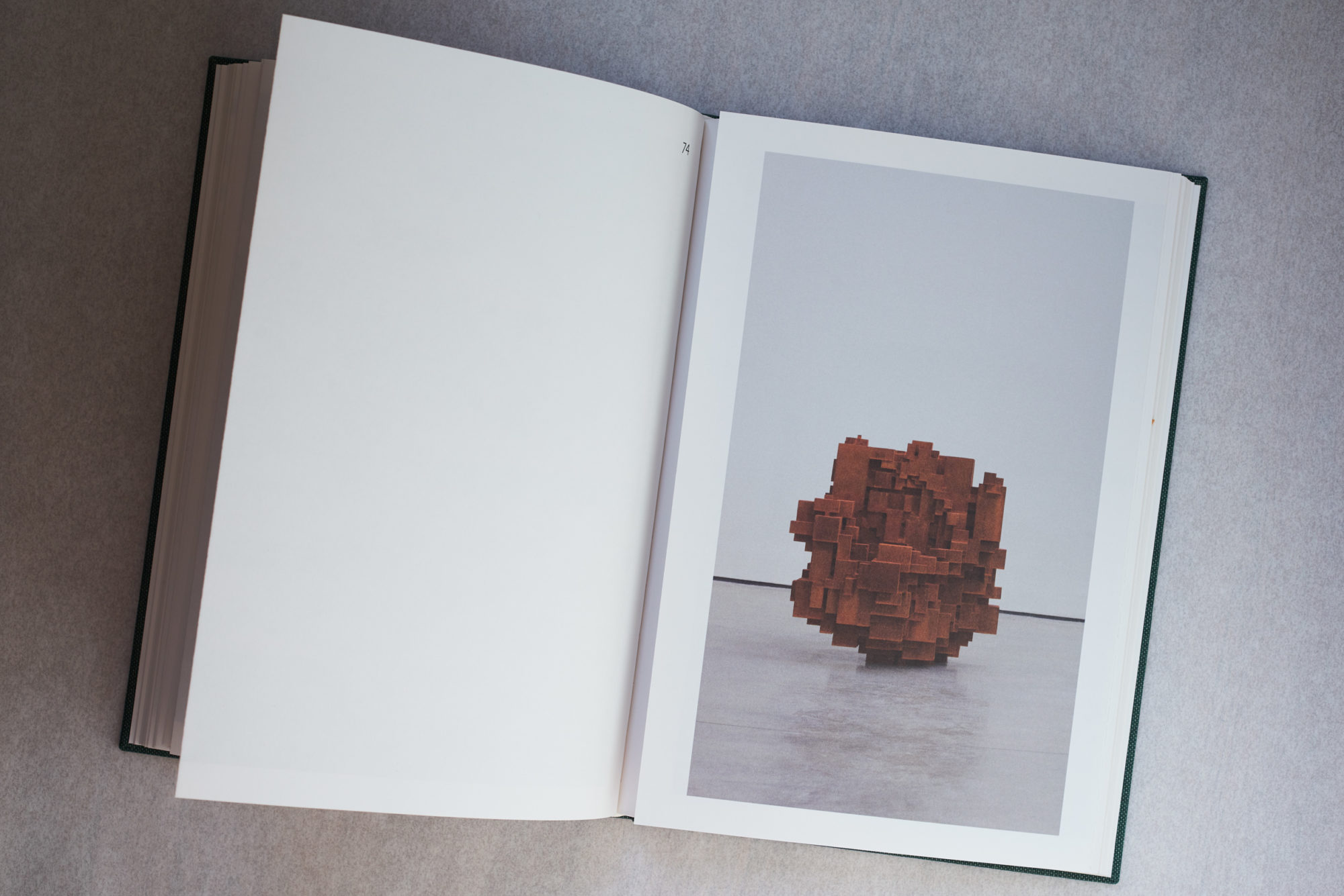
‘In Formation’ featured two kinds of sculptures: on the lower ground floor, primordial ‘Stack’ works made of solid cast iron blocks used dead weight as a construction principle and the gallery walls for support; upstairs, smaller building blocks made up free-standing, seemingly pixelated assemblages called ‘Aggregates’.
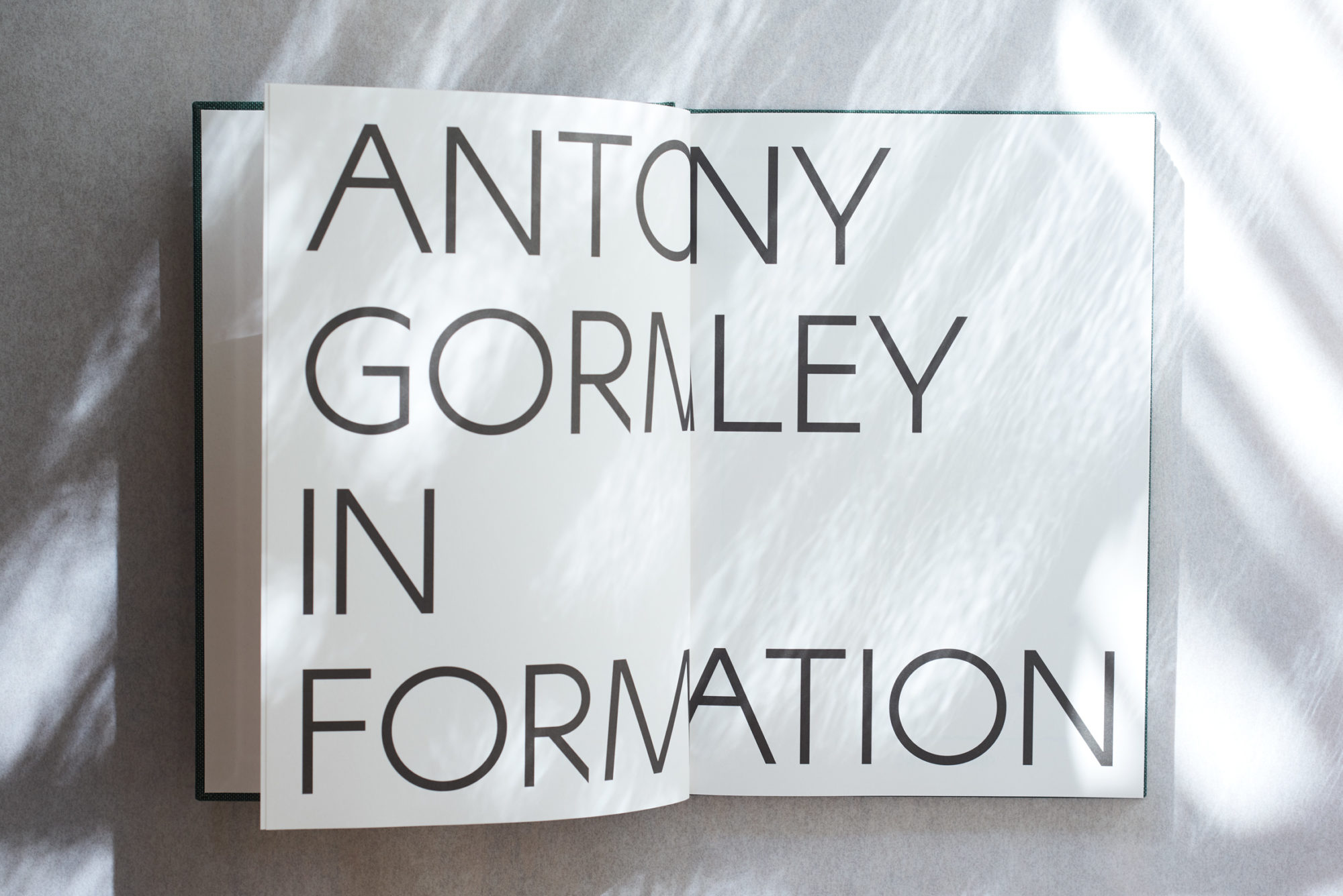
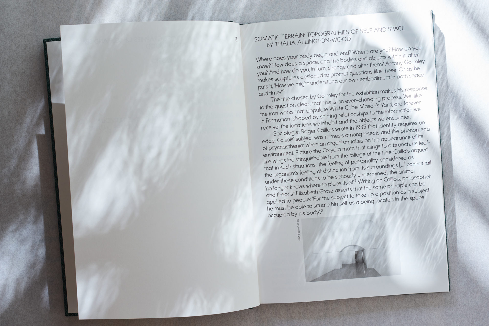
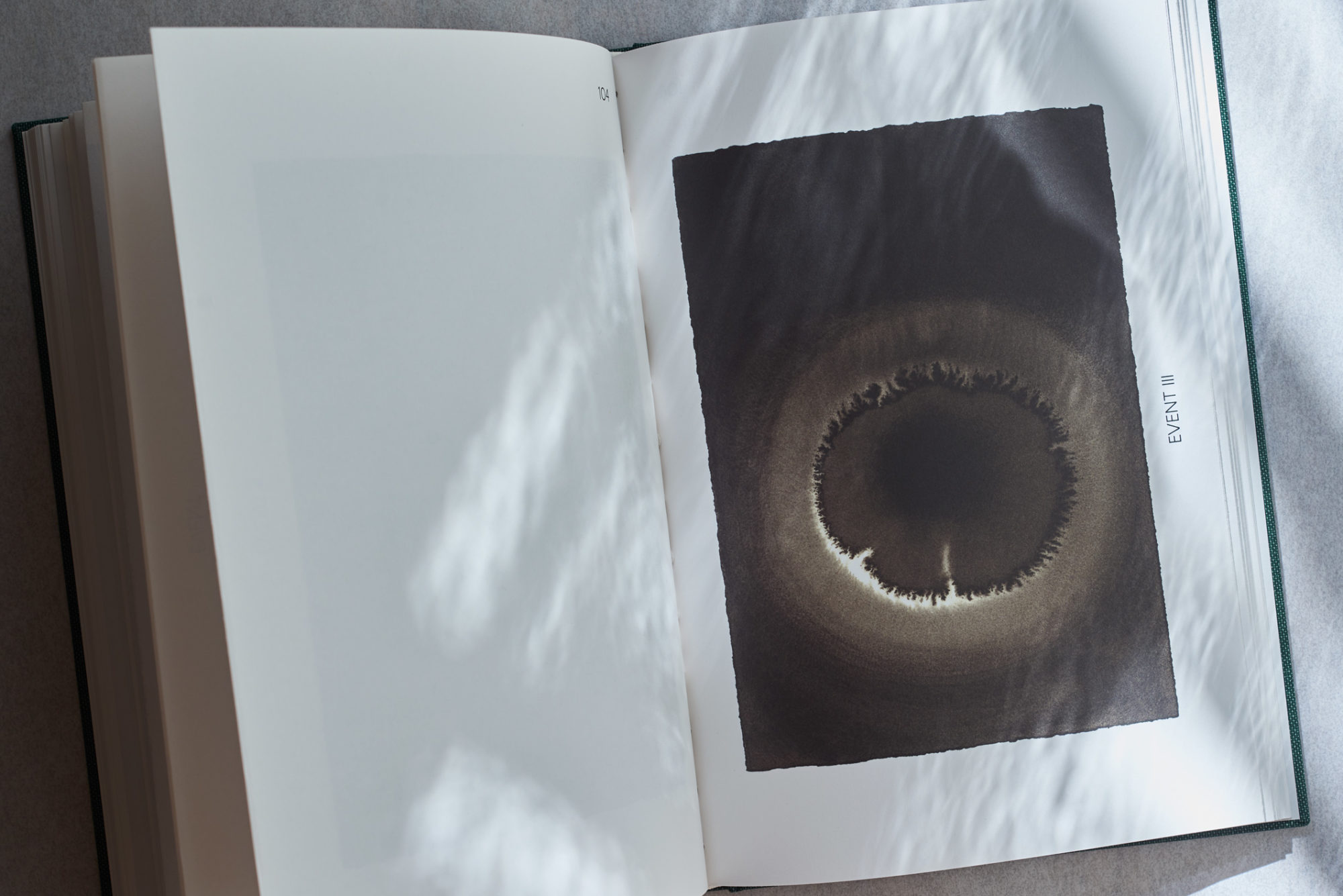
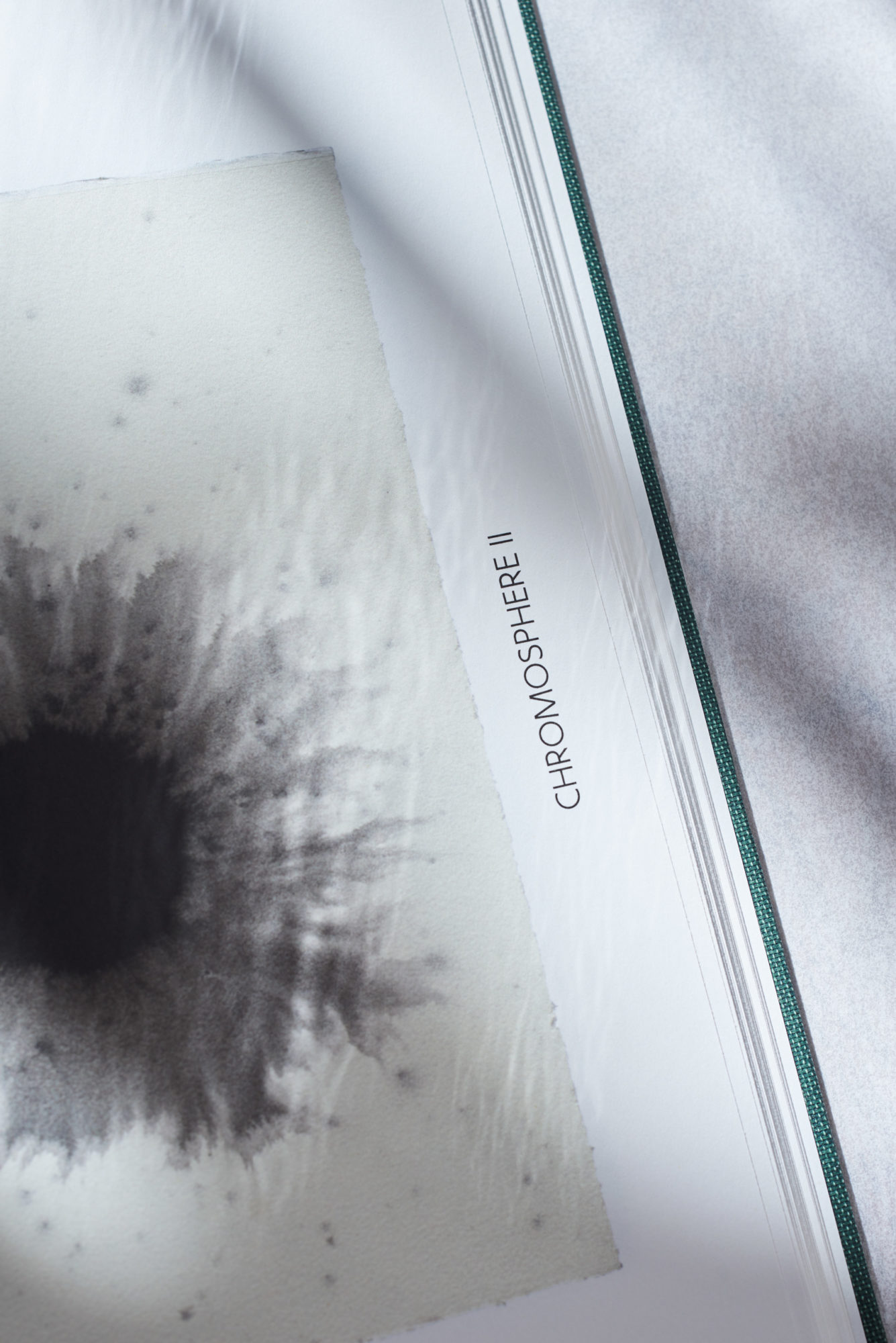
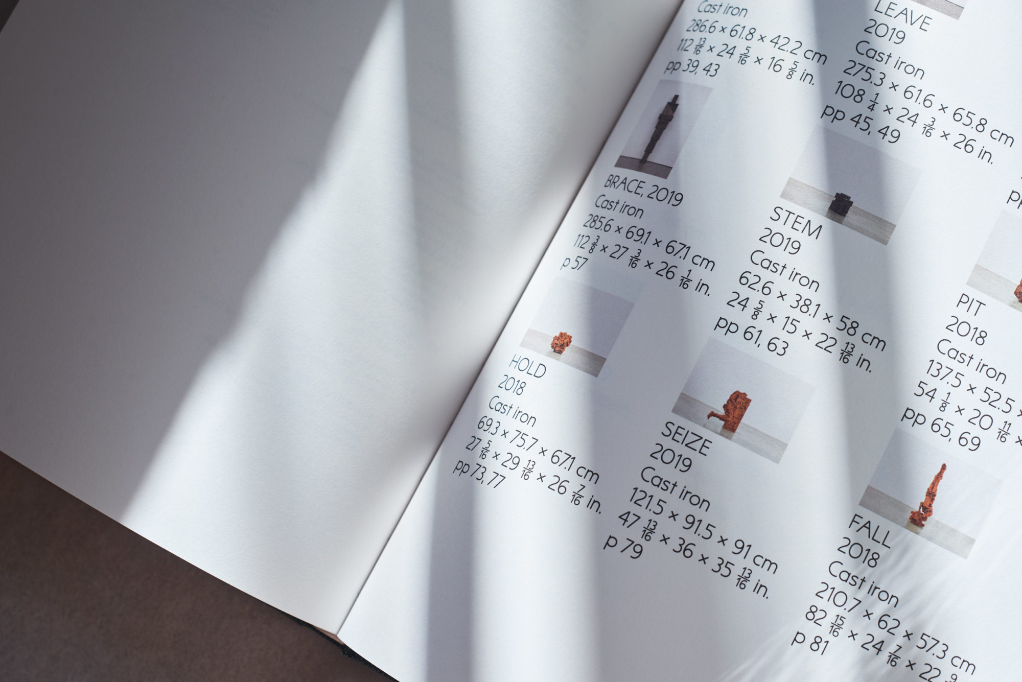
We designed ‘In Formation’ to conflate the space of the gallery with the space of the book. The contents page is a gallery floor plan. The proceeding pages present a tour of the exhibition with images of the sculptures photographed in situ. In conjunction with this narrative, we focused on the book as a space of its own construction – one in which what can be printed on each page is dictated by how paper is folded and assembled. We typeset the book in a font we designed called KW Sammlung (based on a hand-drawn poster by Swiss graphic designer Armin Hofmann). Rigorous page planning meant text and plates appear only on the recto side of a spread. These are punctuated by strategically placed throw-outs.
In her catalogue essay, Thalia Allington Wood asserts Gormley’s sculpture prompts questions such as: ‘Where does your body begin and end? Where are you? How do you know?’ Just as Gormley’s oeuvre posits matter as inextricable from its location in space and time, we purposefully made a book that emphasises its material qualities in relation to the person (or body) reading it and the space that they occupy.
