‘. . . you need to look carefully and be prepared to decipher your surroundings.’ Anj Smith
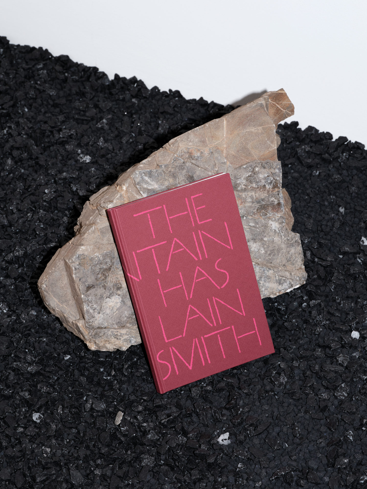
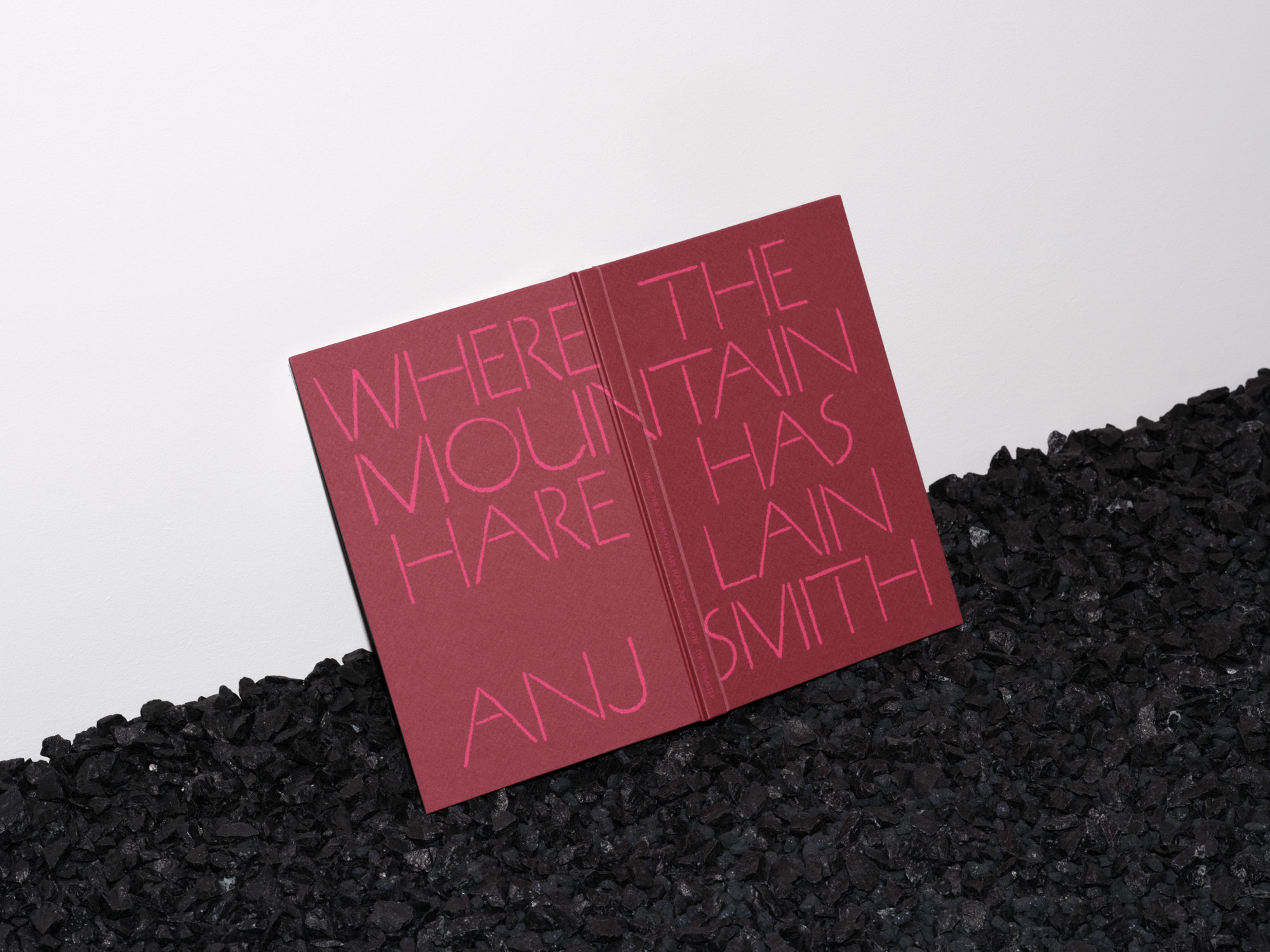
We designed the catalogue for contemporary artist Anj Smith’s London show to evoke the architecture of the exhibition through the architecture of the book. At the four-storey, four-room gallery designed by 6a Architects, the ‘worlds within worlds’ depicted in Smith’s paintings spilled out into the space via Robert Storey’s minimalist black scenography.
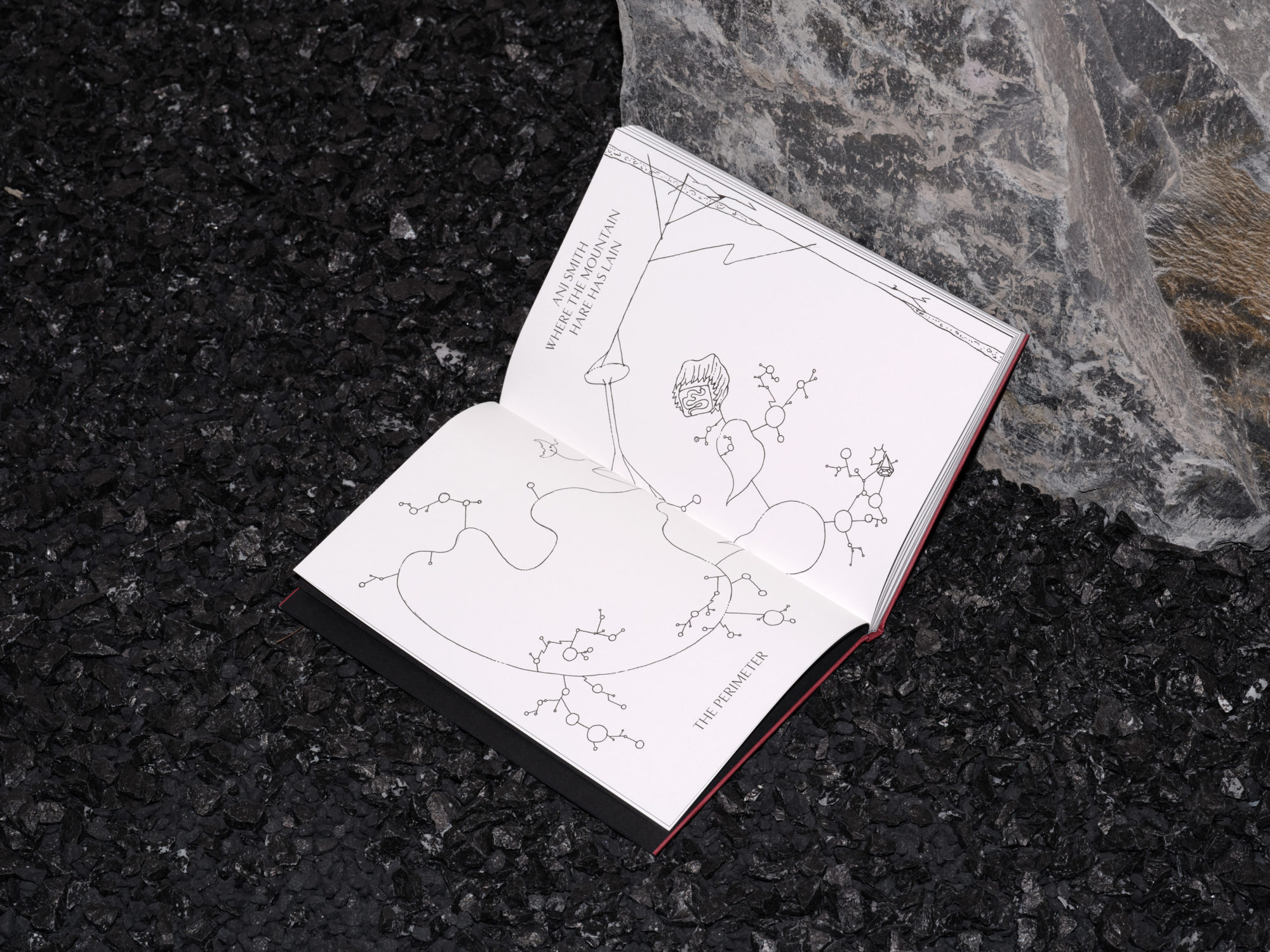
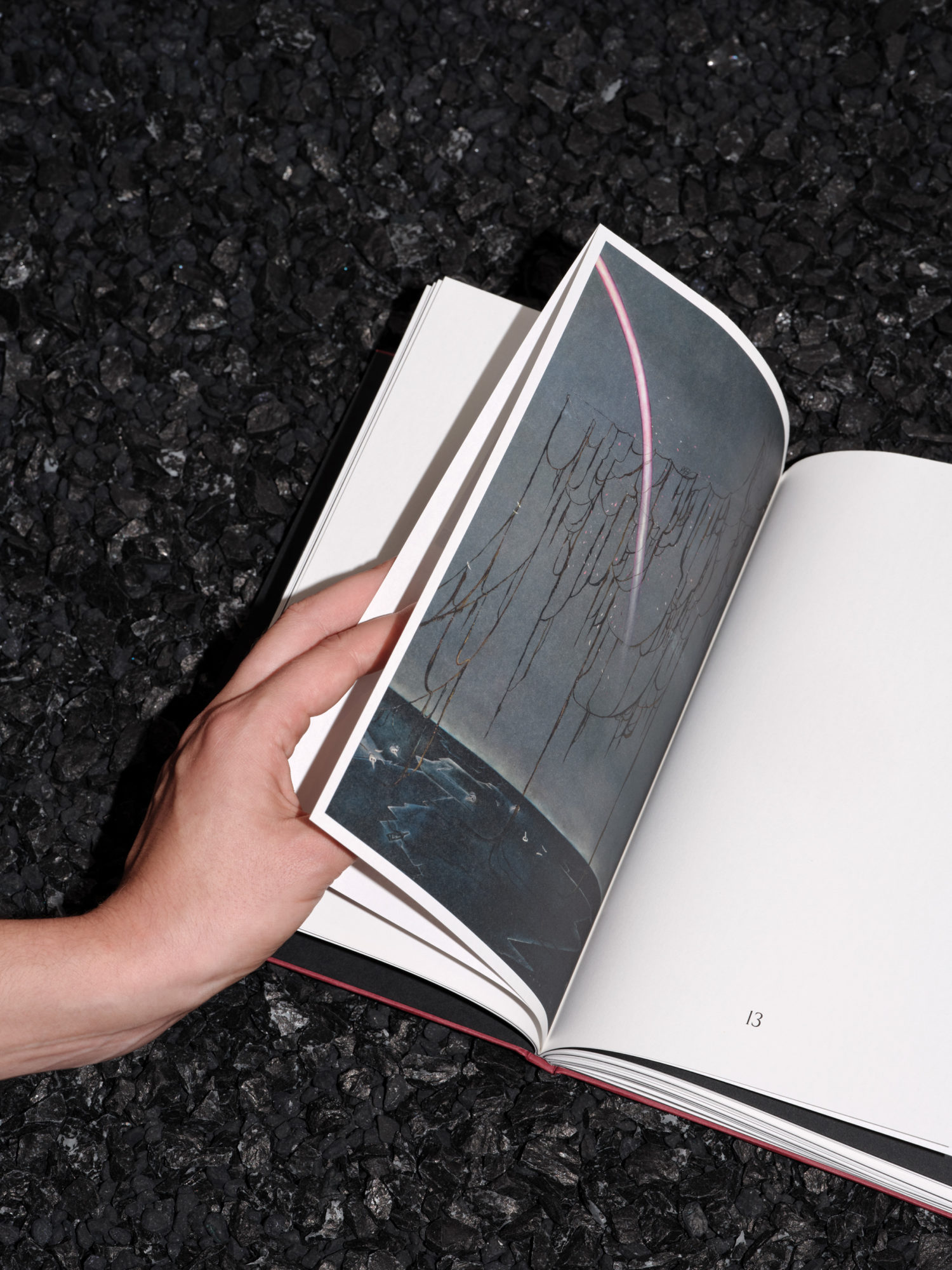
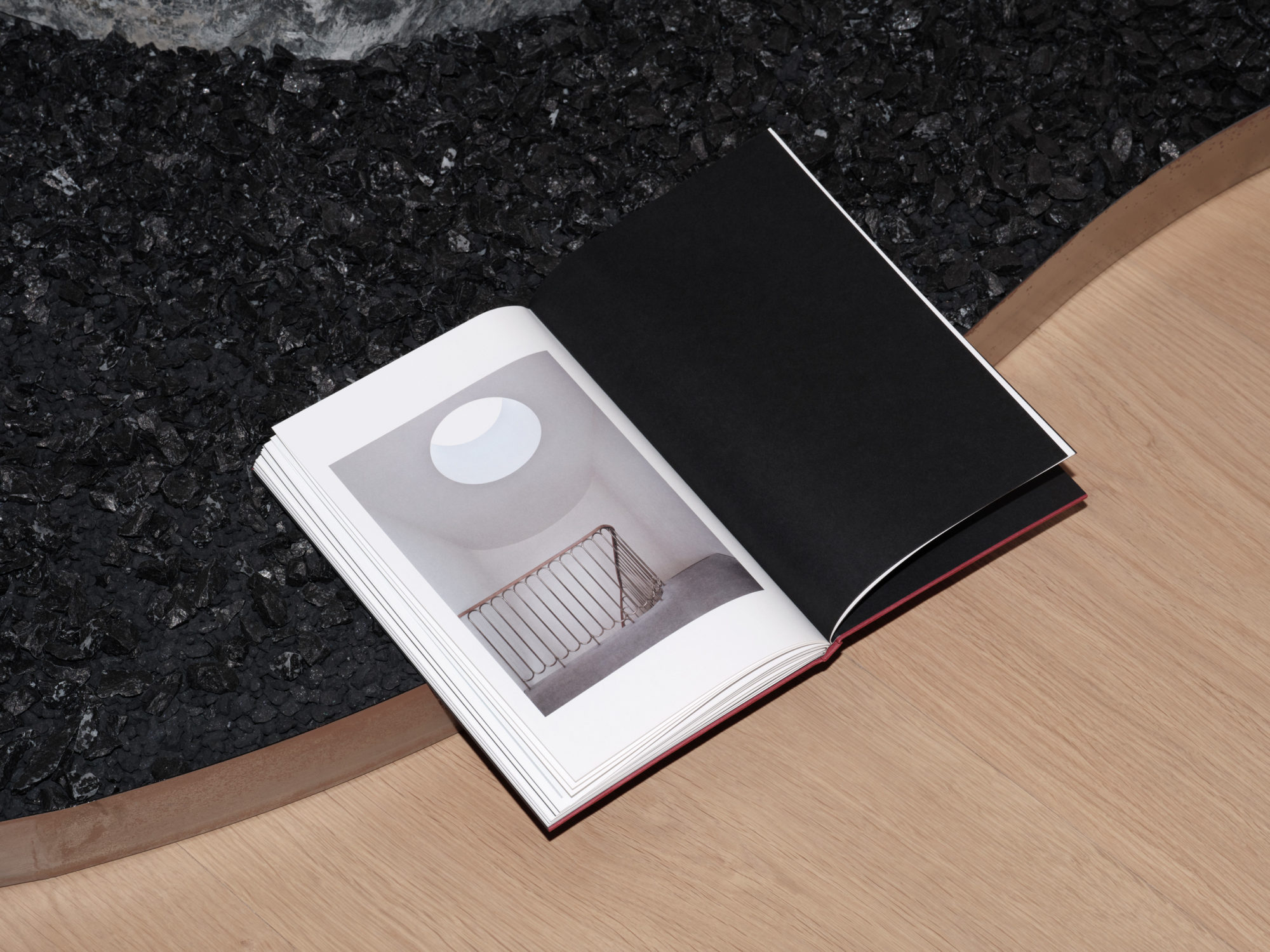
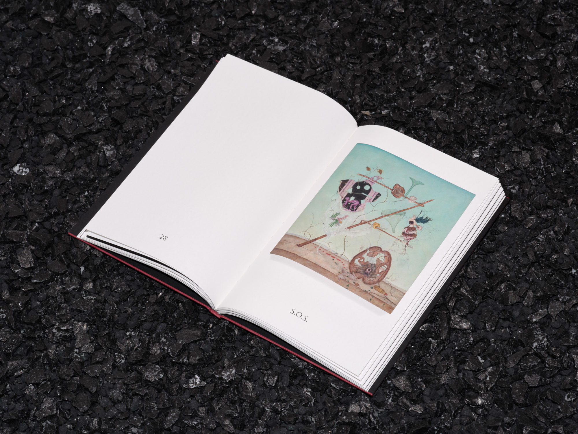
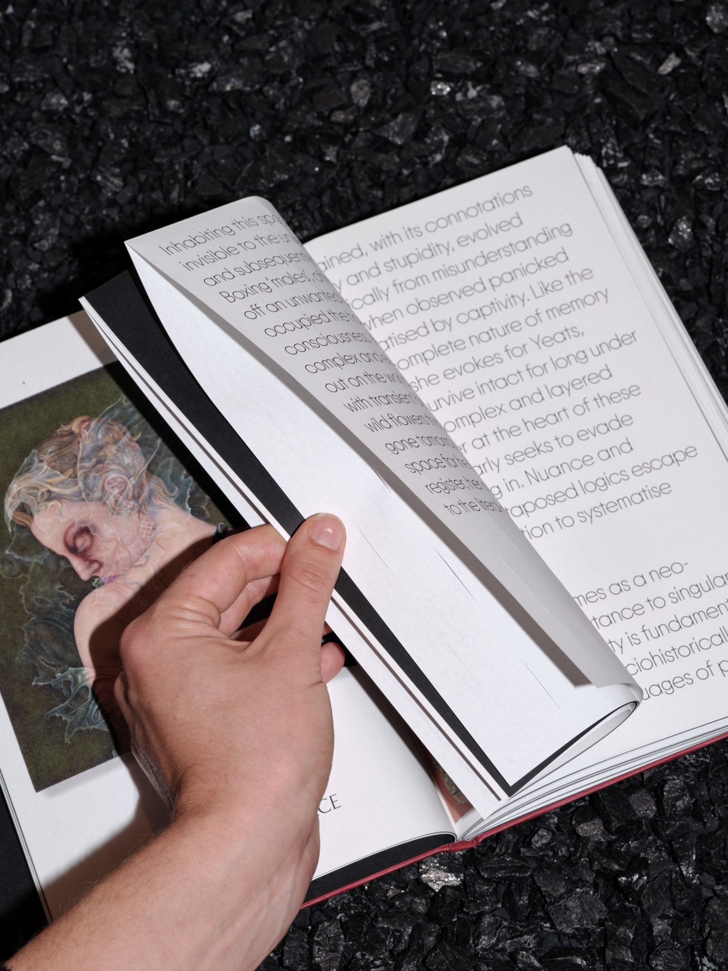
In the book, black section pages delineate the gallery’s different rooms in between which are installation shots by Angela Moore and painting details. Pages, French-folded along the top edge, also draw attention to the book’s construction.
We used three different typefaces to echo the play of allusion in Smith’s iconography. Over-sized type and intermittent vertical slits like grass, on the pages bearing the artist’s essay, further accentuate the materiality of reading. These design interventions ensure a book that, as Yates Norton writes of Smith’s paintings, is ‘always elusive, always winkingly, defiantly there.’
