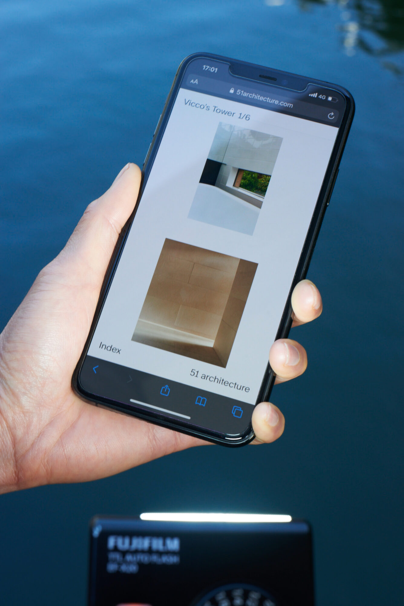
We took a purposefully editorial approach to designing the website for 51 architecture. The key was to revisit the conventions of the architect’s portfolio.
We worked closely with the practice’s vast archive of visual material, editing sequences so that each project becomes a visual essay, a combination of carefully selected architectural plans and sketches, and photographs. We reconfigured the digital space of the web page according to the conventions of a printed monograph. This allowed for ample white space, a hierarchy of images and succinct text. We also art-directed a portrait of the practice partners taken by photographer Nick Seaton.
The result is an architect’s portfolio site that communicates through tight, confident, nuanced narratives befitting a practice more known for its sensitivity to detail, context and responsibility than for grand statements and overviews.
