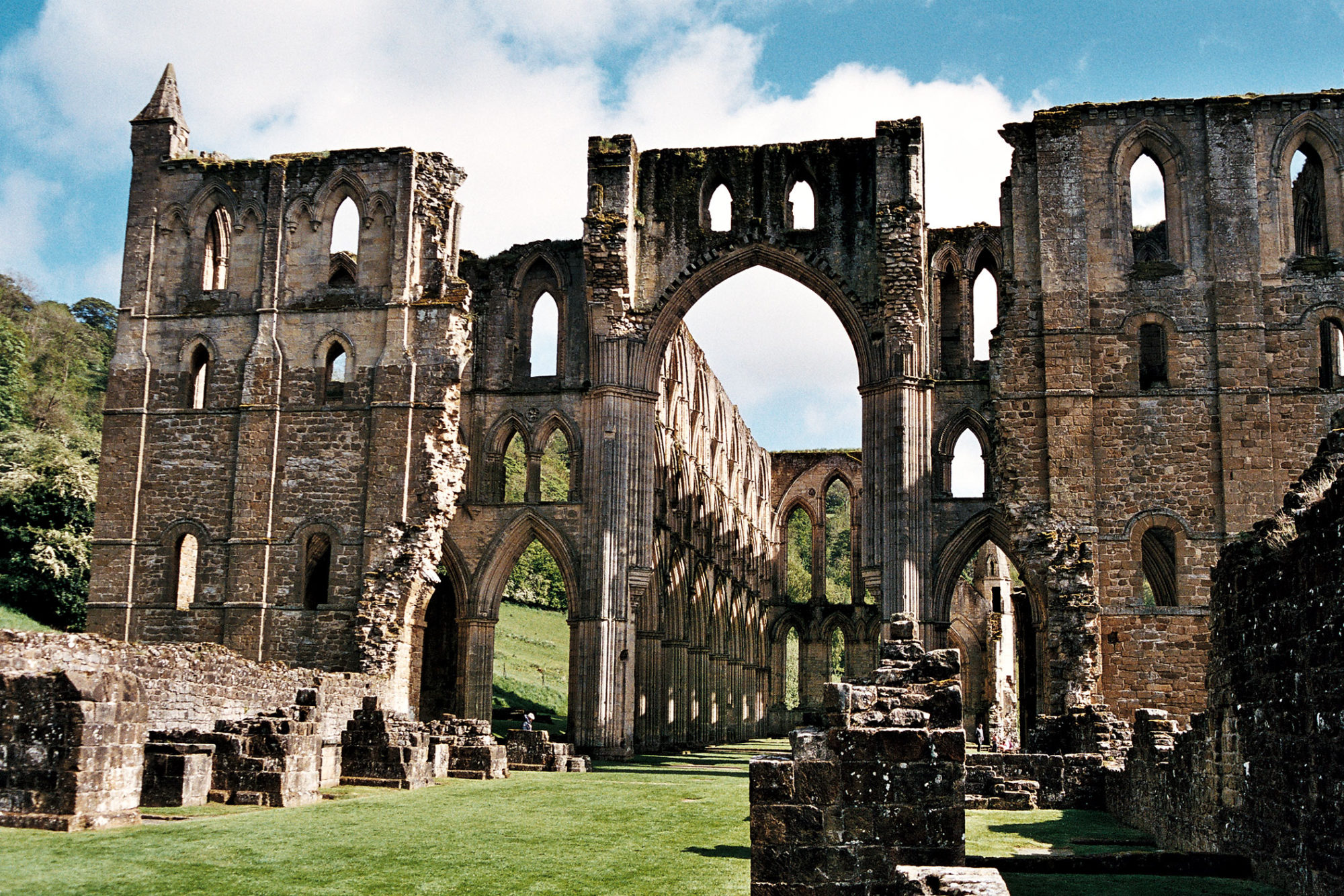
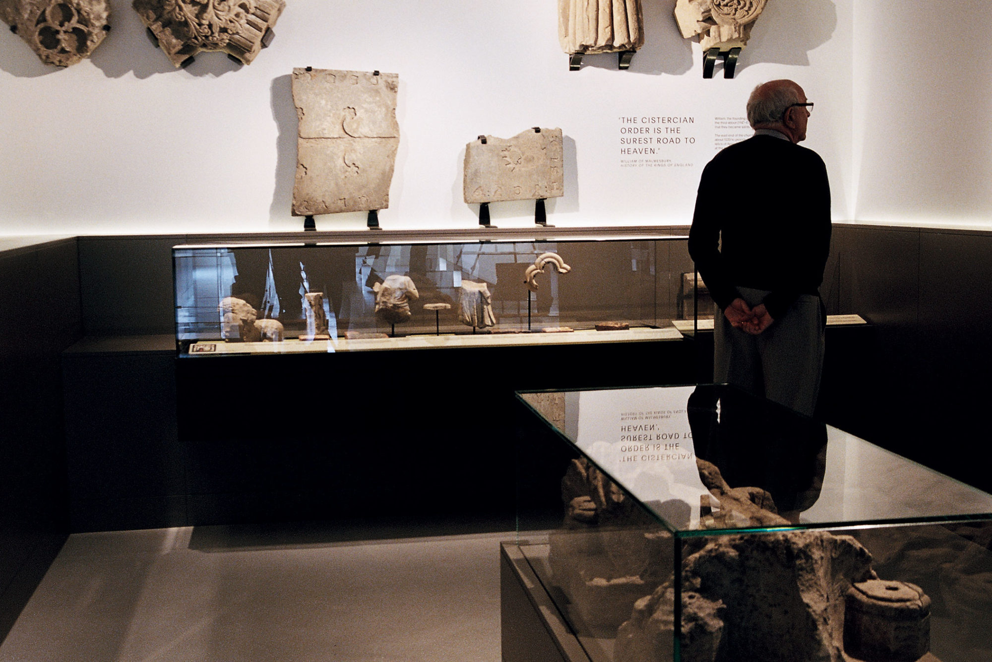
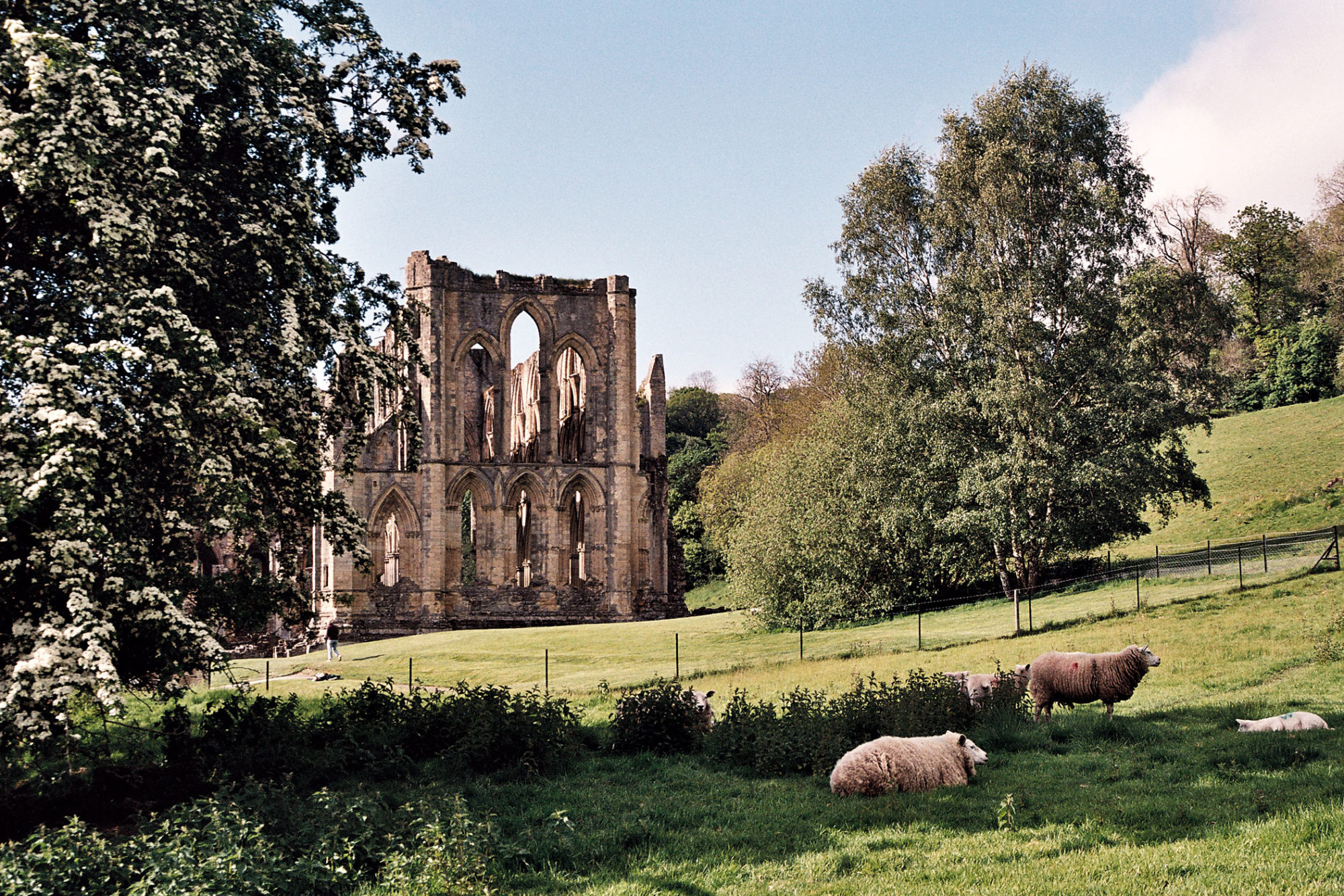
Kellenberger–White were commissioned to design the interpretation signage for Rievaulx Abbey and the Abbey Museum’s identity and graphic design. Key to our scheme was ensuring the link was made between the evocative Abbey ruins and the new permanent museum display.
The 12th-century Abbey became famous in the early 19th century, in its then-ruined state, as the inspiration for Romantic poets and artists. We chose to build an original visual language by focusing on a single key object from a turning point in the Abbey’s 800-year history: the Fother. During the Dissolution of the Monasteries, after Henry VIII took possession of the Abbey in 1538, the Fother was made of lead torn from the roof and melted down. It was roughly cast by pouring the stolen lead into a hole. The object’s complex history and fascinating look and texture were our starting point.
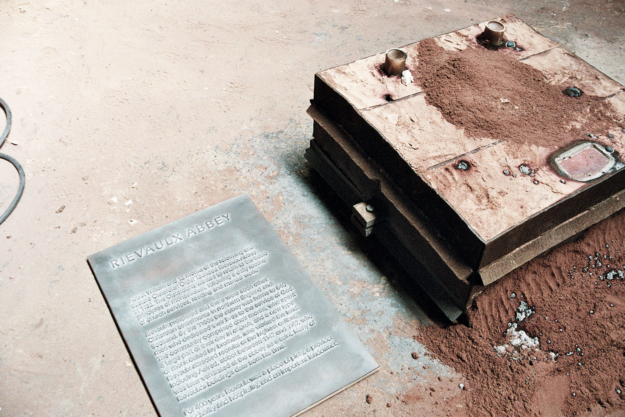
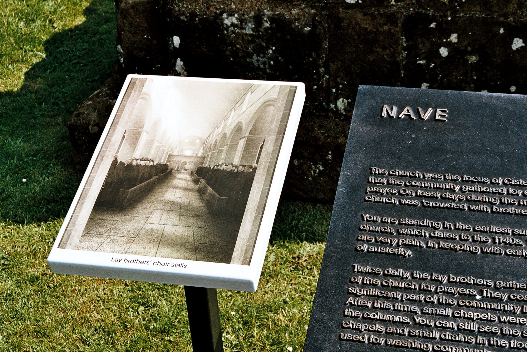
For the outside interpretation panels, we used rugged sand-cast iron – from the Braintree-based metal foundry FSE – that retained the uneven surface of its manufacturing process. On each panel, explanatory text was set in the crisply modern Plain typeface, sand-blasted and polished back to give it a surface interest akin to that of the Fother. We art-directed a series of reconstruction illustrations by OMMX Architects to complement the words, reproducing them on vitreous enamel panels produced by A.J. Wells, the Isle of Wight-based company that makes robust signage for London Transport.
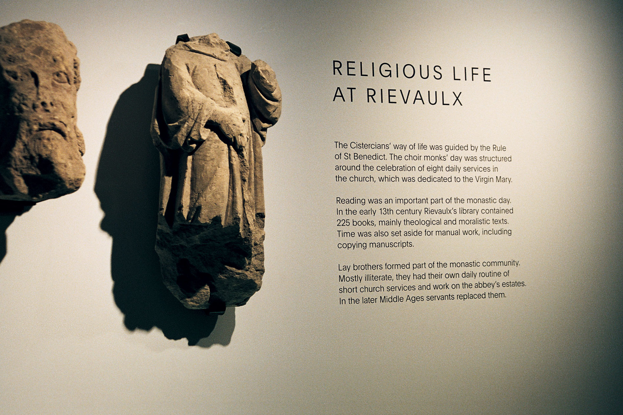
All Things took project lead in our collaboration on the design for a new museum exhibition that emphasises both the archaeological collections and the monument itself. The captions were carefully married with accompanying images, achieving unusual coherence by matching the widths of strokes in the plain line drawings to the widths of the letters beside them. The robustness of the overall design was maintained in the exhibition by screen-printing graphics directly on to the gallery walls.
