1/2
Text
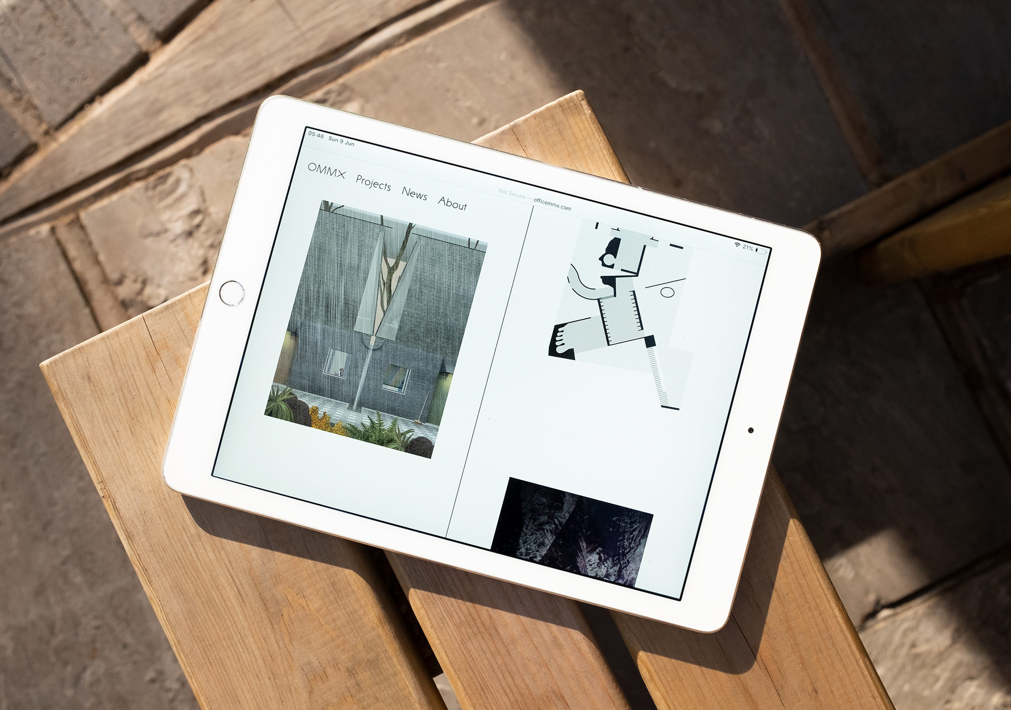
OMMX architects identity
Designed with the moment of turning a page in a physical book in mind, our design for OMMX’s website presents the depth of enquiry that characterises the projects undertaken by the London-based architecture practice.
We made a series of subtle changes to the familiar, skewing and altering well-worn website formats. For example, the loading bar, normally hidden from view, is positioned vertically in the centre of the webpage, acting like a book spine separating content; then on each verso is the story of making for each project, while walk-through photography sits on the recto. The website gently unfolds, with pages turning and scrolling through an elastic mix of content as readers move through OMMX’s work, establishing connections for themselves between built works, furniture design, exhibition-making and teaching.
As part of a wider identity project, we also designed Sammlung, a full upper- and lowercase Latin-A extended typeface. Our inspiration came from a hand-drawn 1957 poster by the celebrated Swiss designer Armin Hofmann. From it, we took the small selection of letterforms that Hofmann had used to spell the word “Sammlung” – which means “collection”, “group” or “library” in German. Using these as a reference, we started drawing and redrawing, establishing a grid to refine the font digitally, and eventually creating a very pure, humanist, geometric font.