1/13
Text
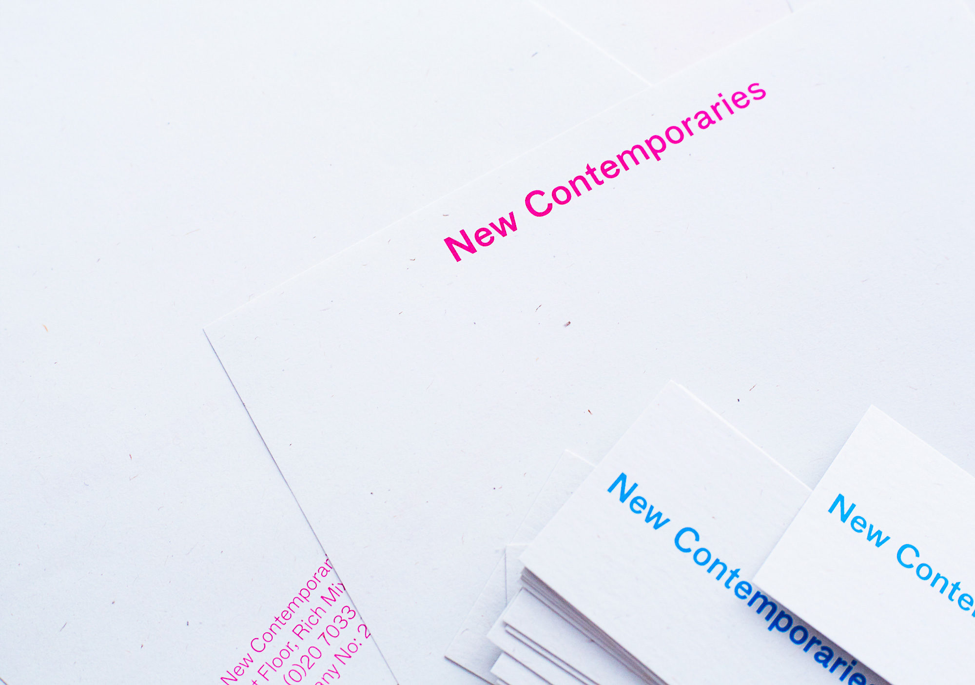
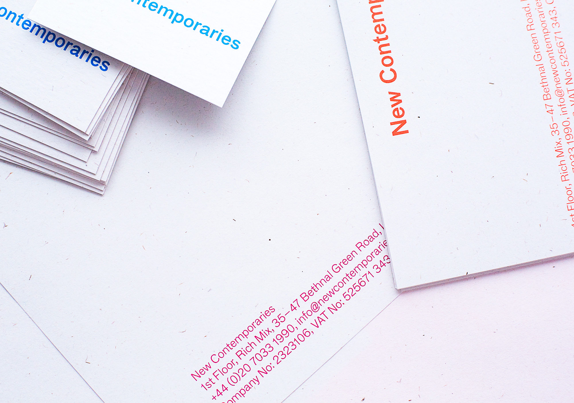
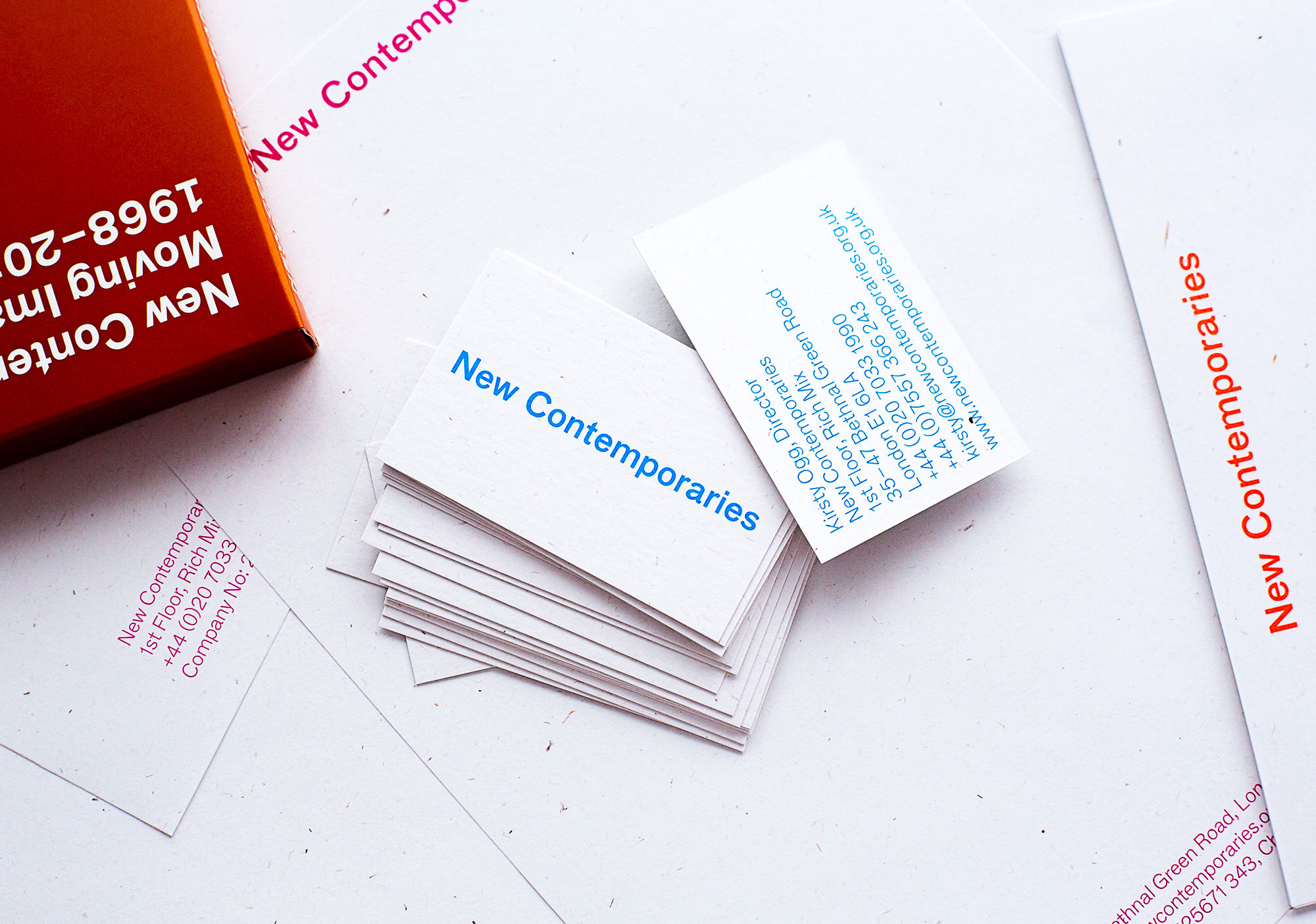
New Contemporaries identity
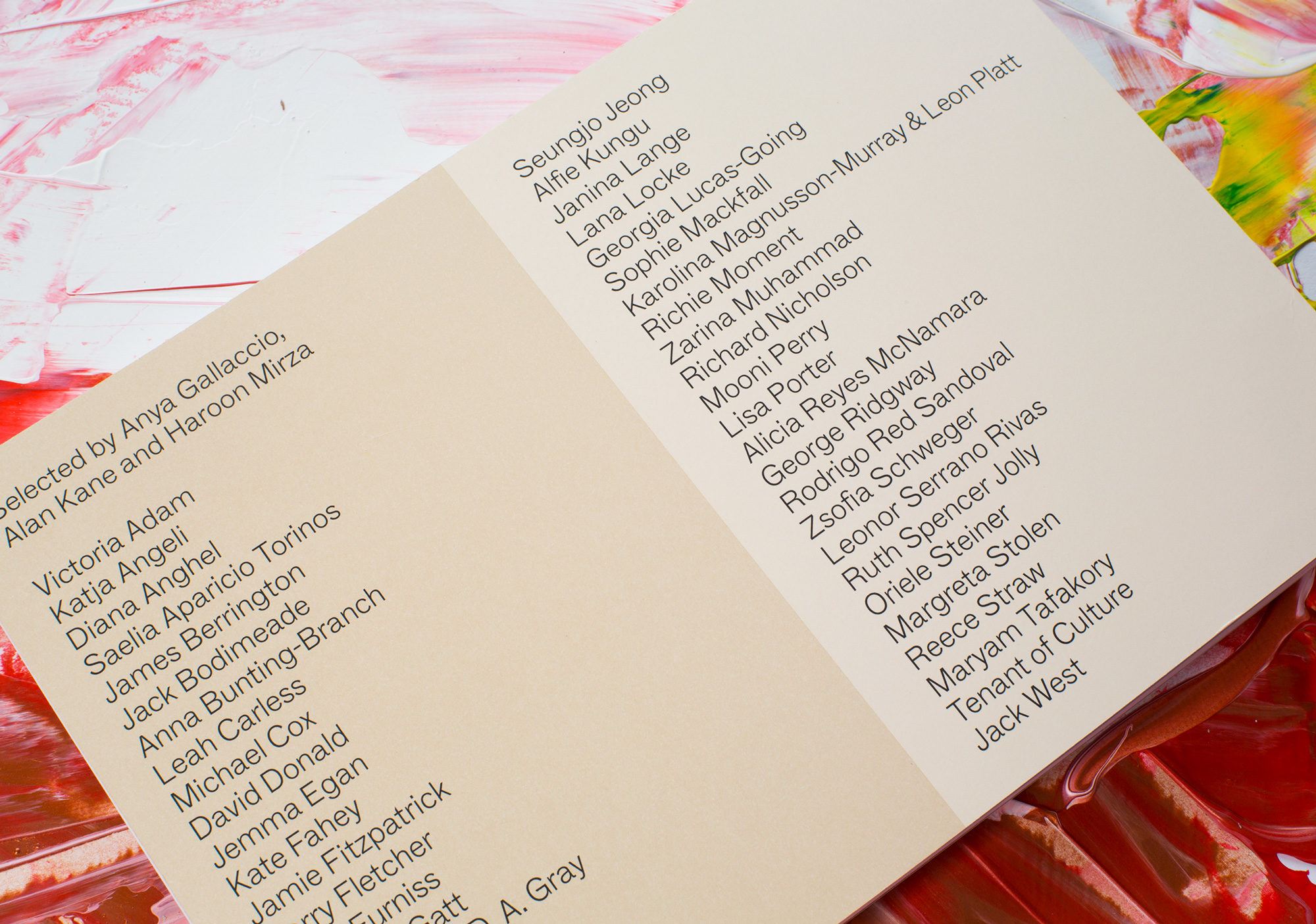
New Contemporaries has been supporting work emerging from British art schools since 1949, notably through an annual touring exhibition for new artists and recent fine-art graduates.
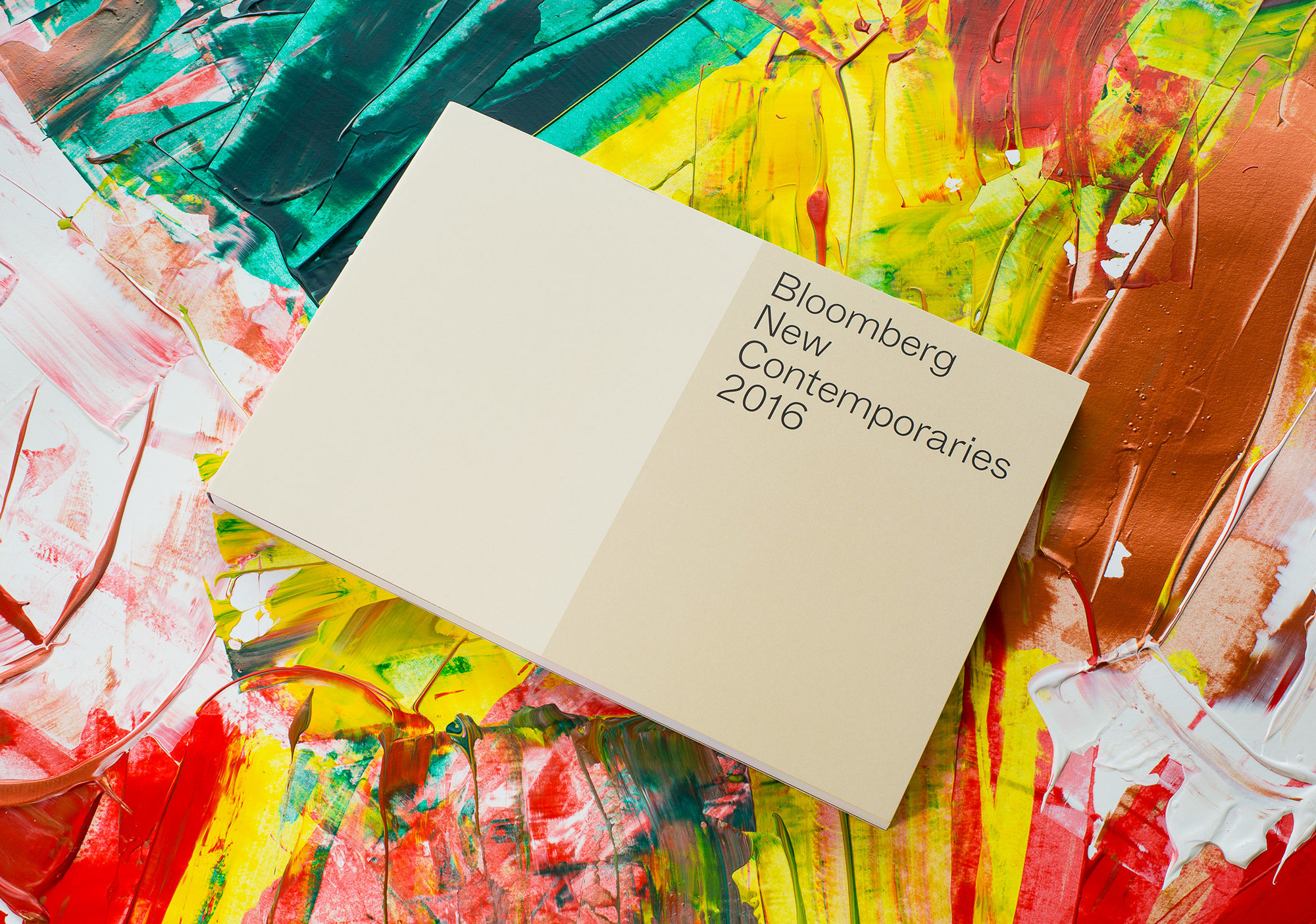
Kellenberger–White were commissioned to rebrand this pioneering organisation for its 65th anniversary in 2014, creating the design for the catalogue series, exhibition signage and a new publisher’s logotype for the New Contemporaries imprint.
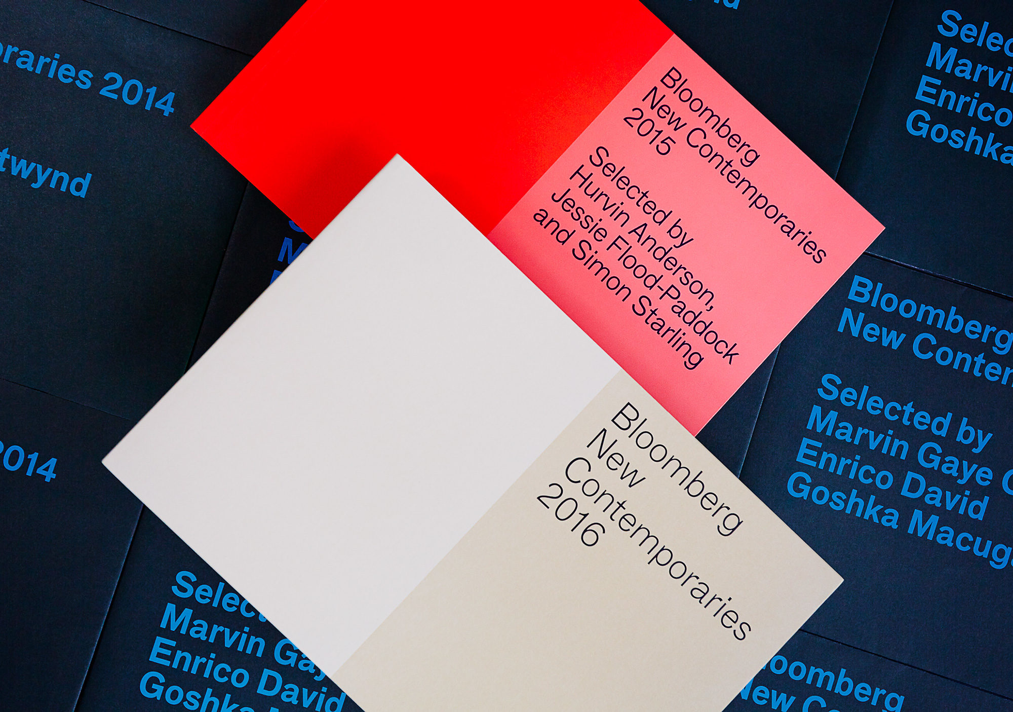
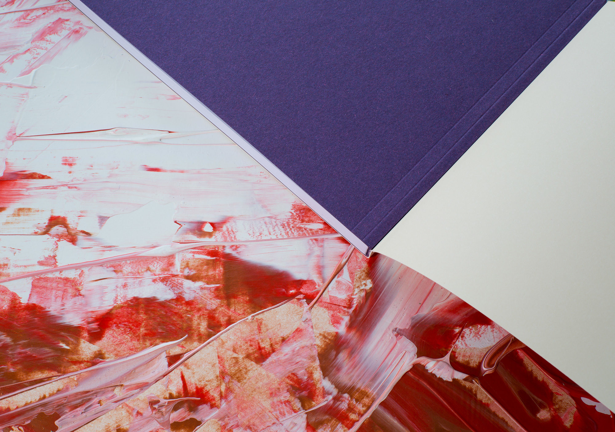
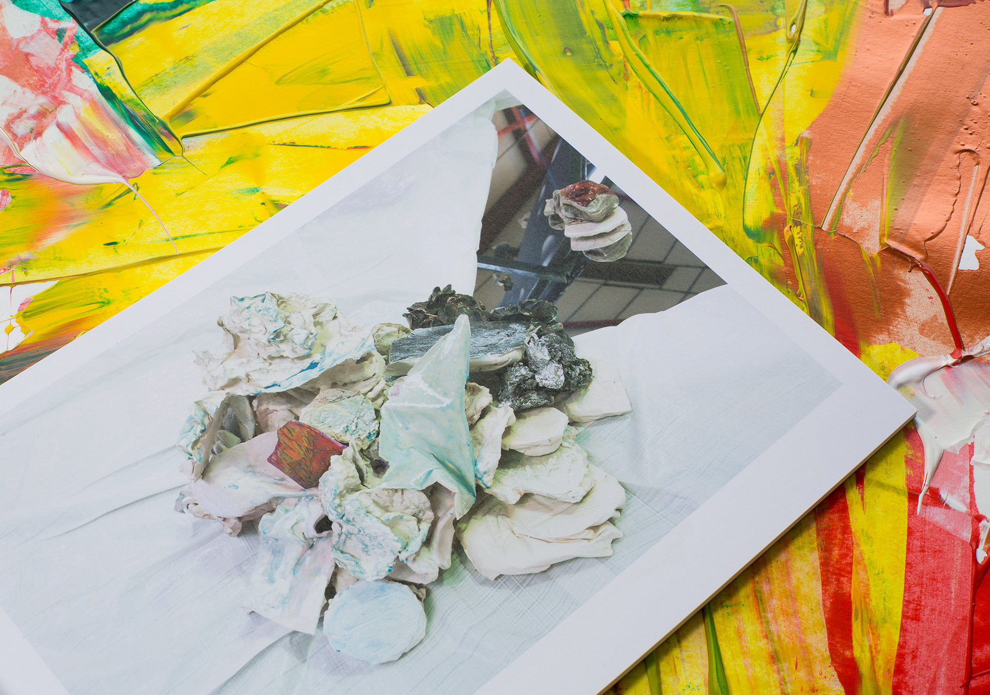
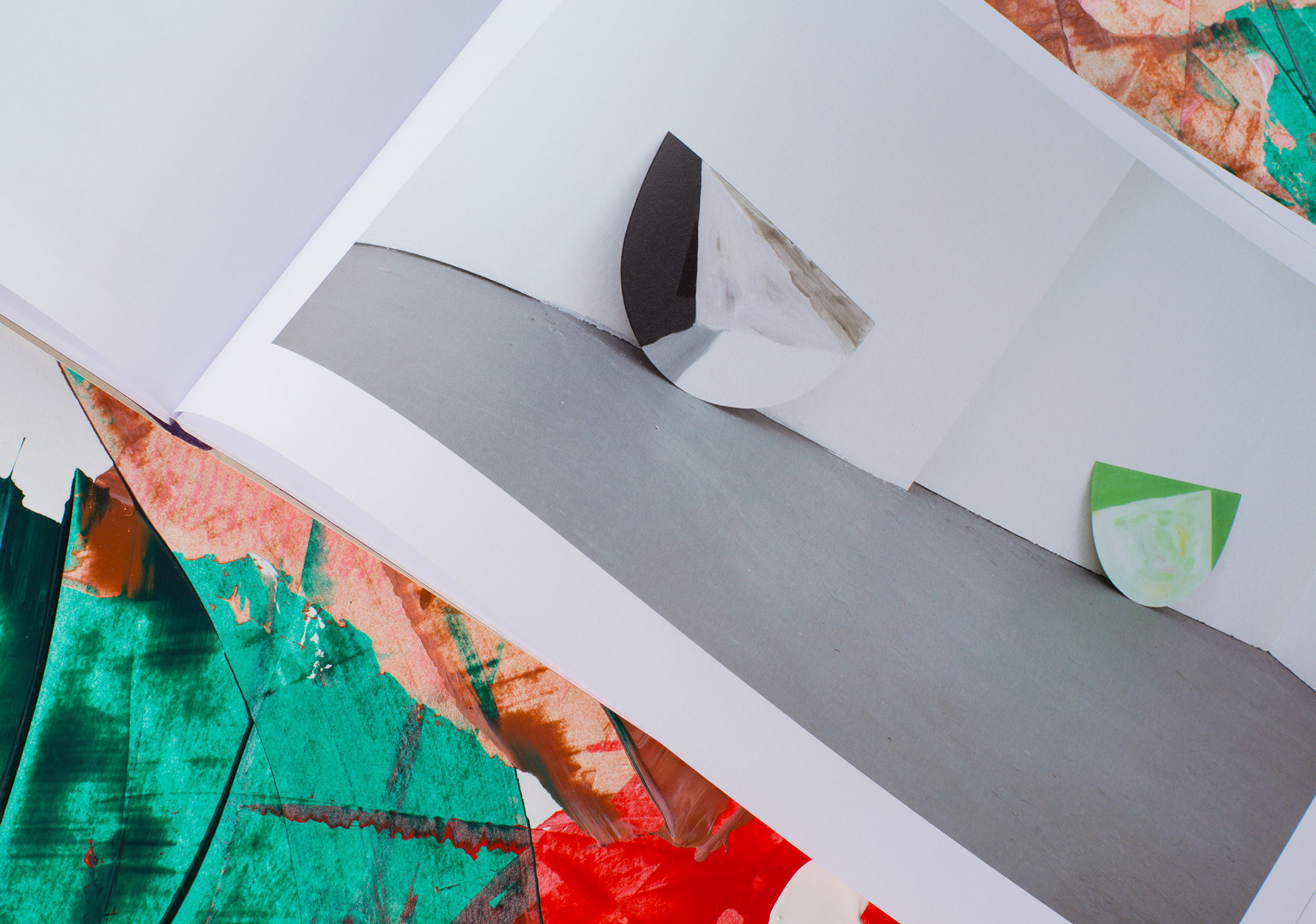
We produced the catalogue for three consecutive years as part of an ongoing partnership with New Contemporaries, matching the inventiveness of their exhibitions with the originality of our design conception. We use the Maximage colourbook to try out exceptionally unusual, even risky colour combinations, without incurring the expense of endless iterations of traditional colour proofing. This has enabled us to come up with such striking cover designs as the half/half split between pink and fluorescent orange in 2015. Within each catalogue, there are single, double and even triple hits of colour, but the virtues of clarity are always to the fore: we selected Radim Peško’s F Grotesk, a boldy drawn san-serif font that is unshowily authoritative, and allowed plenty of white space on the page to give prominence to the art reproduced there.